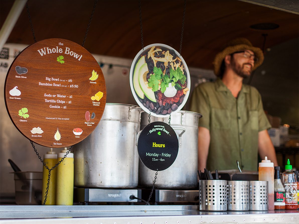
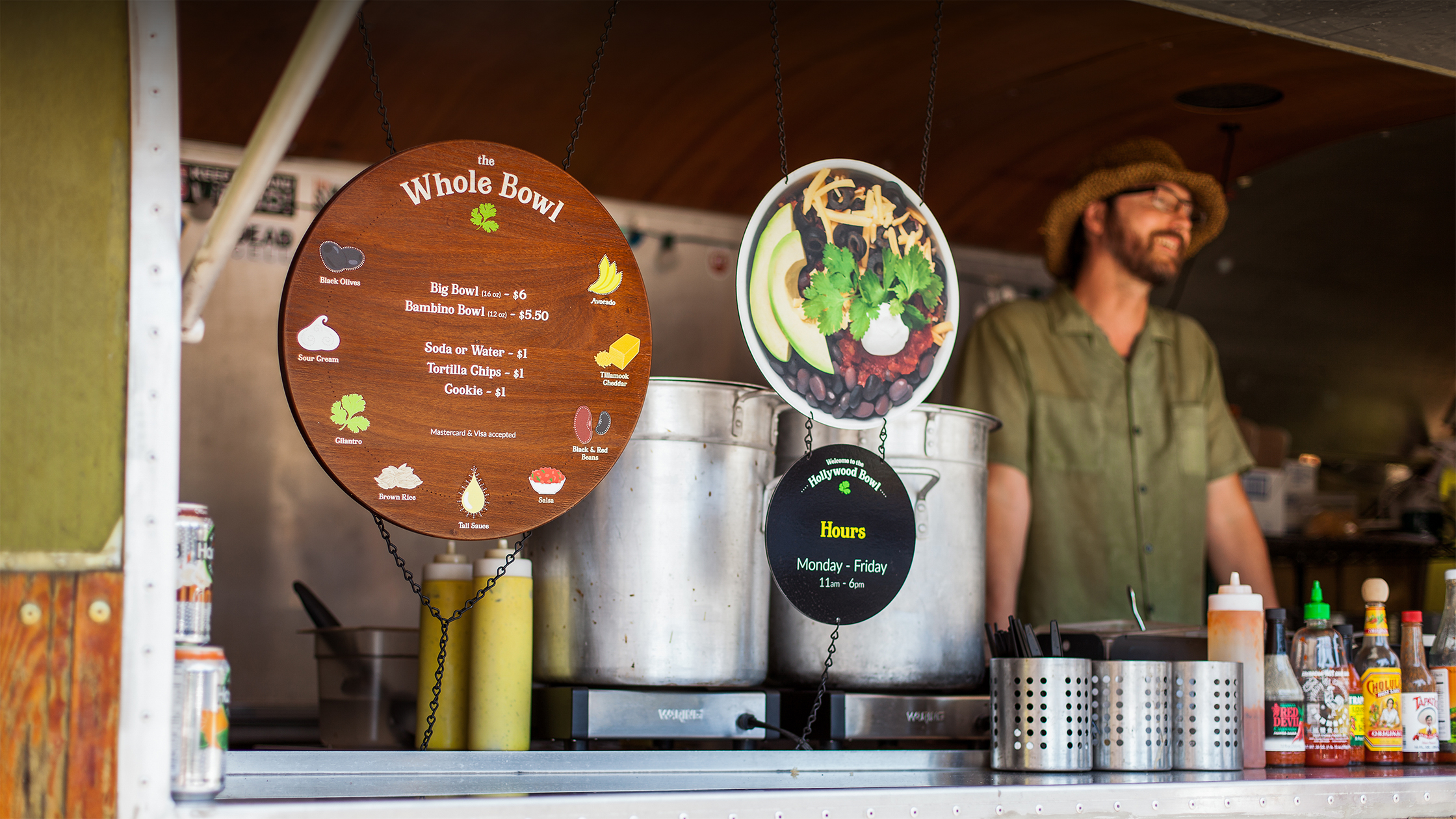
Photograph of a Whole Bowl employee smiling next to the menu. Photograph of a Whole Bowl employee smiling next to the menu.

The Whole Bowl

Rebranding a Portland original


Warning: Undefined variable $hasSector in /app/themes/sc_theme/templates/components/sc-case-study-overview.php on line 26

The Whole Bowl was one of the very first food carts to establish roots in Portland. When owner Tali Ovadia was about to open her fifth flagship location, she was looking for a more flexible, inspiring, and unified brand identity.

The Whole Bowl sells one product: nine healthy, delicious ingredients topped with a top-secret umami-packed sauce. Tali built the business by doing almost everything by herself, including recruiting her friends to hand-draw the eclectic illustrations and signage. It was charming, but as popularity grew for her Bowls and she felt the pull to expand across Portland and nationally, she needed a new brand identity that could honor its roots while adding polish and punch.
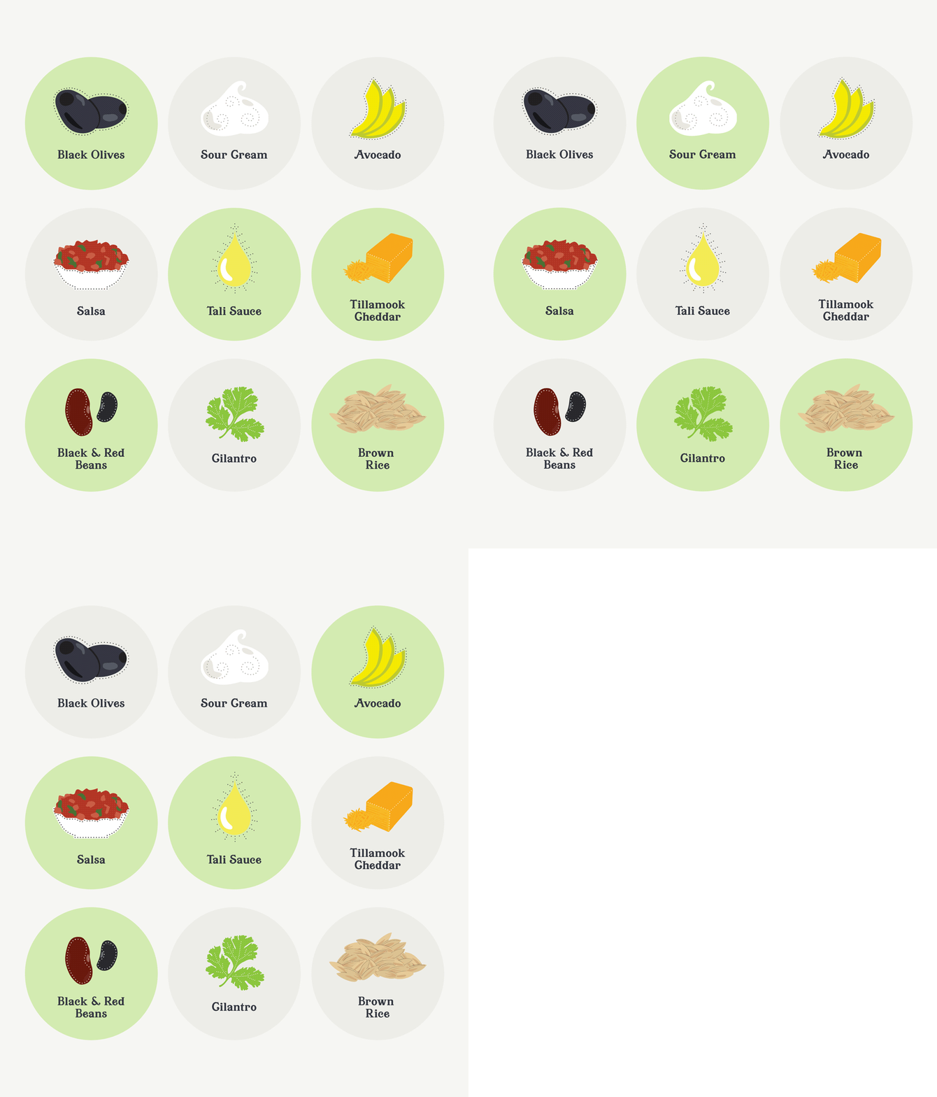
The Whole Bowl logo decal on a glass door. An animation showing different ingredients being selected from the Whole Bowl menu.

We illustrated each ingredient for the new menus to make it visually simple to see what’s in the bowl.
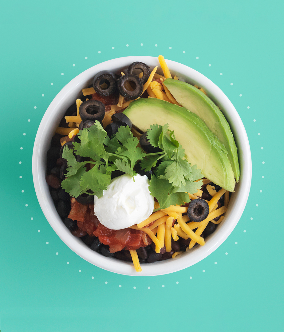
Top-down photograph of Whole Bowl's signature dish.

A Brand Platform for Expansion

Built to expand, still rooted in beloved originality

The Whole Bowl logo would soon appear in dozens of food carts and restaurants across Oregon. We developed a brand system that would express their wholesome roots across signage systems, marketing, swag, packaging, staff uniforms, and more. A motif of brightly-colored dots expresses the delightful experience of grabbing a Bowl.


3

states with Whole Bowls after the rebrand (up from 1)

7

locations after the rebrand

21

years since The Whole Bowl was established

9

ingredients that built this mini-empire
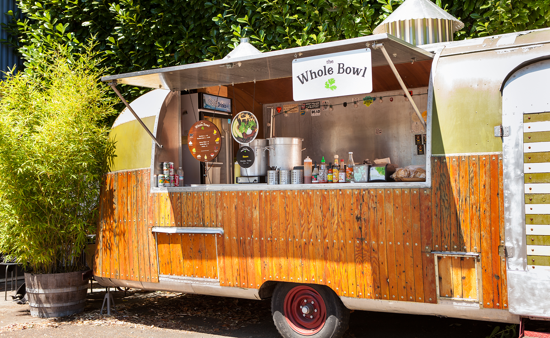
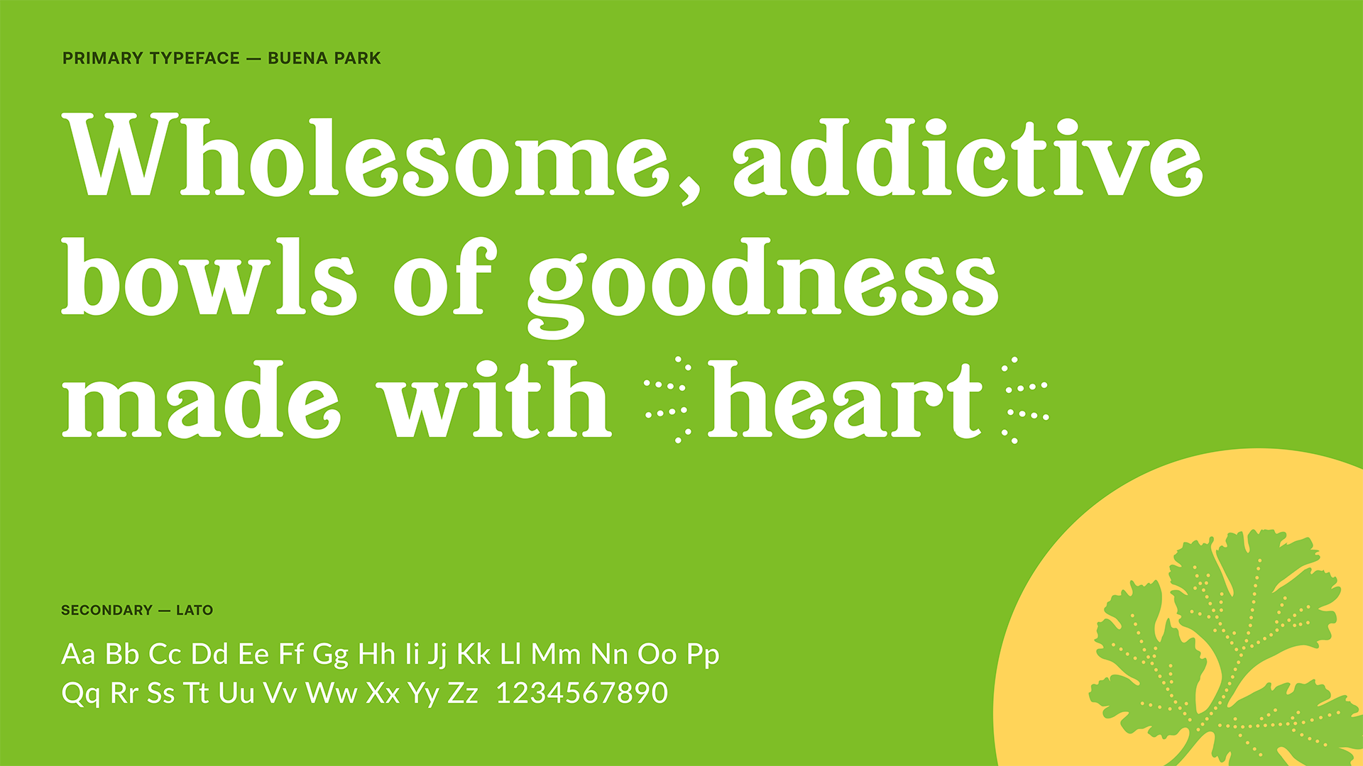
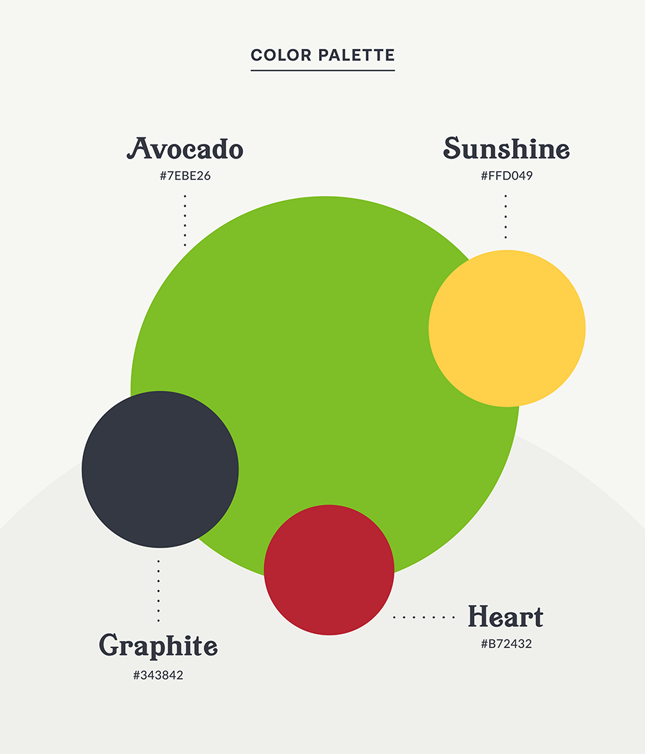
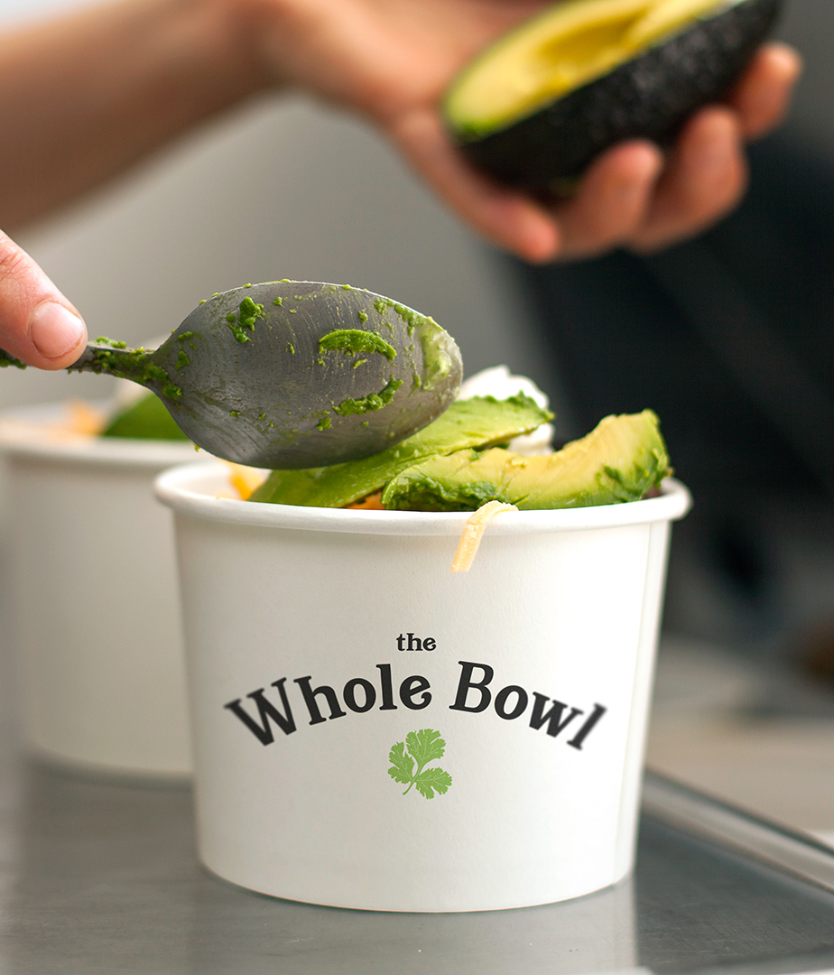
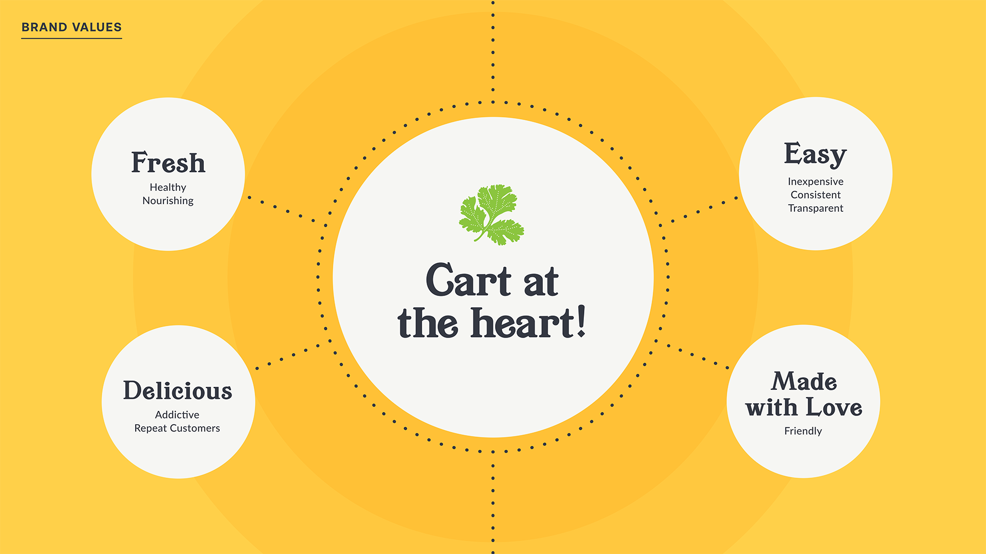
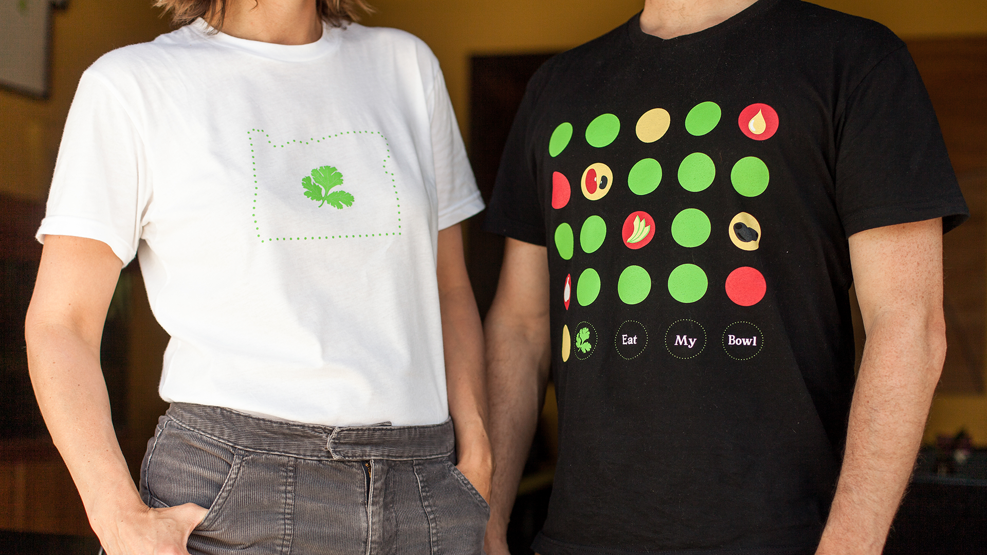
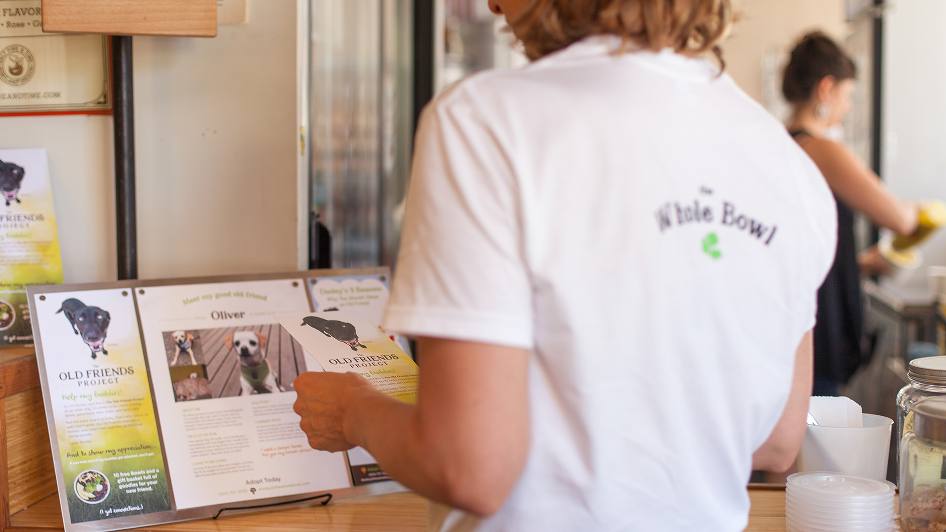
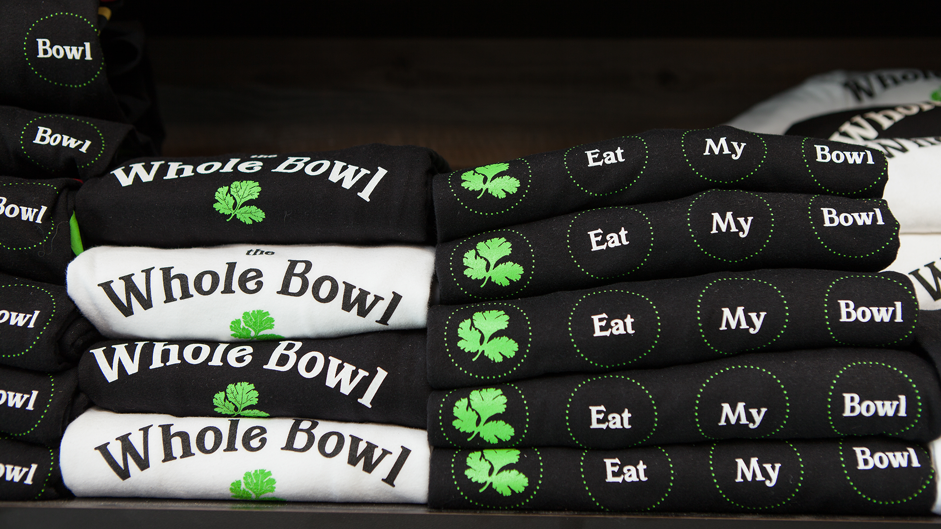
A landscape photograph of a Whole Bowl food truck in Portland, OR. An example of the brand typography using the Whole Bowl brand tagline we crafted, "Wholesome, addictive bowls of goodness made with heart." The brand color palette: Green, Yellow, Charcoal, and Red. A photograph of someone scooping fresh avocado into a Whole Bowl with the logo on the cup. Whole Bowl's brand values. In the center a circle reads "Cart at the Heart", then spokes reach out to smaller circles that read "Fresh, Delicious, Easy, and Made with Love." Two of the shirts we designed for Whole Bowl. The first is a white shirt with the Oregon state silhouette with the Whole Bowl cilantro leaf in the center. The second shirt features the illustrated menu items with the words "Eat my bowl" at the bottom. A photograph of a woman standing in a Whole Bowl restaurant wearing a white shirt with the Whole Bowl logo. A stack of branded shirts being displayed in a restaurant.

It’s a good sign

One of the coolest and most fun brand applications we developed is the menu board. It’s fabricated out of wood, laser engraved, and then painted with a simple brand palette. The menu itself communicates the handmade feel of the food and the brand tagline of “It’s Like Eating a Hug!” Wood and steel signs use fundamental materials that tell the whole story of The Whole Bowl.
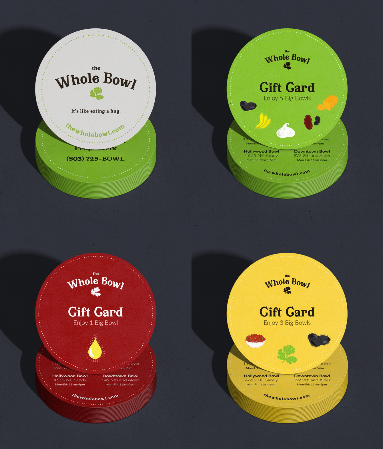
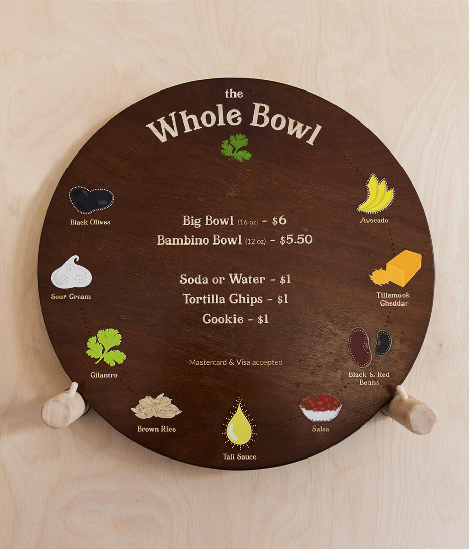
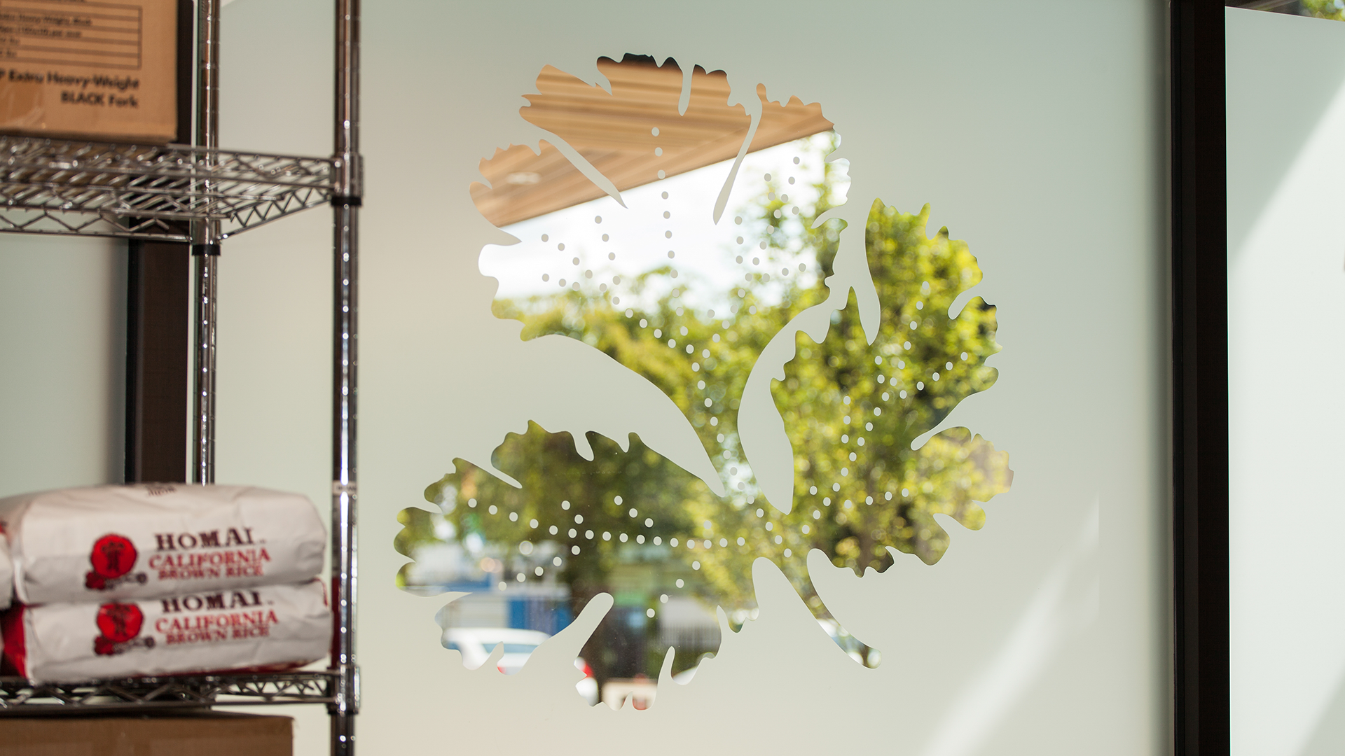
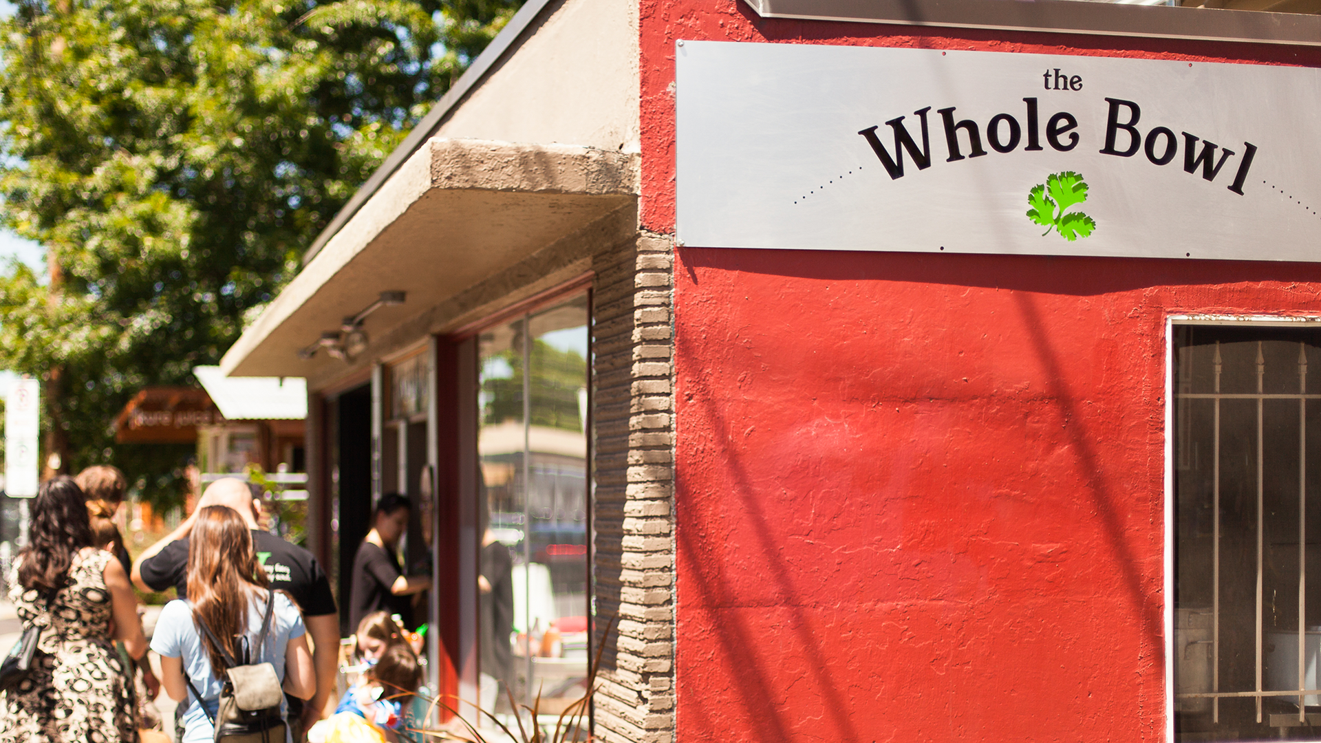
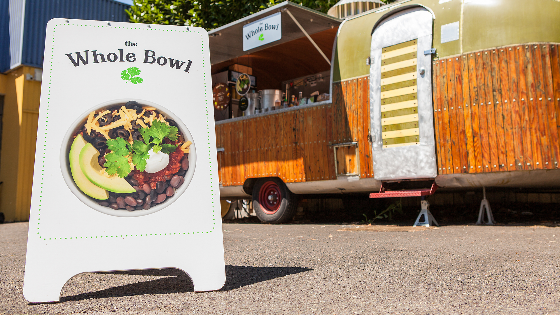
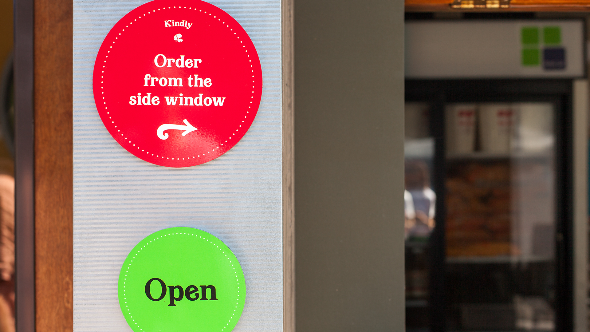
A gif rotation through the Whole Bowl branded business cards and gift cards. The Whole Bowl menu is a round wood base with decals for each of the bowl ingredients around the circumference. A cilantro leaf window decal in the restaurant made with frosted glass. The Whole Bowl logo on the side of the restaurant. An a-frame sign featuring a photograph of the famous bowl sitting outside of a Whole Bowl food cart. A photograph of restaurant's signgage. A green open sign set in the brand font, and another round sign in red that reads "Order from the side window."

As a businesswoman who has worked with many vendors, working with Smith & Connors has been a pleasure cruise with professional results that made me grateful to have found them.

Talie Ovadia headshot

Tali Ovadia

Owner, The Whole Bowl

Project Scope

All Work
Billboard mockup with the new West Slope Library branding. Marketing print collateral mockups with the new West Slope Library branding.

Next Up: West Slope Library

West Slope Library

  • Footer B Corp Logo New in white.
  • The Footer WBENC Logo in white.
  • The Footer Zebras logo in white.

© Smith & Connors LLC

Use of Cookies

We use cookies to provide you with a great experience and to help our website run effectively. By using this website, you agree to our use of cookies. See our Privacy Policy for more information.

Accept & Close