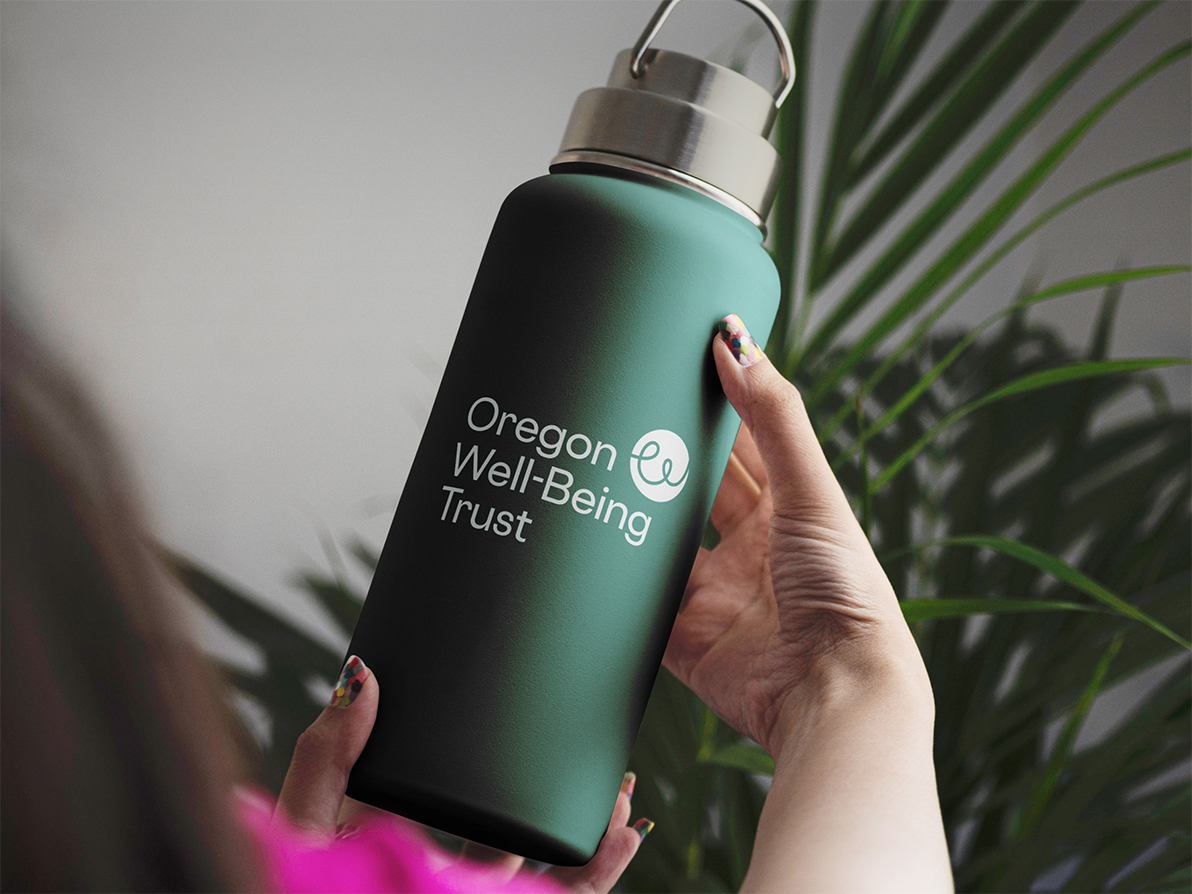
Oregon Well-Being Trust
Shaping a new era of educator well-being
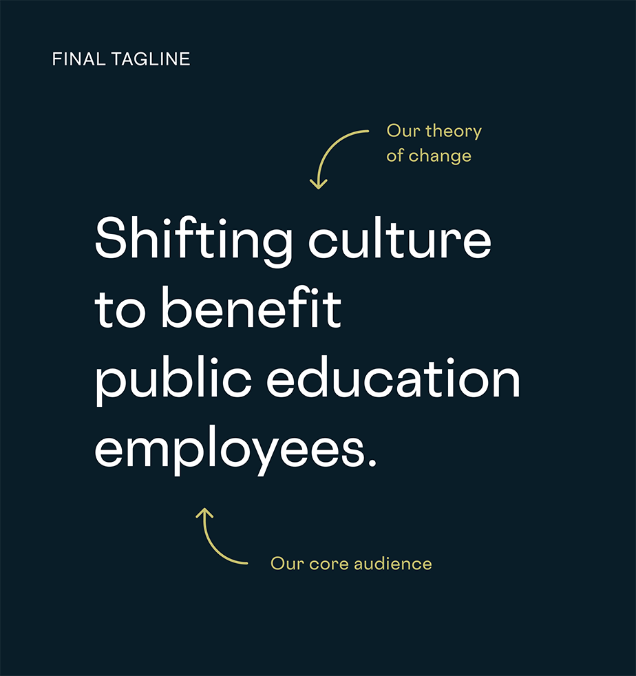
Oregon Well-Being Trust (OWT) is a nonprofit dedicated to promoting the total well-being — physical, social, emotional, financial — of Oregon’s public education employees. They came to us for a facilitated brand creation process, which led to an updated name, core messaging, and articulation of emerging identity and values.
OWT is a benefit provider, which started by offering health insurance in the 1980s. In 2009, the organization transitioned to offer benefits in the form of grants and technical assistance for public education entities throughout the state. Through work with Smith & Connors, they gained a refreshed brand that encompasses their past, present, and future.
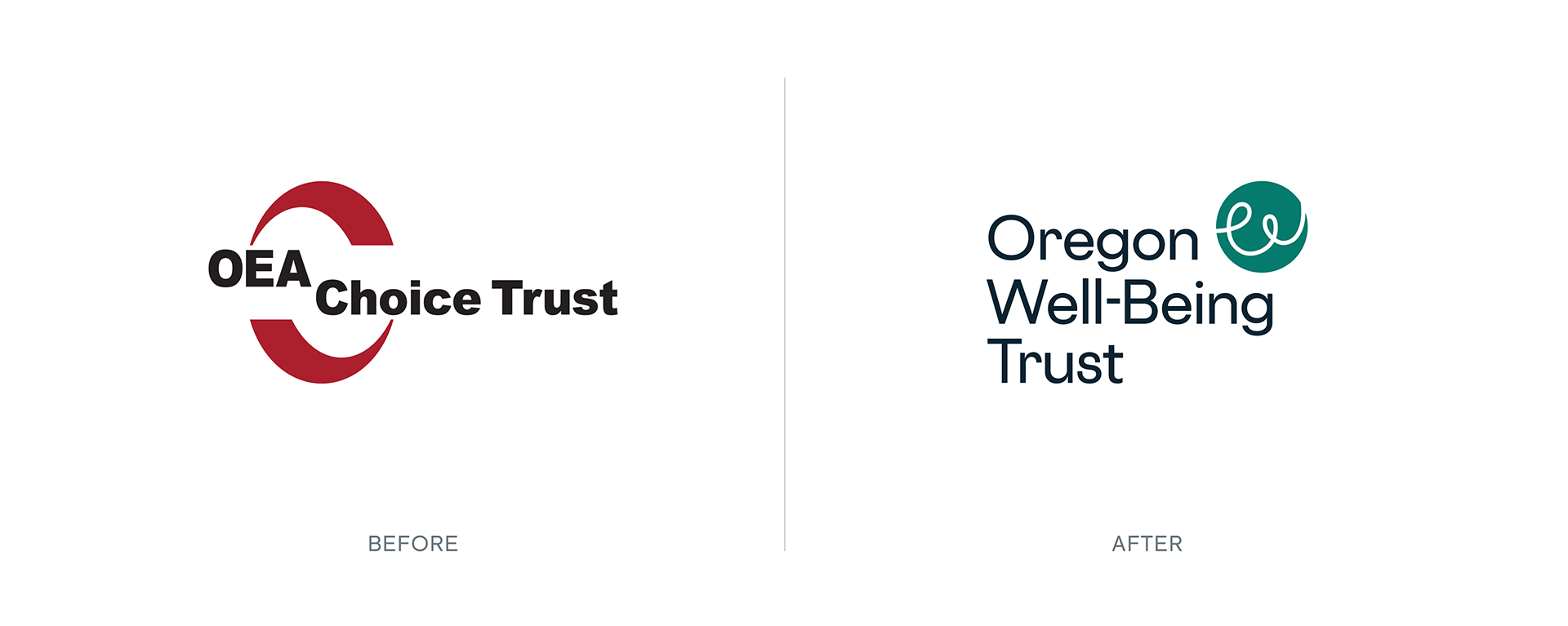
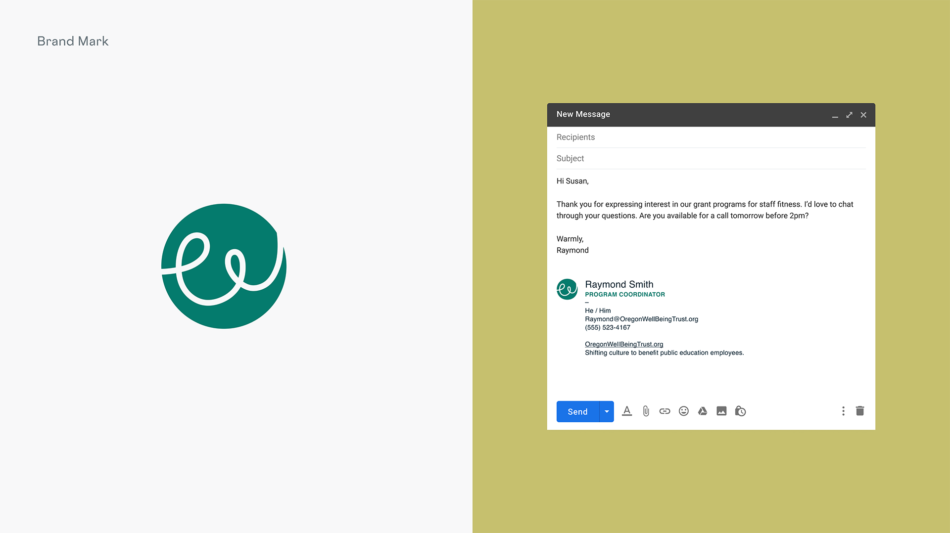
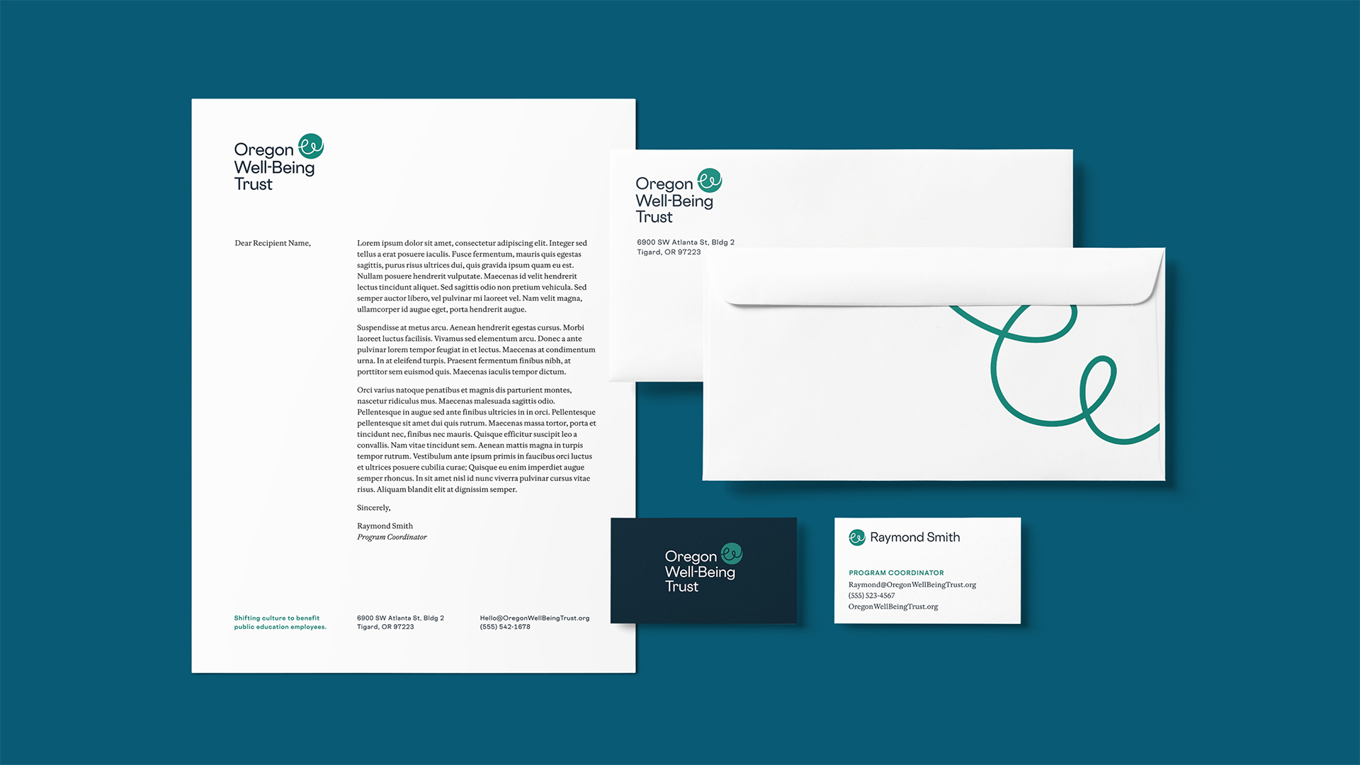
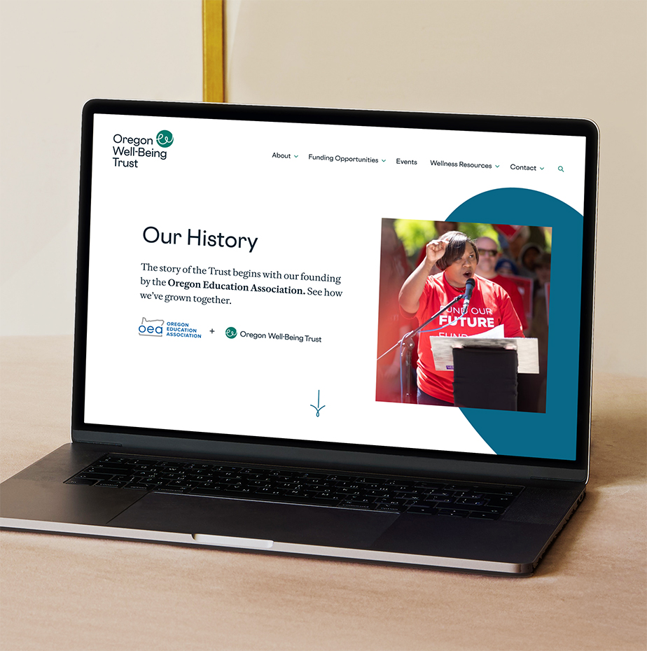
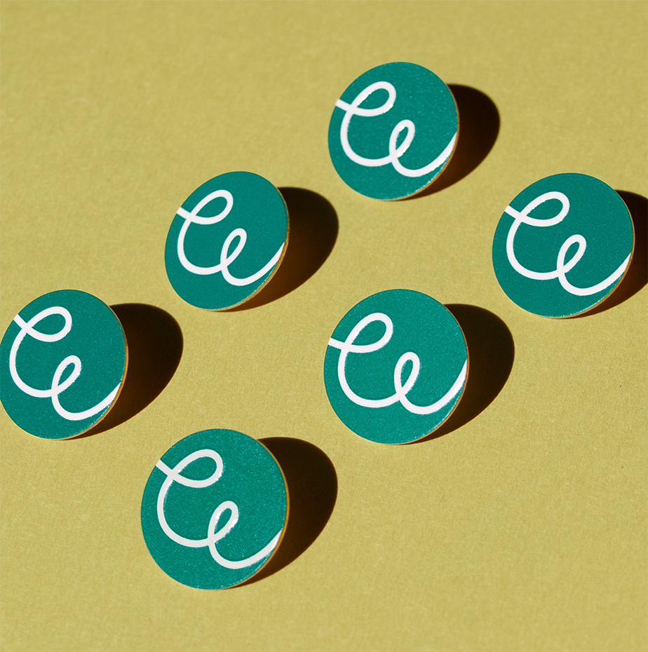
The new logo, with its active and joyful mark, nicknamed the “Flourish,” is inspired by OWT’s forward-thinking mission to transform workplace cultures through a commitment to well-being.
A new strategic framework
We created a strong foundation to express OWT’s commitment to fostering a culture of well-being across Oregon’s public education system. The organization can always refer back to this strategic language to help them keep their brand expression focused and consistent.
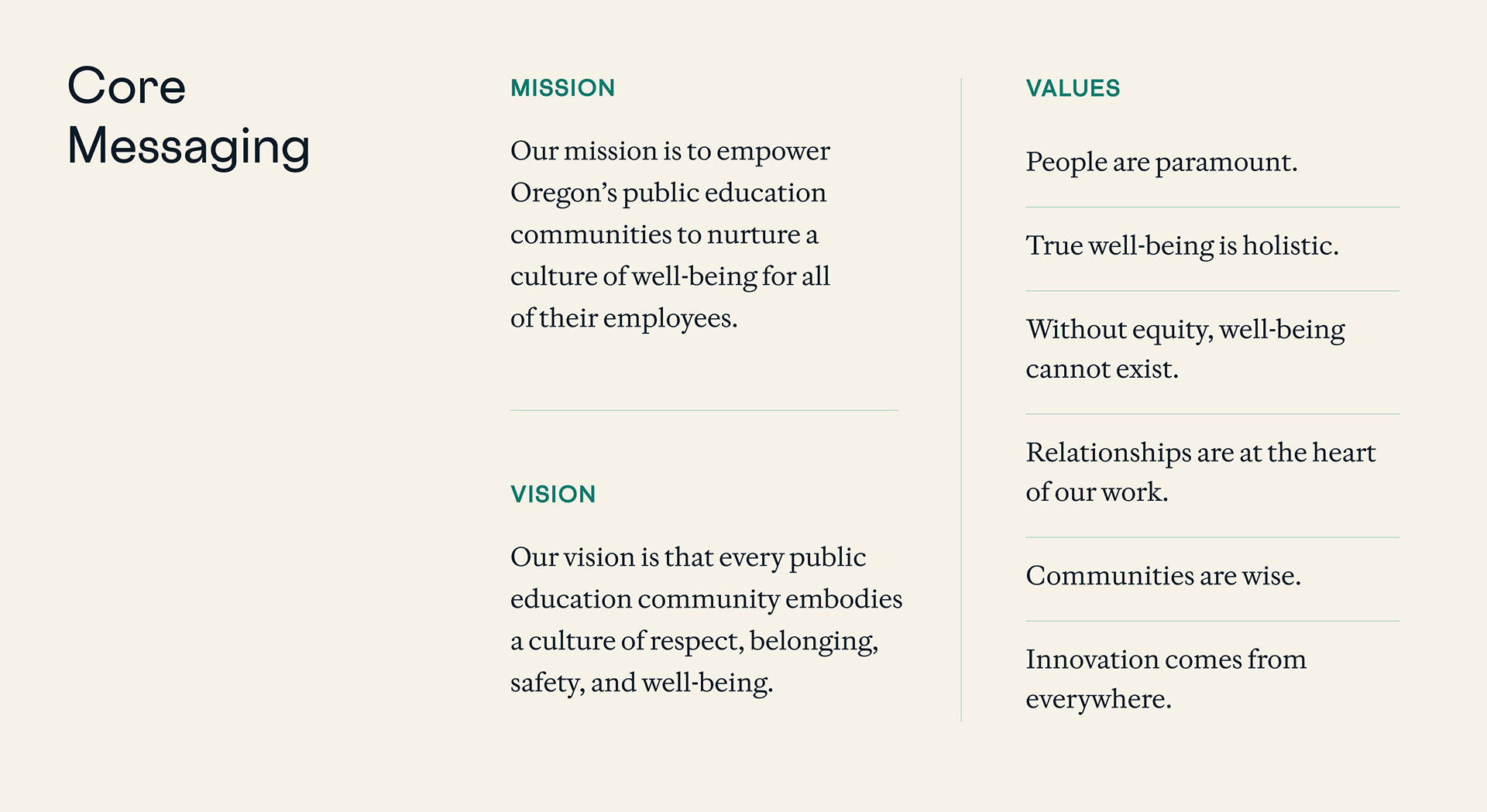
OWT’s new vision, mission, and values statements provide OWT with the tools to clearly communicate their commitment to fostering a culture of respect, safety, and belonging in every public education community.
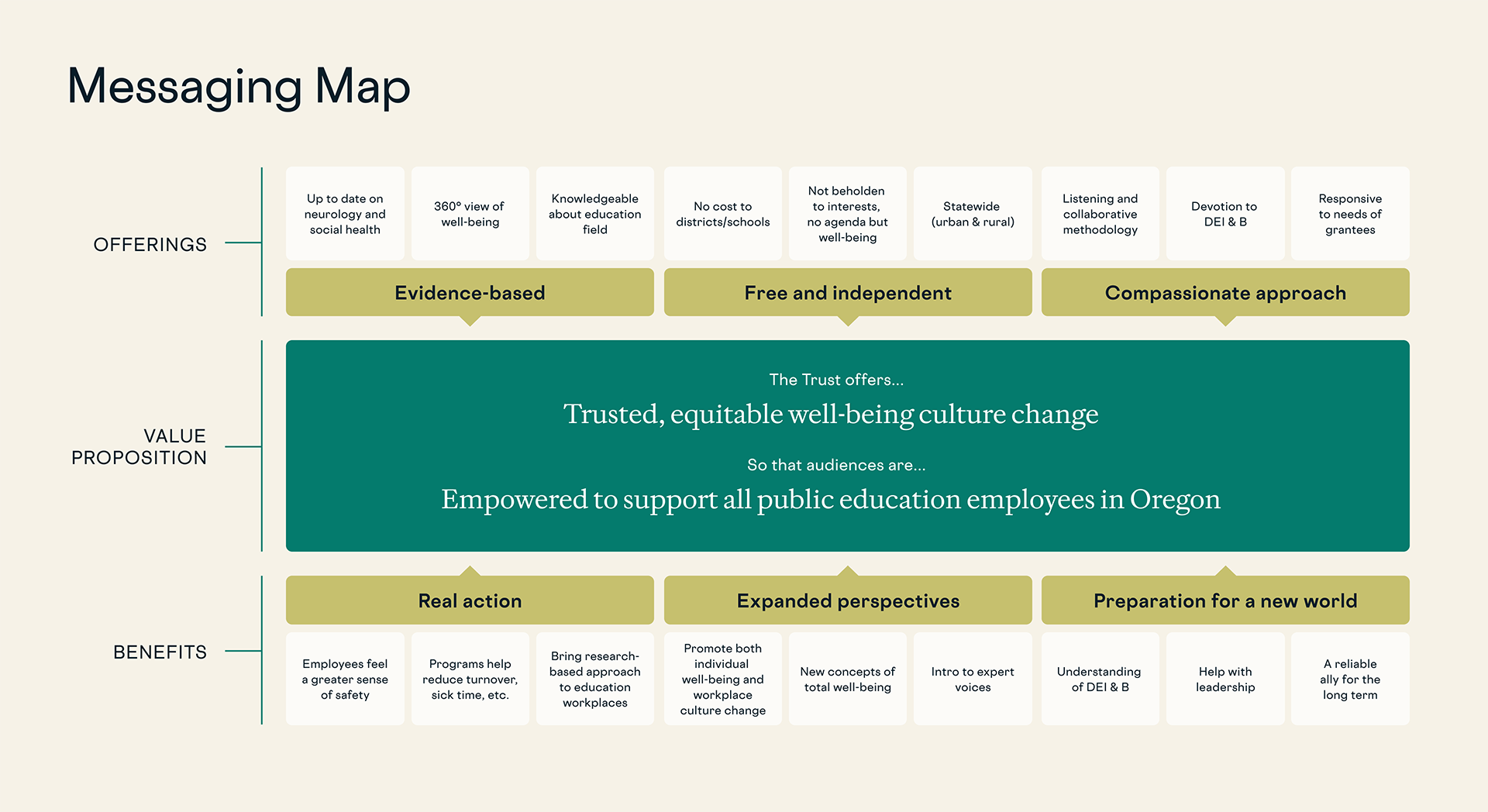
The Messaging Map delineates the benefits of OWT’s programs — such as enhancing employee safety, reducing turnover, and promoting equity. We helped them create a narrative that not only informs but also inspires action.
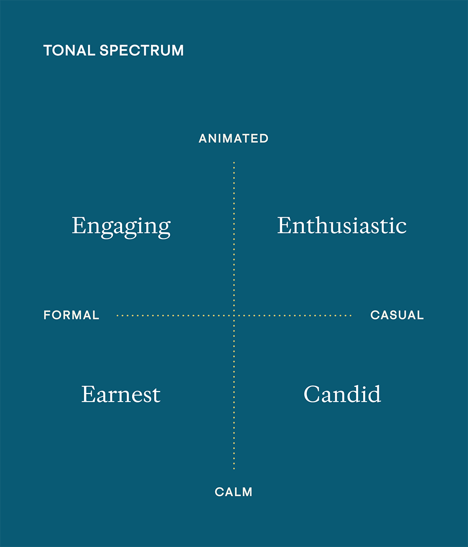
Giving OWT a spectrum of tones to express their voice ensures that all communications are impactful and relatable.
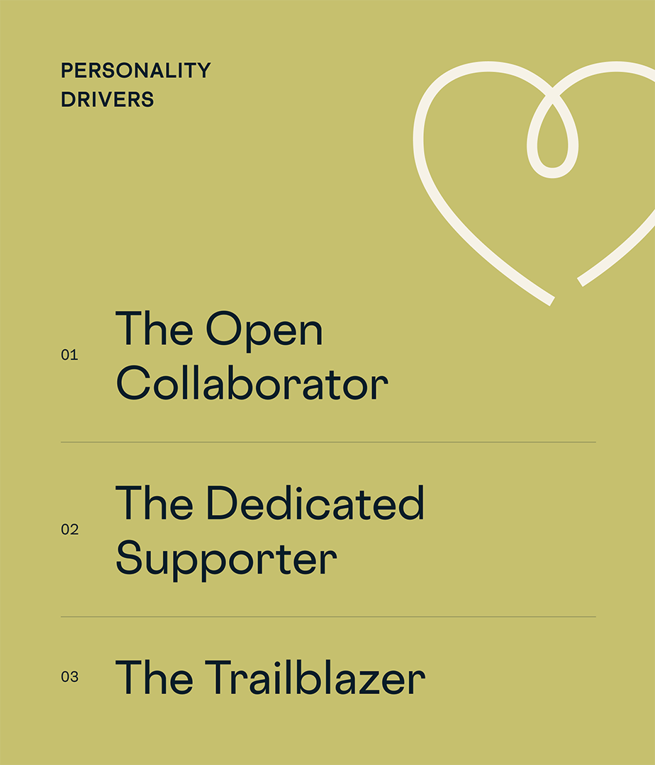
New personality drivers guide every interaction, ensuring that the Trust is seen as approachable, committed, and forward-thinking in its mission.
Crafting a name with purpose
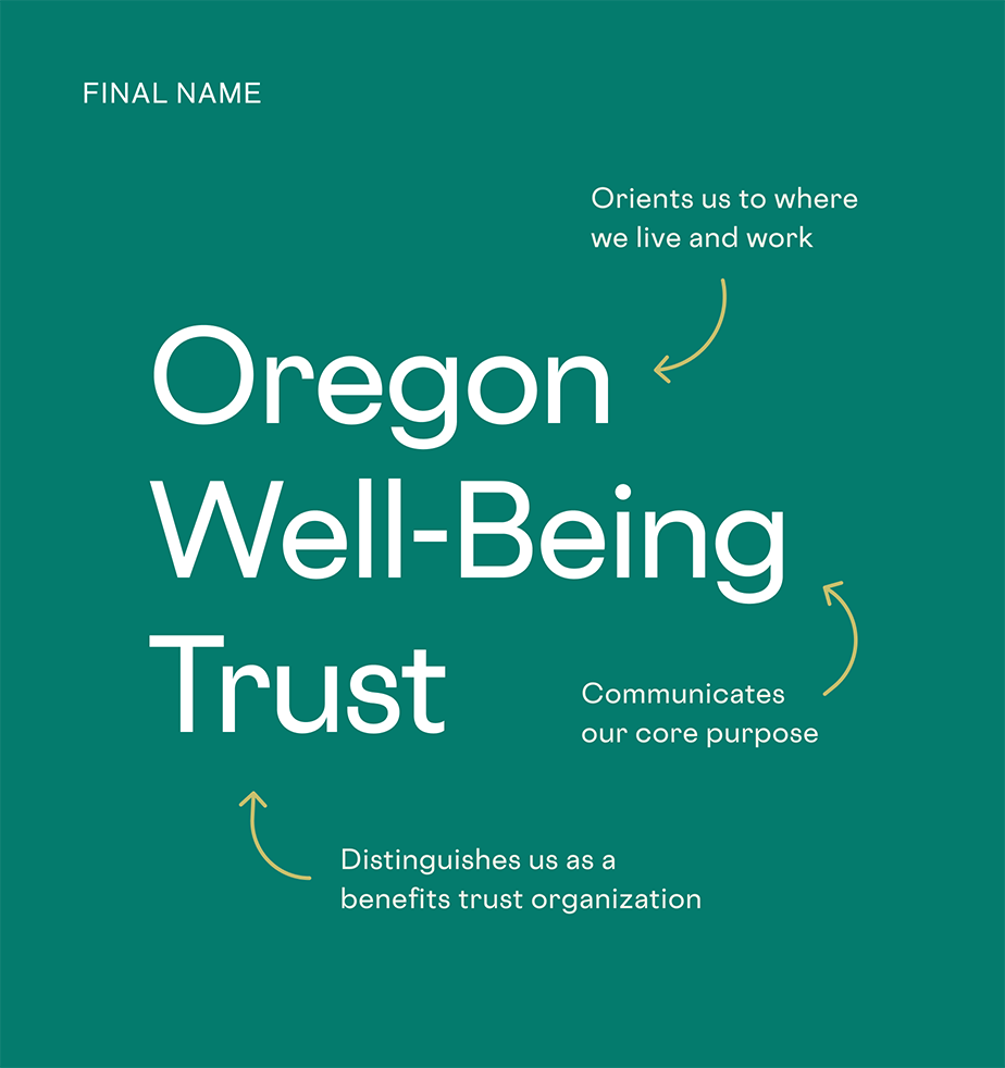
A name is often the first way a brand connects with audiences. We wanted to develop a name that would stand out in a crowded marketplace, clearly communicate OWT’s mission, stay connected with the past, and resonate with new audiences. We facilitated an inclusive process that involved all staff members and the board and reached a consensus.
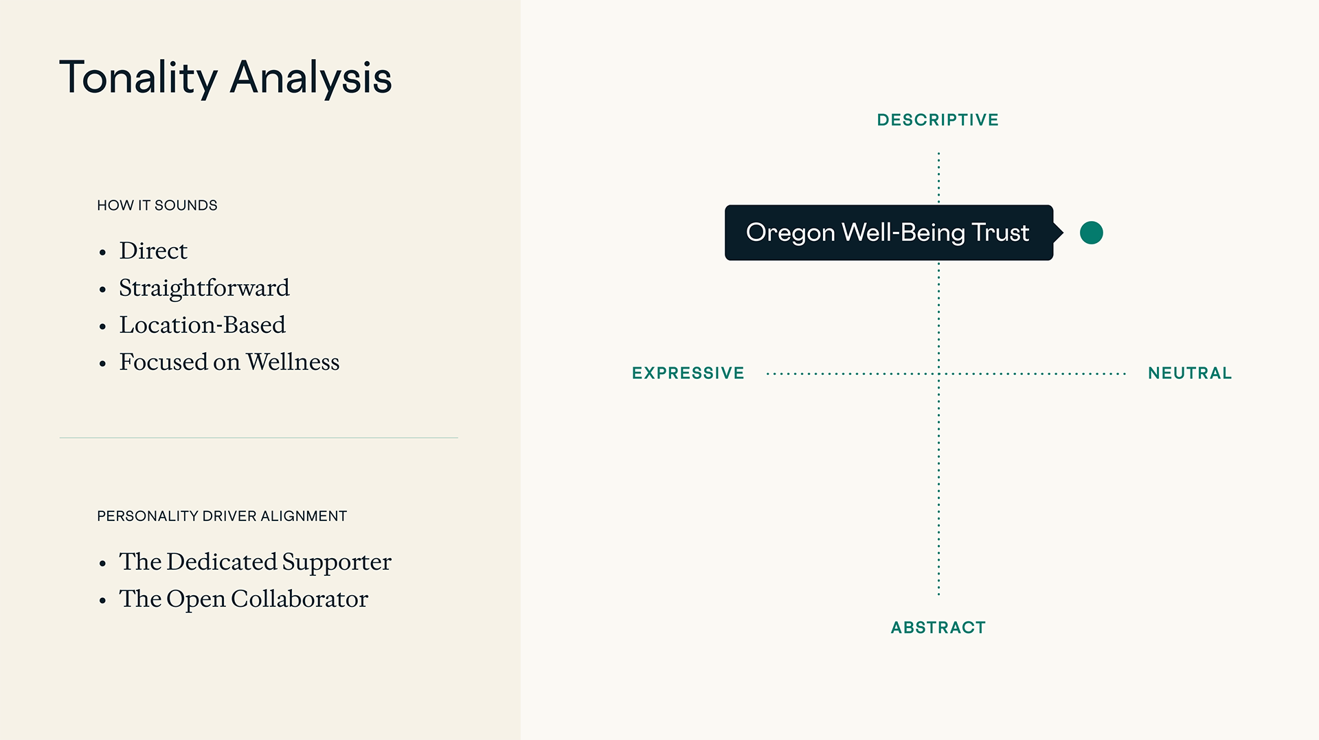
We positioned the name on a spectrum between descriptive and expressive so it conveys a sense of place and purpose while remaining approachable.
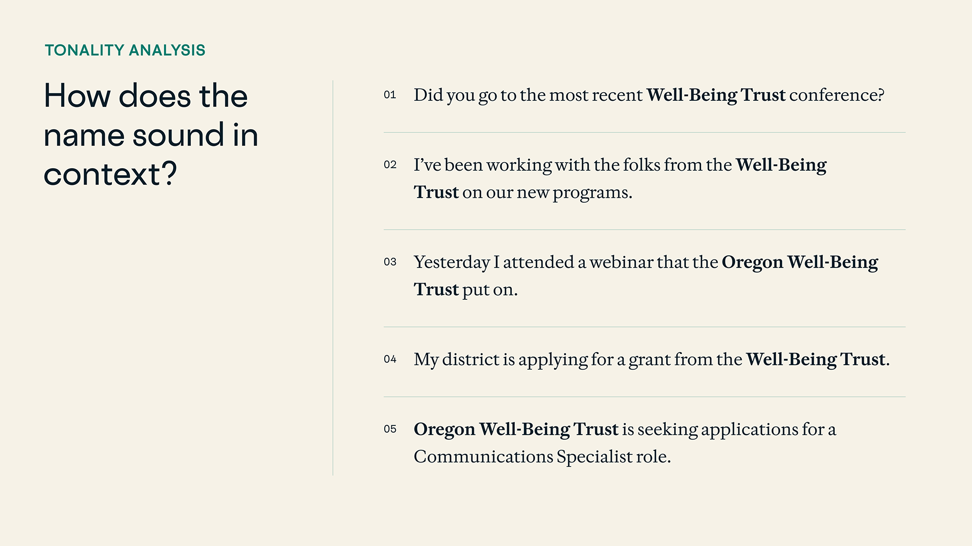
Understanding how the name would function in everyday communication was critical to our process. Because the name aligns with the Trust’s personality drivers, it’s an effective tool for both formal and casual communications.
Crafting cohesive brand elements
Every element of a brand should work in harmony to tell a compelling story. From the thoughtfully designed brand mark, which symbolizes unity and support, to the carefully curated color palette that conveys a sense of calm and trust, each component was crafted to resonate with OWT’s diverse audience. The custom iconography, used across all platforms, reinforces key values such as connection, equity, and action.
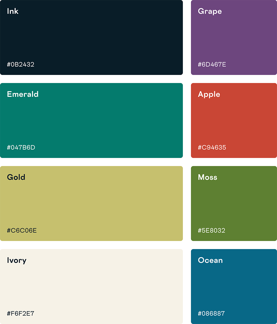
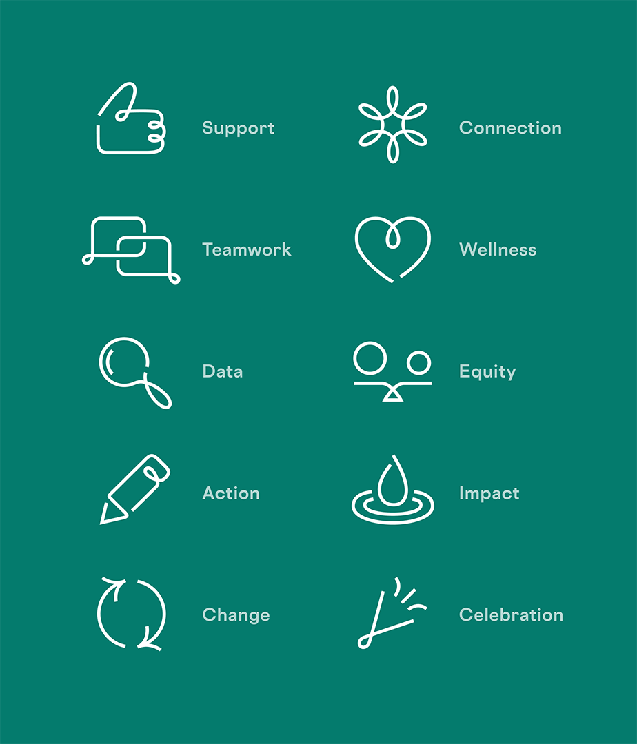
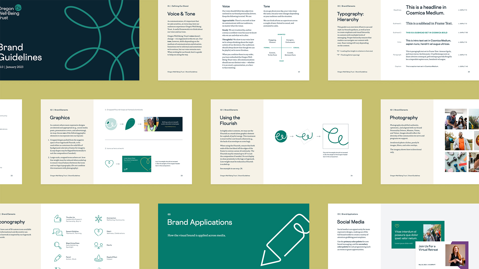
We designed a comprehensive brand guide that covers everything from voice and tone to typography, iconography, and photography and provides clear directives on how to apply the brand across various mediums.
Building new tools for brand expression
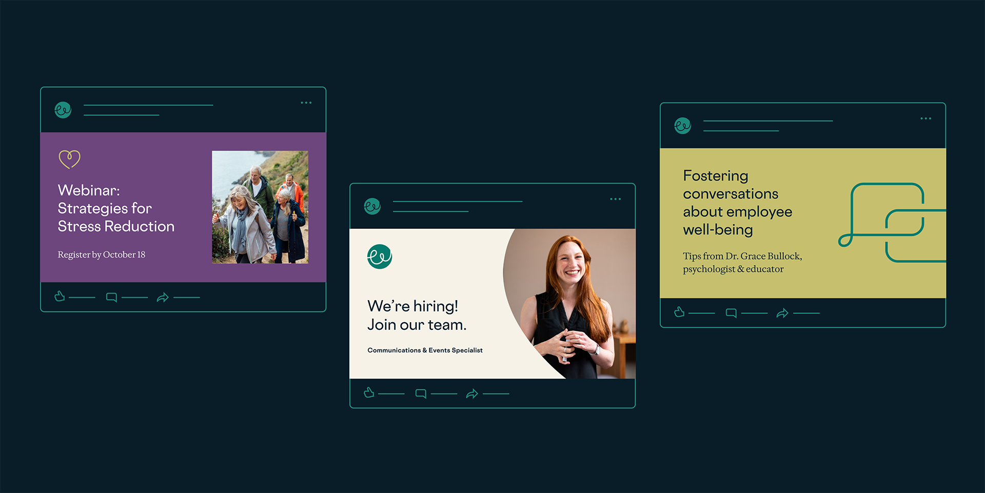
We crafted a strategy detailing how the brand could be brought to life across various touchpoints—digital platforms, print materials, and environmental graphics. One of the key tools is a versatile PowerPoint template with 52 master slides that serve as both practical templates and inspirational guides, showcasing how to effectively use color, typography, imagery, and other brand elements across different content types.
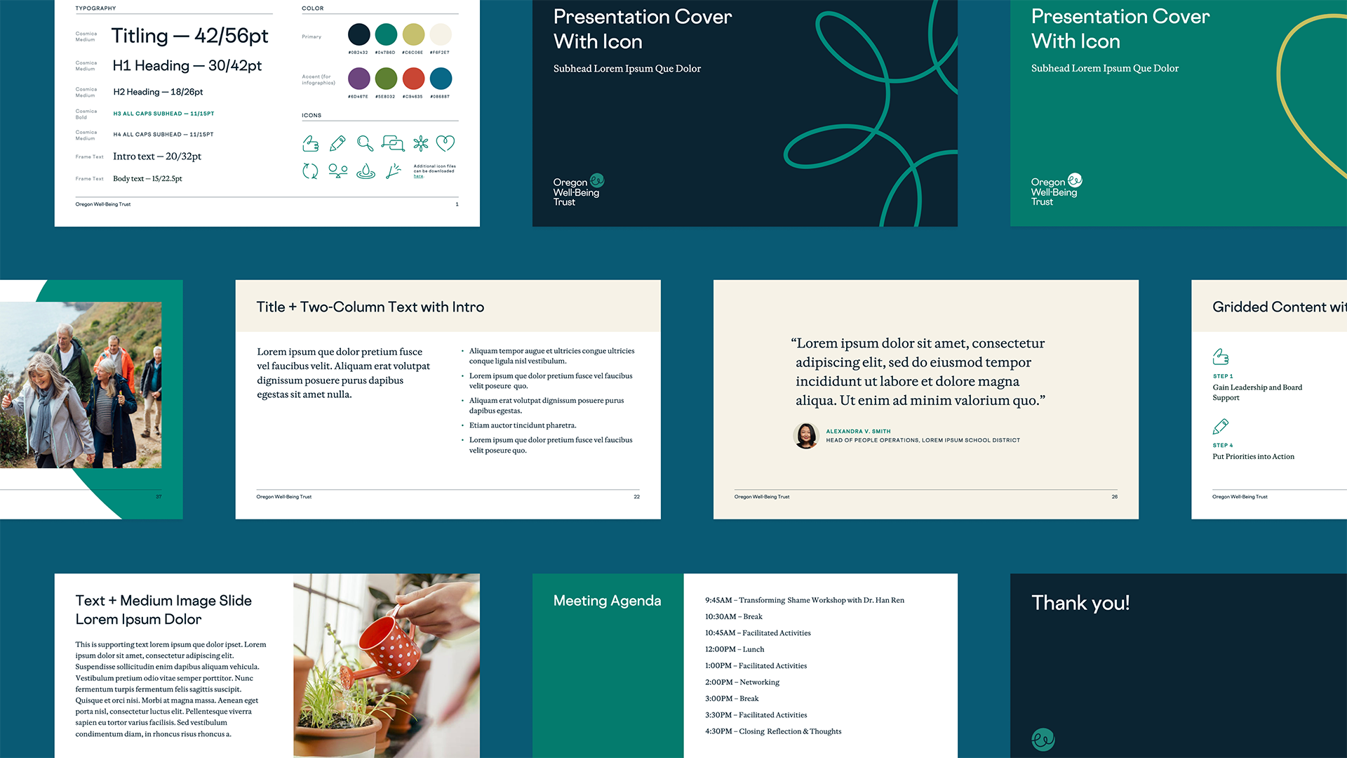
These presentation templates give Oregon Well-Being Trust the tools to stay consistent and professional.
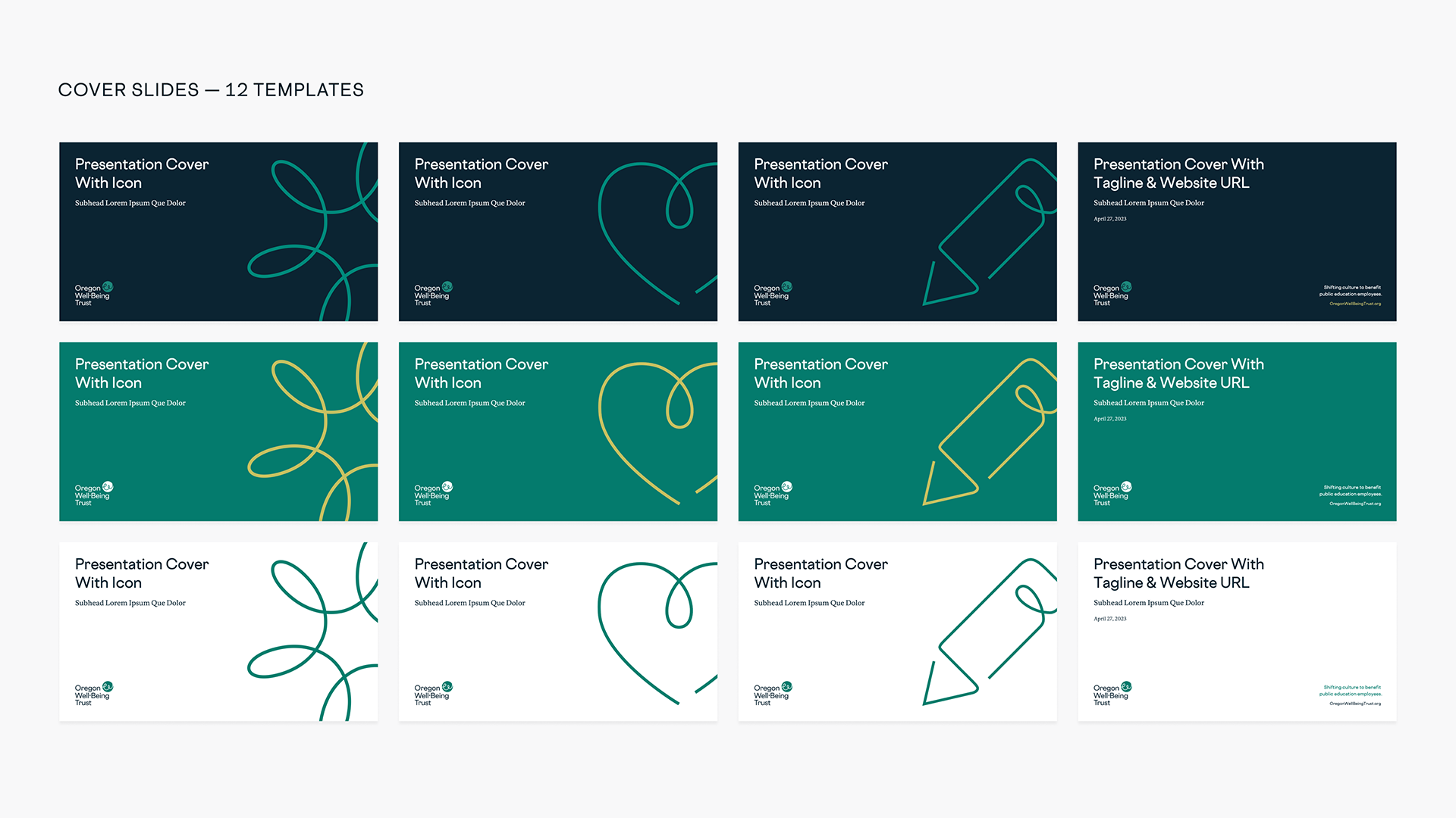
The team can use different icons and colorways to create multiple variations of the presentation cover.
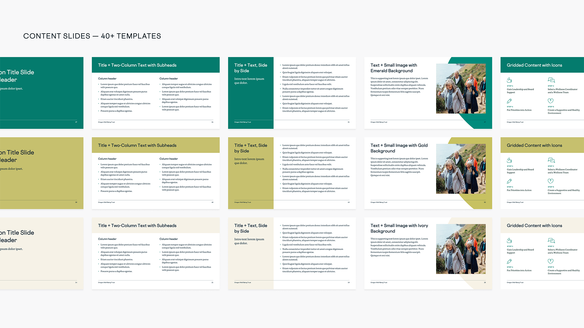
The extensive suite of more than 50 templates provide the team with plenty of options.
We hired the team at Smith & Connors to help us at a pivotal moment of growth and evolution. They were thoughtful, strategic partners at every step who walked multiple stakeholder groups through complex change. It was a delight to work with them. Our new name and brand feel like a natural and exciting reflection of our work. Our story and the immense value Oregon Well-Being Trust brings our communities are now told in a credible, beautiful, and authentic way.

Lauren Booth
Executive Director of Oregon Well-Being Trust
Project Scope
-
Brand Identity -
Marketing & Communications -
Transformation & Alignment


Next Up: Meyer Latiné Report
Meyer Latiné Report


© Smith & Connors LLC