

Meyer Memorial Trust Brand
Amplifying impact through brand transformation
Meyer Memorial Trust is Oregon’s leading philanthropic voice for equity and social justice.
In 1978, Fred Meyer, an entrepreneur that started out with a coffee cart and grew into a chain of supermarts in his own name, died and left substantial shares of his company to establish a trust with few mandates: “Realizing as I do the uncertainties of the future, I want my trustees to be able to exercise broad discretion in shaping and carrying out charitable programs which can be tailored to fit changing conditions and problems.” Meyer Memorial Trust was formed to support change across Oregon. During the early 2000’s, Meyer’s leadership began moving toward an equity and racial justice framework, taking a bold step forward to change philanthropy. Since the pandemic of 2020, Meyer has emboldened and sharpened its focus on justice. The new brand needed to reflect its powerful commitment to impact and community, a deep respect for Oregon’s interconnection, and an optimistic vision for collective well-being.
Awards & Recognition
Brand Design
Discovering voice through dialogue
A need for flexibility and customization
In the community foundation world, things move really quickly. They’re responsive organizations, after all. GCF needed to be able to build new pages that all feel part of the same system while being as easy to assemble as Lego blocks. That requires a deeply considered, and truly custom design system.
Experience principles
Purposeful and Positive
The website needs, always, to encourage the visitor to take the first step with optimism.
Clear and self-guided
Eventually, all engagements with GCF are relational, but visitors are looking to validate and decided to take the next step. That requires absolute clarity.
Polished and Approachable
GCF’s role as a trusted advisor requires that the site reveals the professionalism and warmth they radiate in person.
Energetic and Forward-Looking
Every design choice has to highlight GCF’s innovative side while also reflecting their stability.
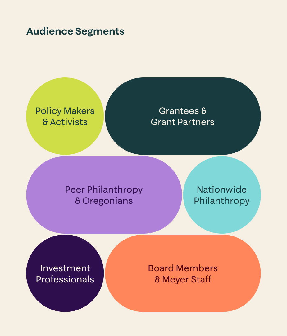
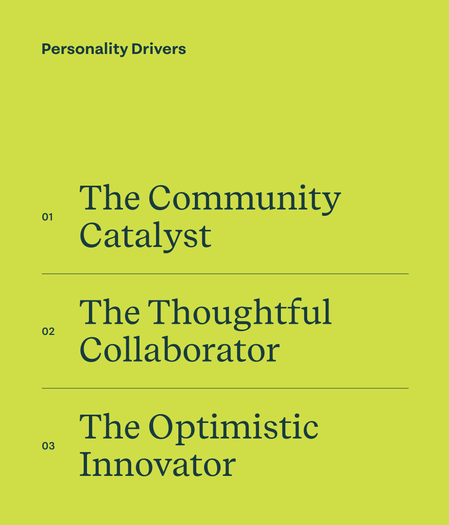
Through this process, we helped Meyer’s team align around new brand positioning, messaging, and visual identity for the first time in a decade.

Smith & Connors has been a trusted, strategic partner to Meyer for over a decade. They guided us in launching a new brand, website, and suite of materials that sharpen our story and strengthen our ability to achieve our goals. Their thoughtful approach and deep expertise consistently turn vision into tangible results.

Toya Fick
President & CEO Meyer Memorial Trust
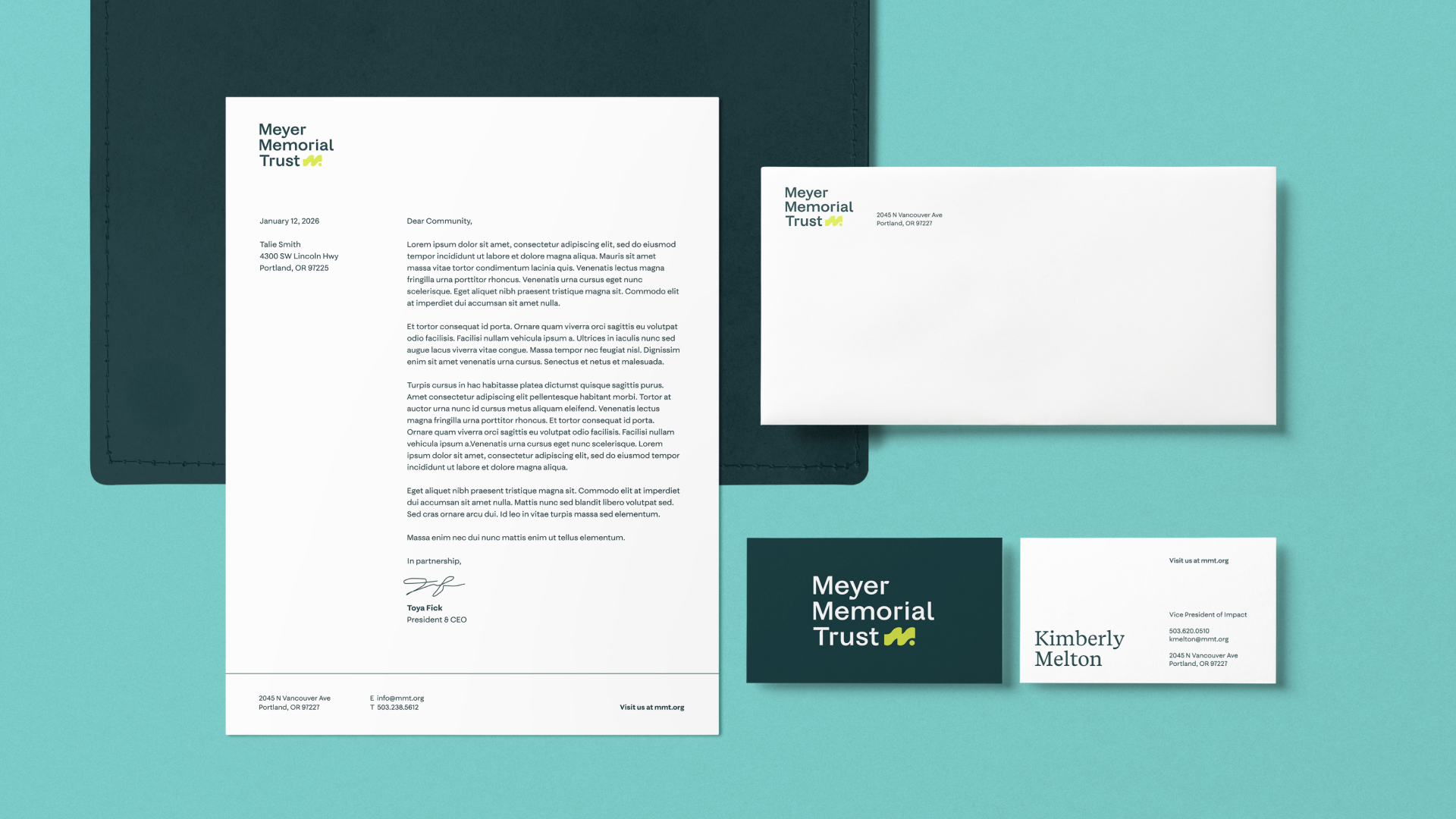
A living brand ecosystem
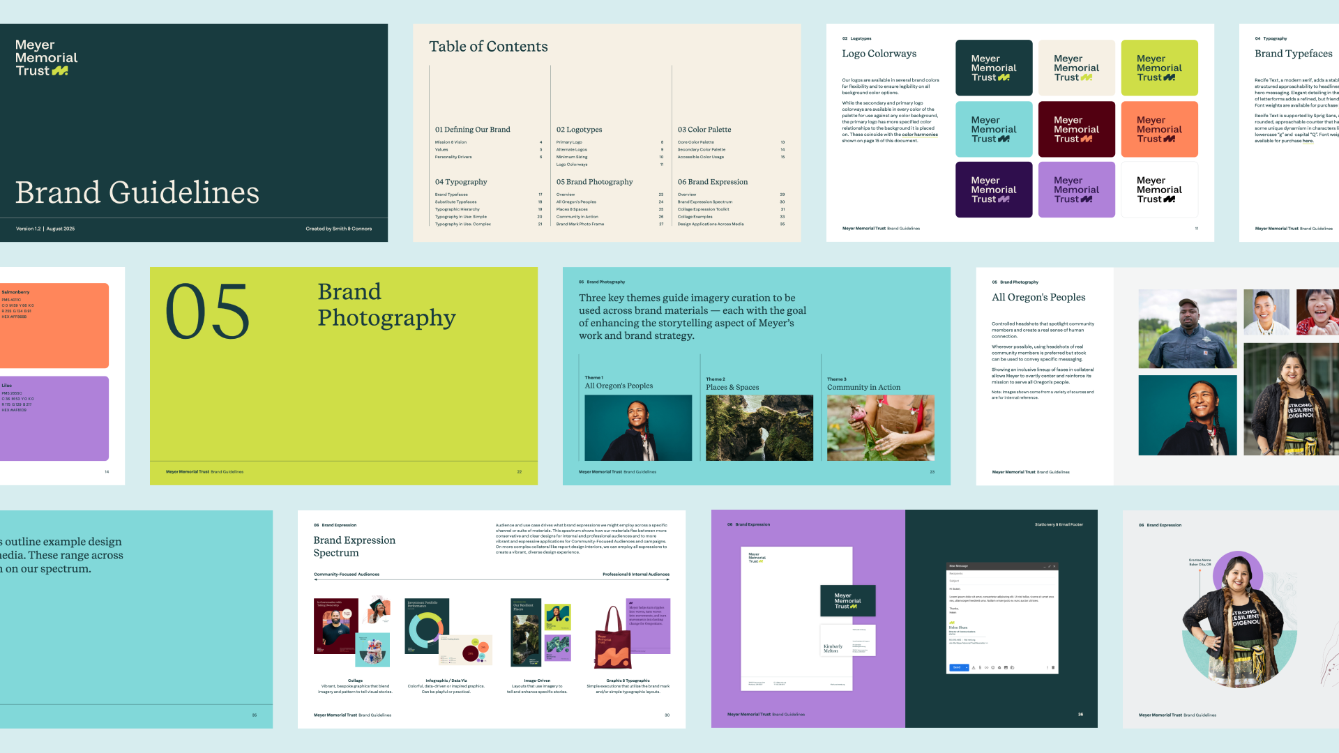
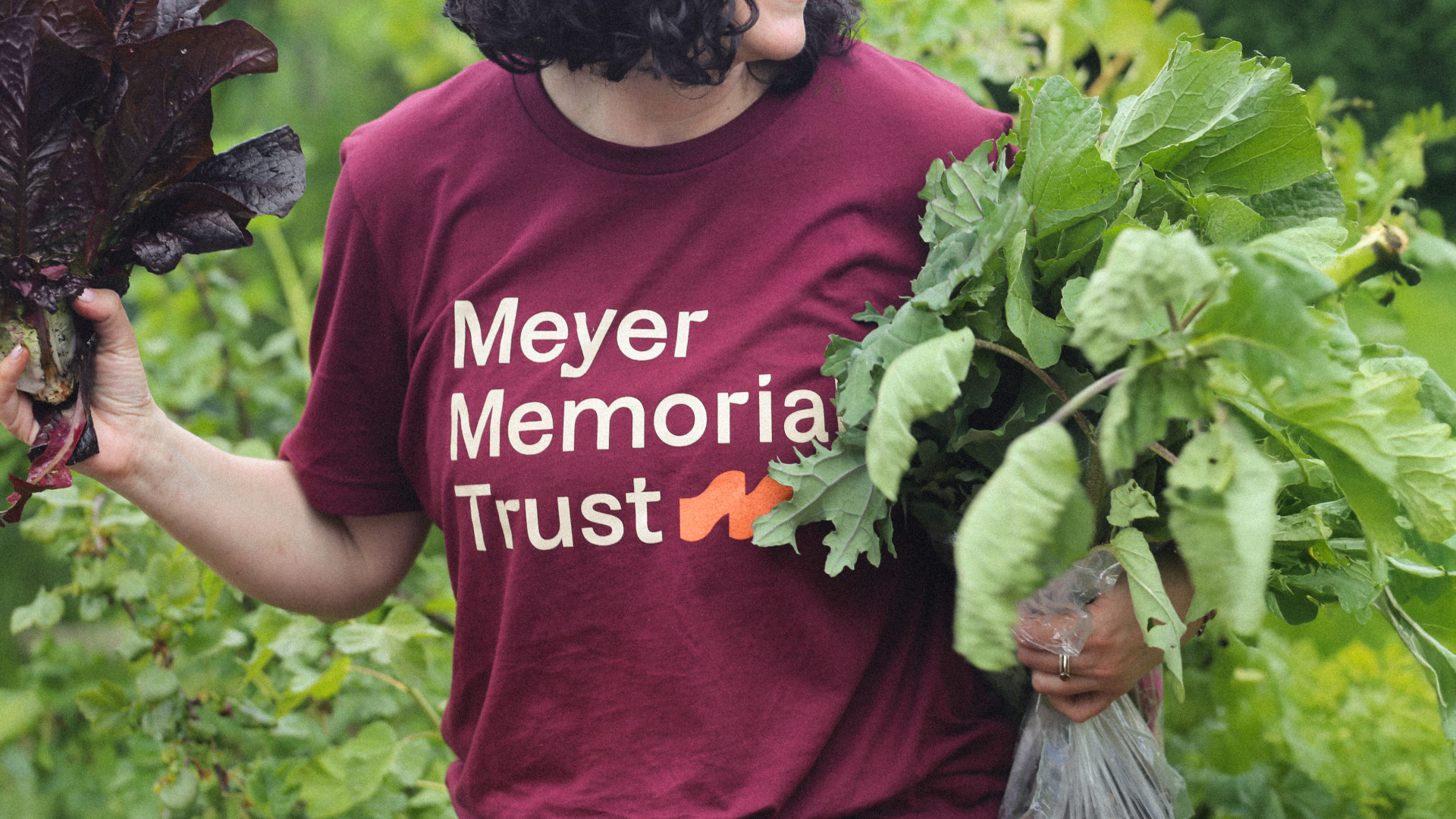
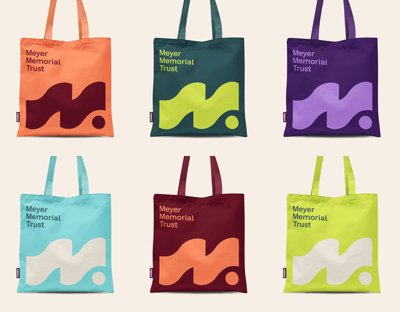
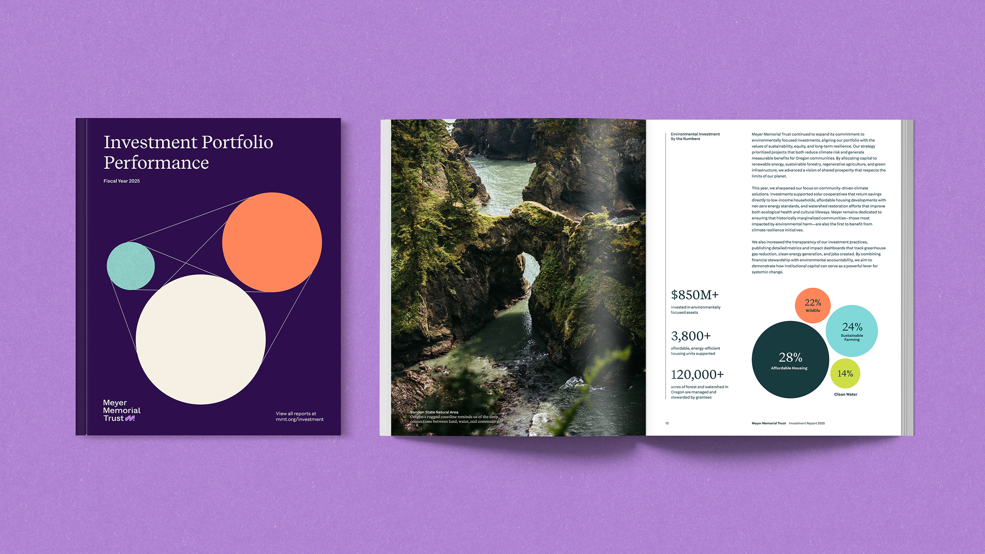
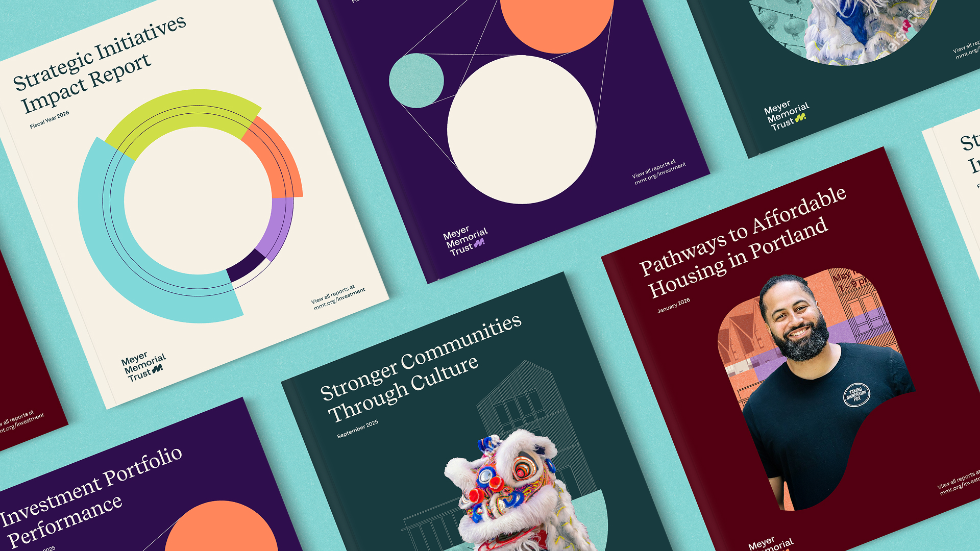
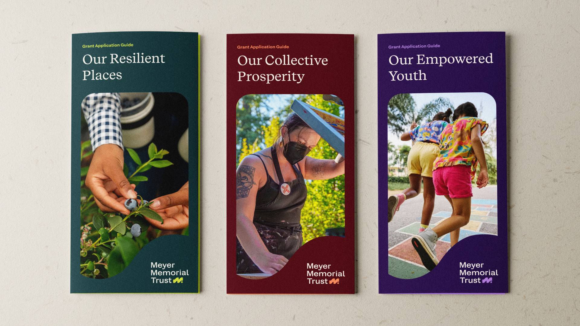
The new identity system celebrates Oregon’s natural diversity while embracing bold, contemporary expression. A vibrant color palette draws from the state’s landscapes, creating accessible combinations that work across digital and print applications.
The brand mark itself suggests movement and momentum: a dynamic form that evokes Oregon’s rivers, valleys, and forward progress.
Typography balances approachability with authority. Recife Text brings warmth to headlines while Sprig Sans ensures clarity in complex grant documentation. Together, they create a voice that’s both welcoming and credible.
Activating the brand
Comprehensive brand guidelines provide more than a visual rulebook: they are a strategic tool for organizational alignment. The brand system is flexible enough to grow, with a textural collage expression toolkit that allows for community-specific storytelling while maintaining cohesion. Photography guidelines ensure diverse representation. Color harmonies balance vibrancy with accessibility compliance. The result is a brand that can flex from corporate investment reports to grassroots community celebrations.
A new digital home
Meyer’s new modular WordPress website is where the brand really shines. We designed and built a flexible system for the site that allows the communications team to use a variety of content components that all work together without compromising visual or storytelling coherence. Wherever visitors land or explore, they consistently encounter the breadth of Meyer’s reach. Every interaction reinforces Meyer’s positioning as an accessible, forward-thinking partner in community transformation.
Smith & Connors is not only incredibly talented but also a true joy to work with. Their process is fantastic: they help us navigate different perspectives, offer smart recommendations and solve problems creatively. Most importantly, they always deliver. We trust them. We love them. We wholeheartedly recommend them.

Helen Shum
Director of Communications Meyer Memorial Trust
Project Scope
-
Brand Identity -
Websites & Digital -
Marketing & Communications -
Transformation & Alignment

Next Up: Lawrence Berkeley National Laboratory
Lawrence Berkeley National Laboratory


© Smith & Connors LLC