CoEnergy Propane
Reintroducing a local coop-owned energy provider
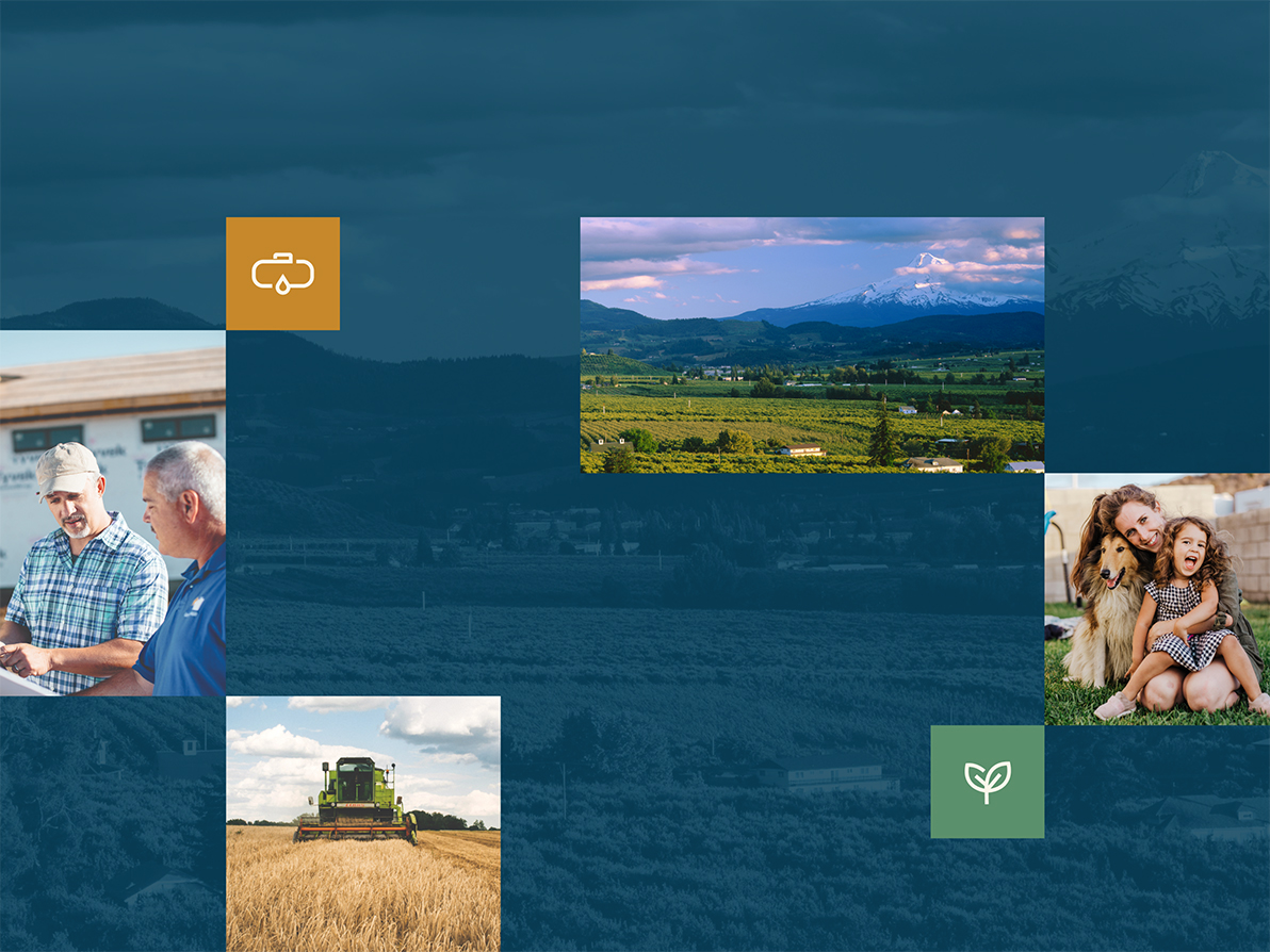
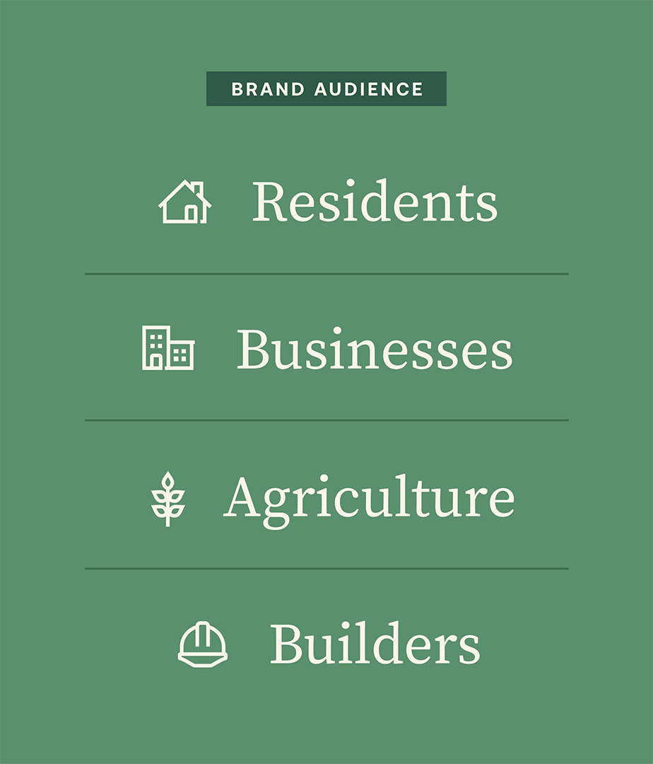
CoEnergy Propane is owned by two cooperative businesses that serve 60,000 people in Oregon. Their customers — almost all rural — often have no access to natural gas to heat their homes.
For these communities, propane is one of their only sources for energy. Their choice is between the big national brands and local businesses. CoEnergy Propane is a locally-owned business that invests in the region in ways that their national competitors don’t. We had the opportunity of repositioning the company and launching a new brand, marketing, and website to tell the rich story of CoEnergy Propane’s 20 years of serving their community.
A New Look
Communicating values
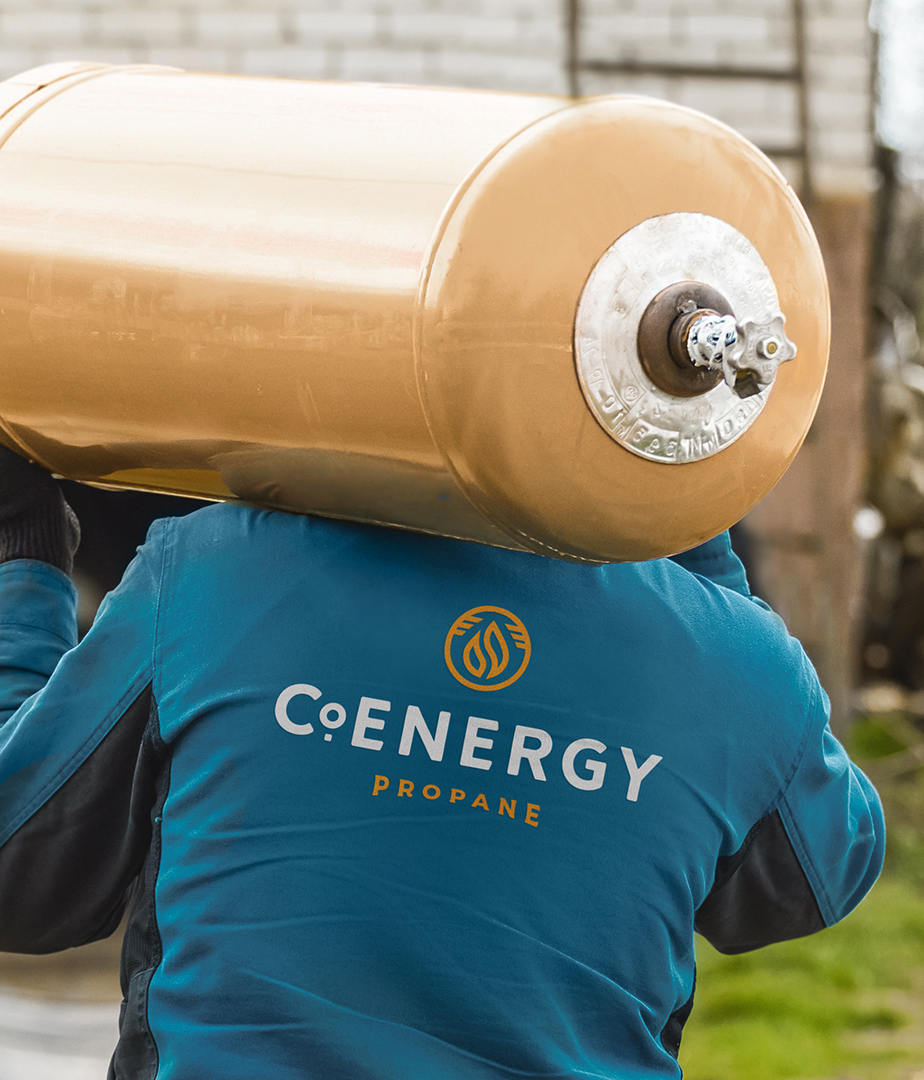
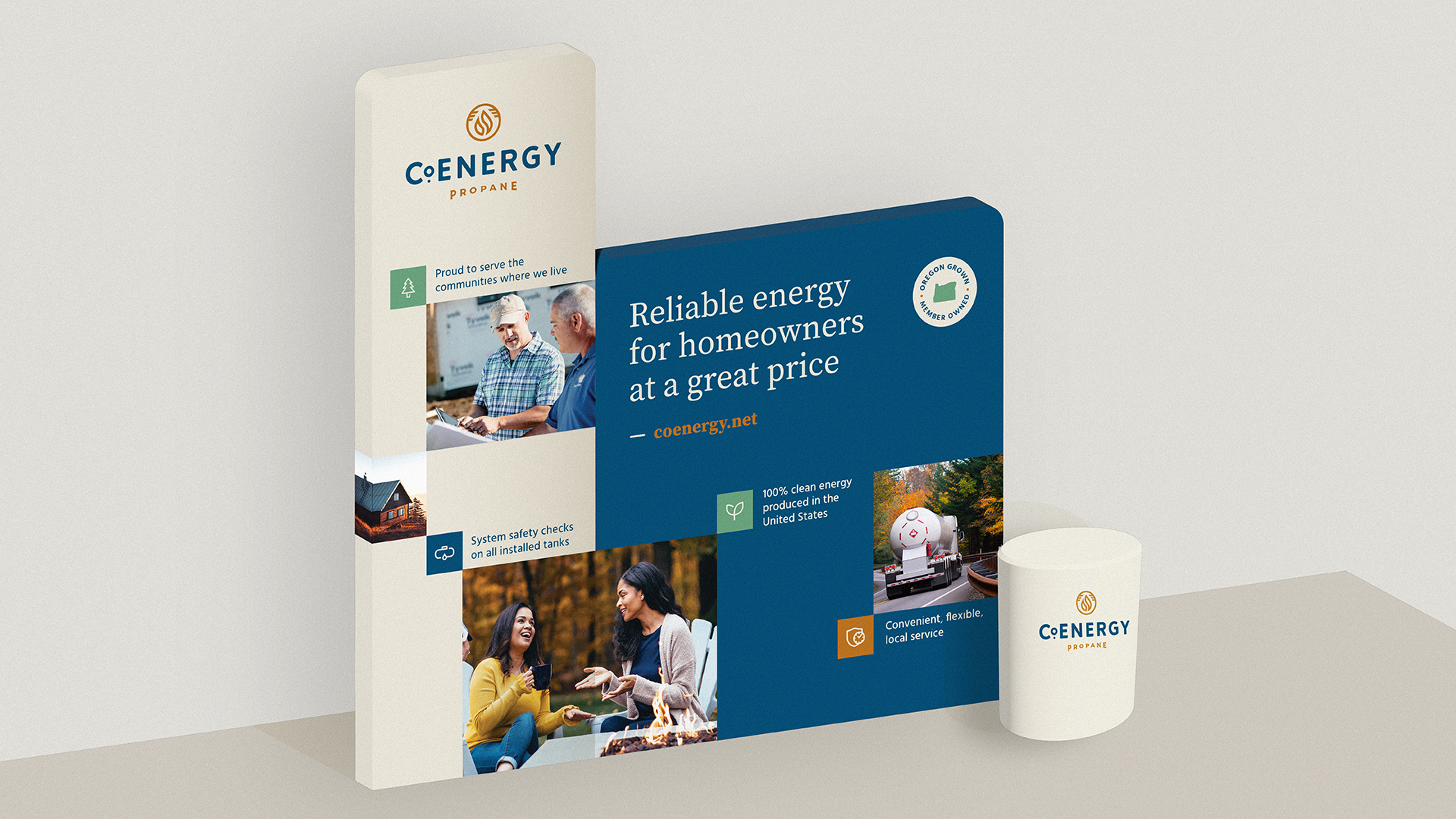
A key aim of the rebrand was to create a clearer link to CoEnergy’s mission and dedication to community: to create warmth and energy in homes and businesses, and to support growth and vitality of the region. The logotype emphasizes the “co,” as in co-op, and has curves and rounded edges to add warmth. The flames are hugged by a set of lines that evoke the sense of energy and expansion. And the overall mark design feels like a stamp, indicating a longstanding business.
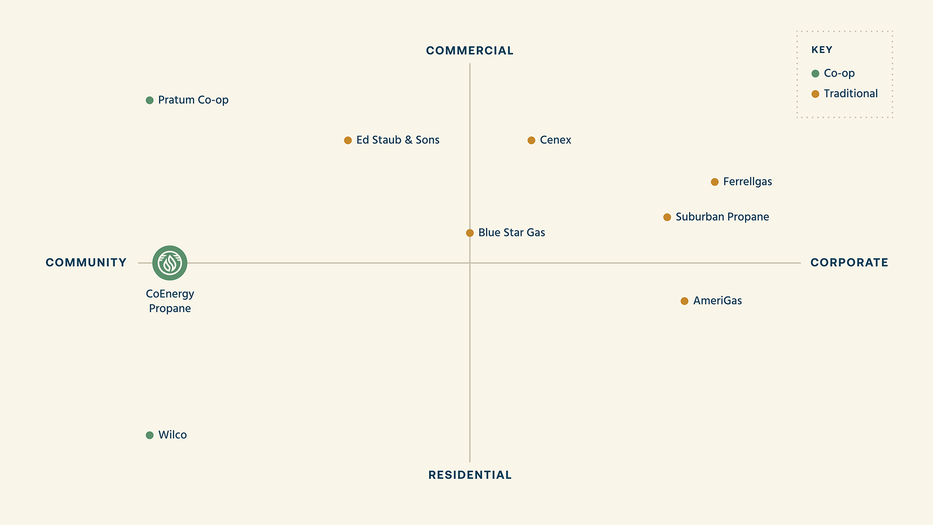
In a crowded field and selling a commoditized product, we needed to develop a strong brand that differentiated CoEnergy.
Many applications
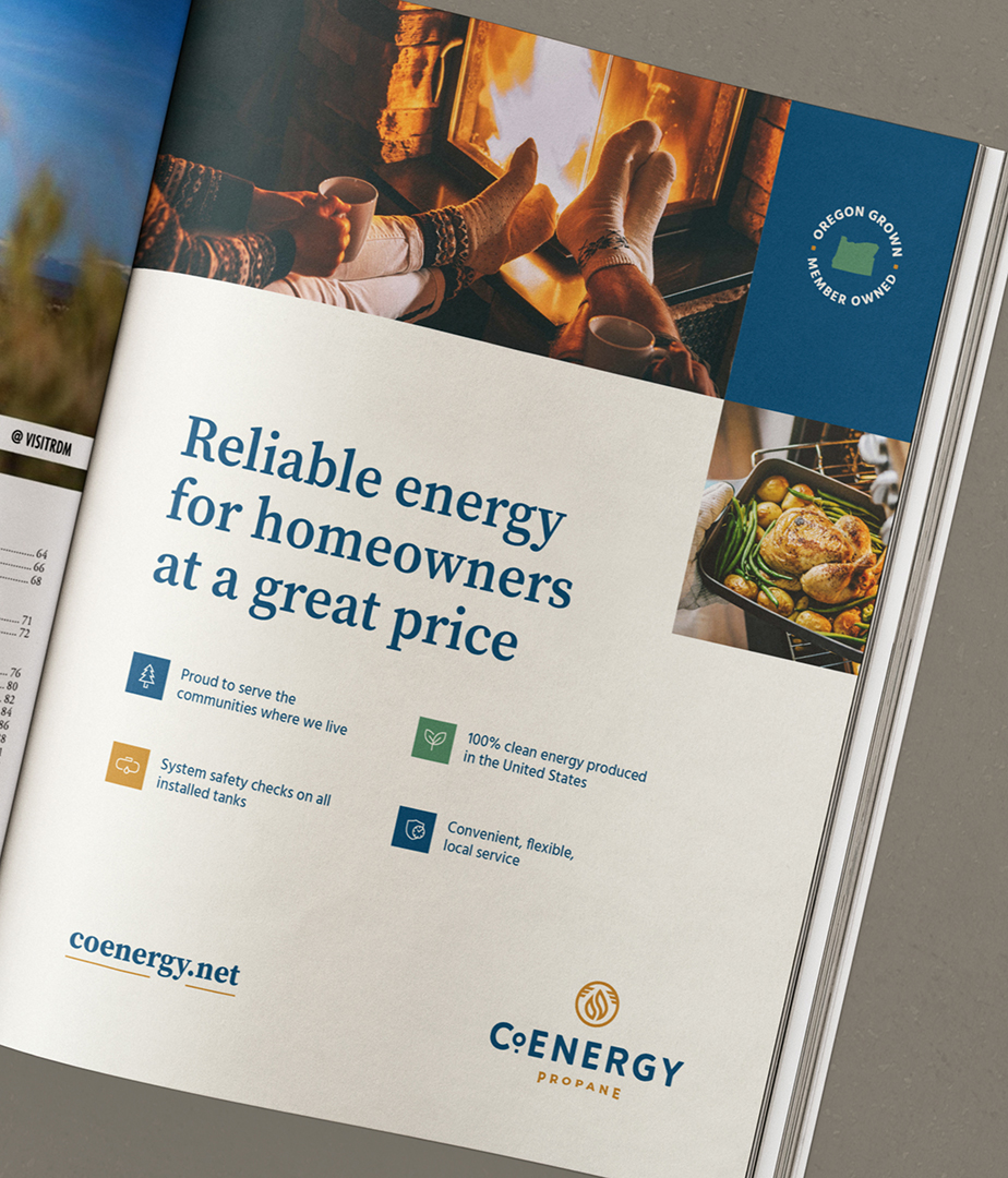
The CoEnergy brand rollout was a complex and coordinated effort across a multitude of print and digital media. They needed help applying the new logo on everything from trucks, tank decals, signage, and much more. We helped by designing and working with printers to deliver what they needed.


Digital communications made easy
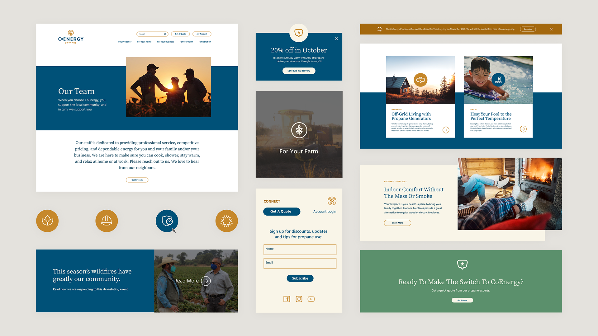
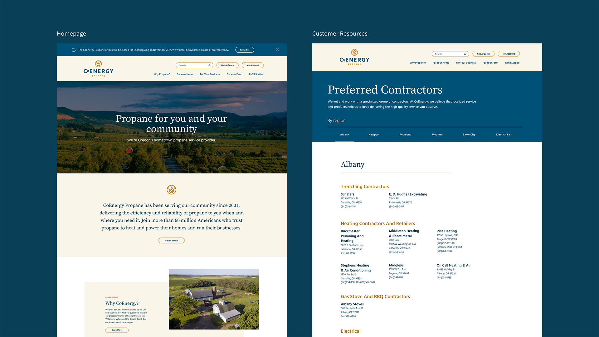
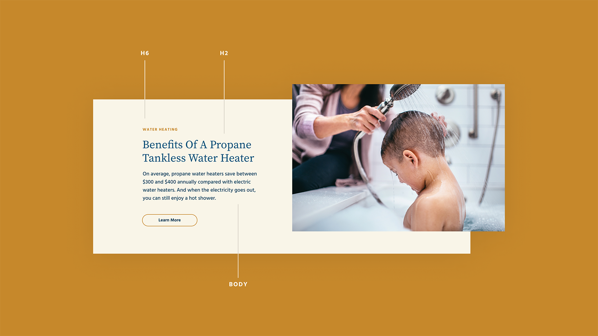
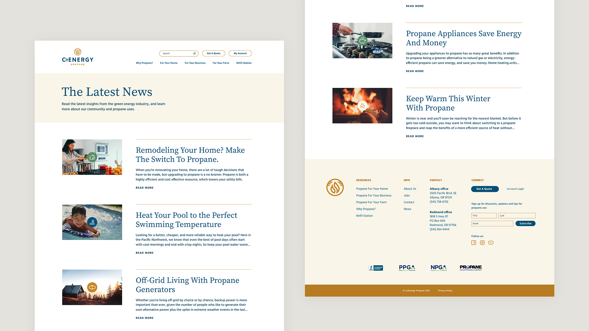
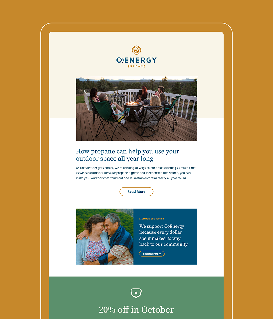
CoEnergy’s existing website was difficult to navigate. The content was out of date, and keeping it up to date meant a painful experience for their communications team of one. We created a new WordPress site that can expand with them as they grow. We also developed a MailChimp newsletter template that lets them stay in close touch with their customer base.
New brand assets
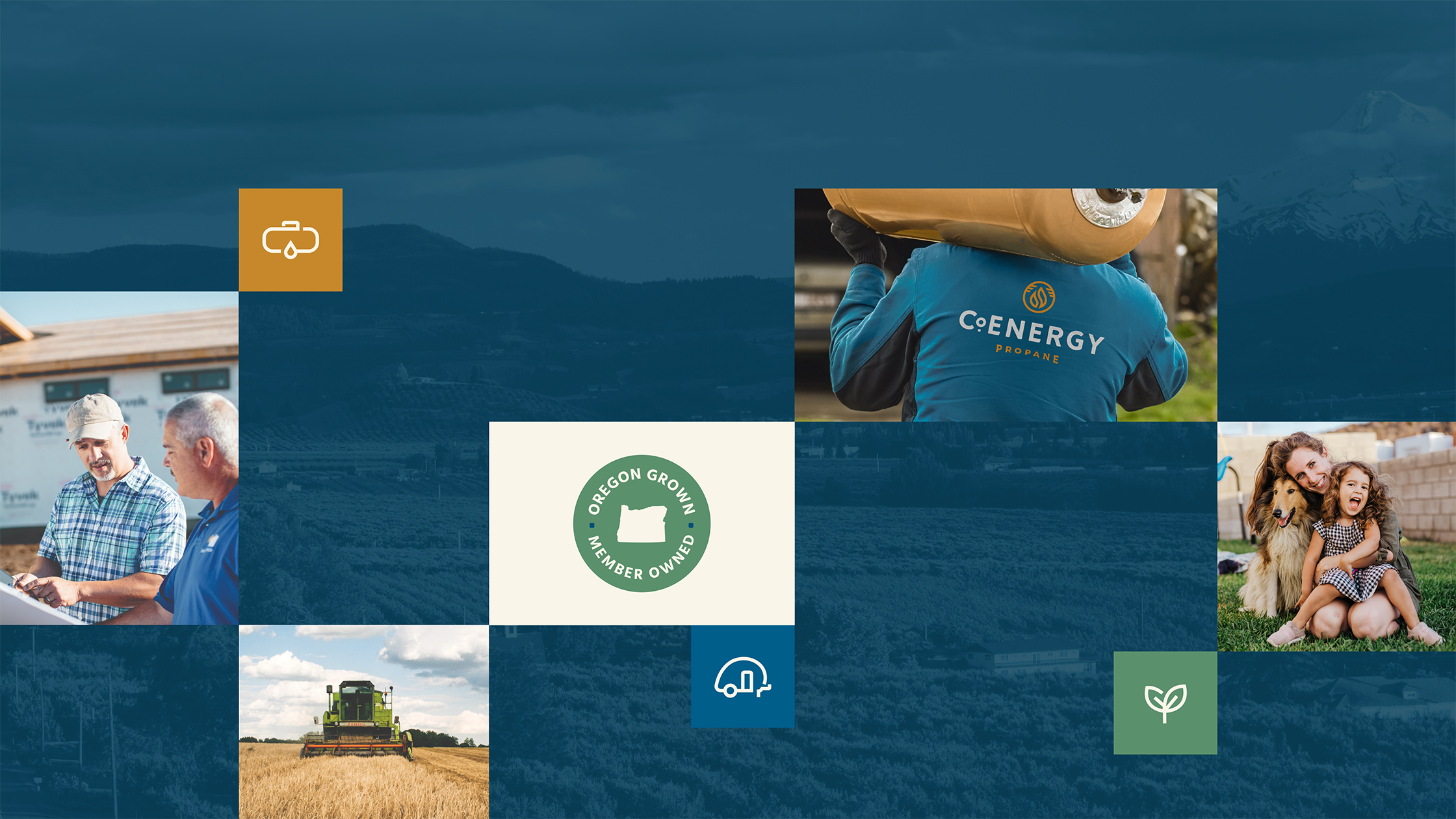
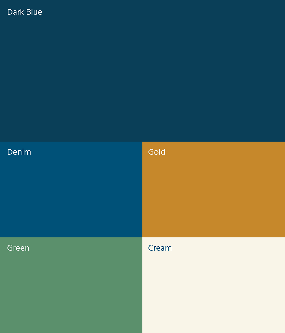
We developed a full brand system that included new iconography and standards for photography. Finding photography that expresses both individual services and the right brands attributes is never simple — especially for a commodity as specific as propane — so we collected a library of quality stock photography that told their story, and created guidelines to help CoEnergy grow that library over time. We also provided creative direction and storyboarding to bring the new brand to life in video.
I was looking to create a new look and voice that told a better story of purpose and offerings to our community. Smith & Connors really listened to us, deeply understood our customers, and guided us toward a powerful new brand position, visual identity, a new website, and marketing tools. Our image finally reflects our company’s unique approach and mission.

Bryan Adams
President, CoEnergy Propane
Project Scope
-
Brand Identity -
Websites & Digital -
Marketing & Communications -
Transformation & Alignment


Next Up: Neighborhood Health Center
Neighborhood Health Center


© Smith & Connors LLC