Black United Fund of Oregon
Setting up a legacy organization for a new era
Sector
Services
Black United Fund of Oregon is the oldest Black-led nonprofit in Oregon, operating out of an iconic building in North Portland, helping community members achieve their dreams.
During a leadership transition, BUF-OR sought help facilitating board, leadership, and staff meetings to clarify fundamental aspects of their next chapter. They were looking for help with alignment, defining their value and differentiation in the community, and to build a strong brand strategy and visual identity that maintained a connection to their history while signaling to their audiences that they’re entering a new phase of service.
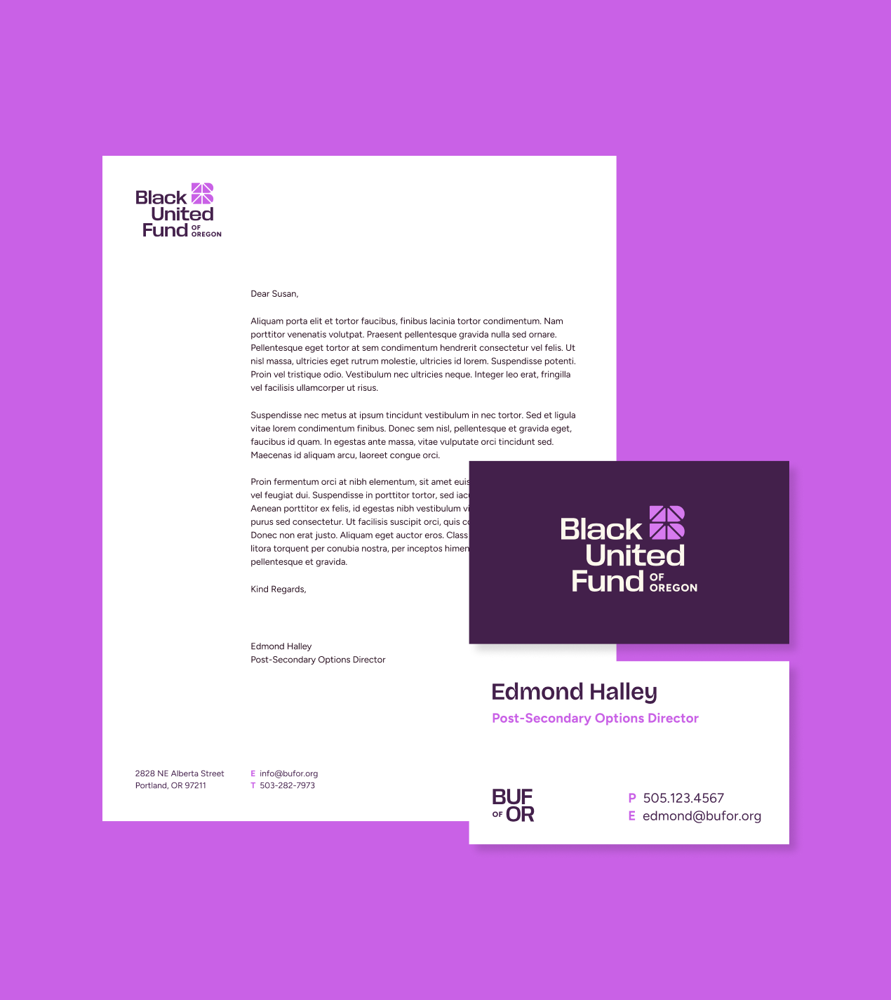
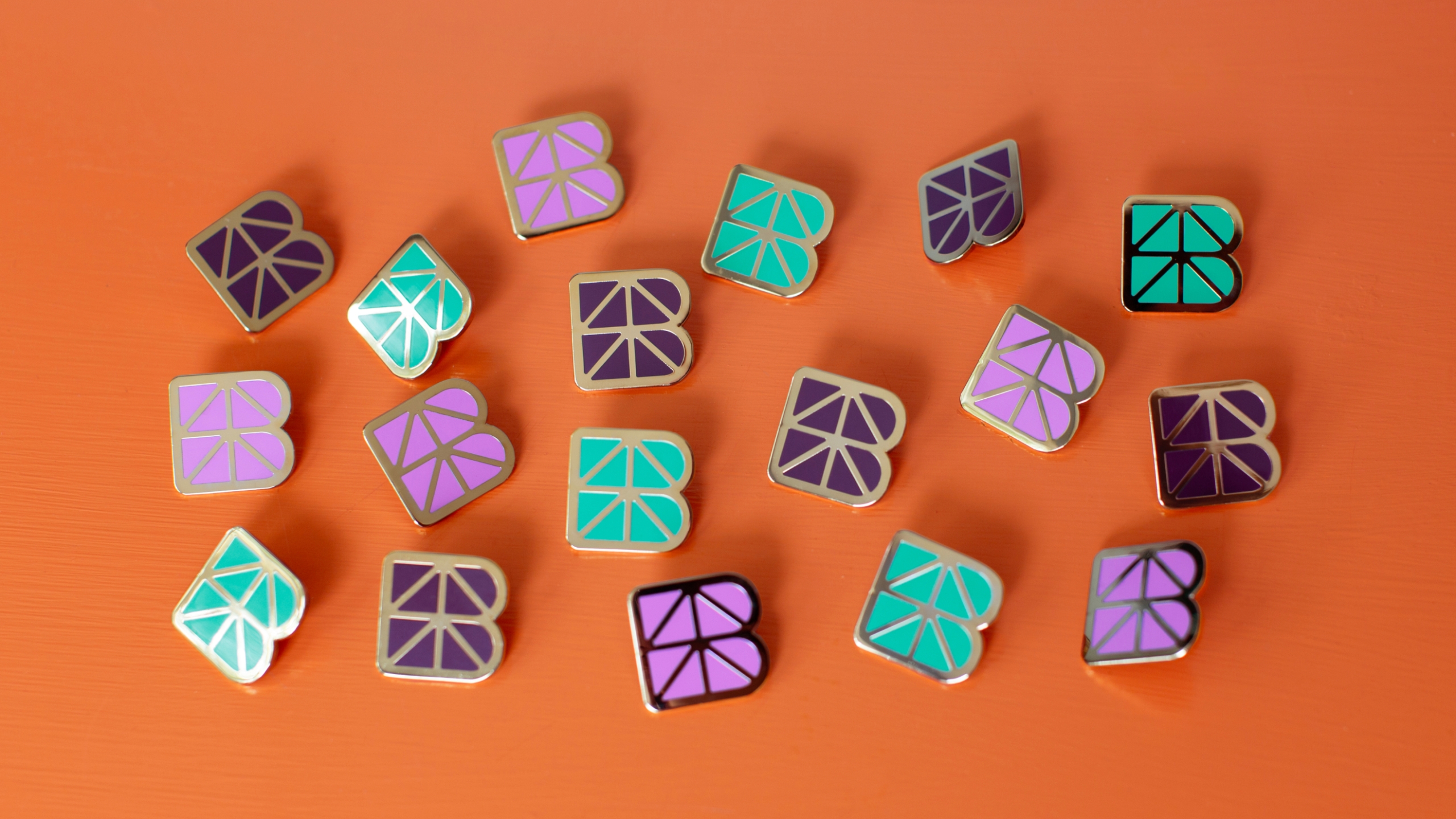
The new logomark honors their role as a connector with multiple elements bound together in forms reminiscent of a bridge — a direct nod to their core purpose bridging ambition and access. Upward angles represent growth and progress.
Transformation & Alignment
Surfacing the wisdom in the room
BUF-OR’s voice, which is inclusive, unified, clear, and backed with action and storytelling, has the power to inspire and build trust in their track record of unwavering stewardship and dedication to people. We focused our facilitation work with their team on getting them to talk about how they serve their audiences, including their staff and the greater community.
Our work with BUF-OR came in three phases: first, a consultative phase where we worked with leadership to build alignment, then a brand strategy phase that included core messaging, and finally the visual design and expression.
Our work with BUF-OR came in three phases: first, a consultative phase where we worked with leadership to build alignment, then a brand strategy phase that included core messaging, and finally the visual design and expression.
Our work with BUF-OR came in three phases: first, a consultative phase where we worked with leadership to build alignment, then a brand strategy phase that included core messaging, and finally the visual design and expression.
A Strong Brand Strategy
Everything starts at the foundations
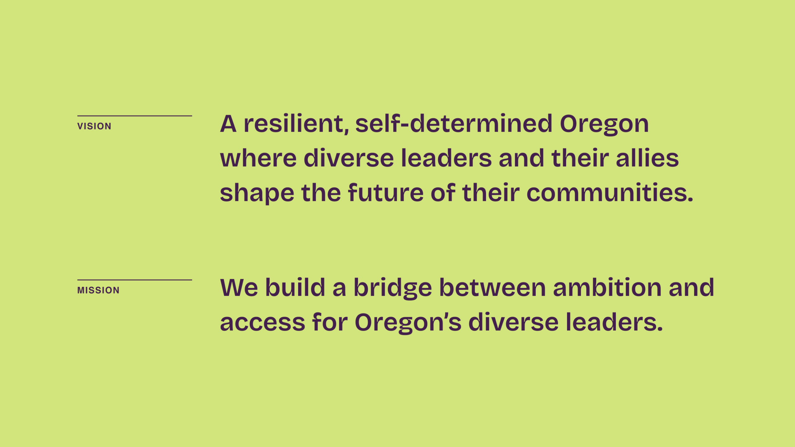
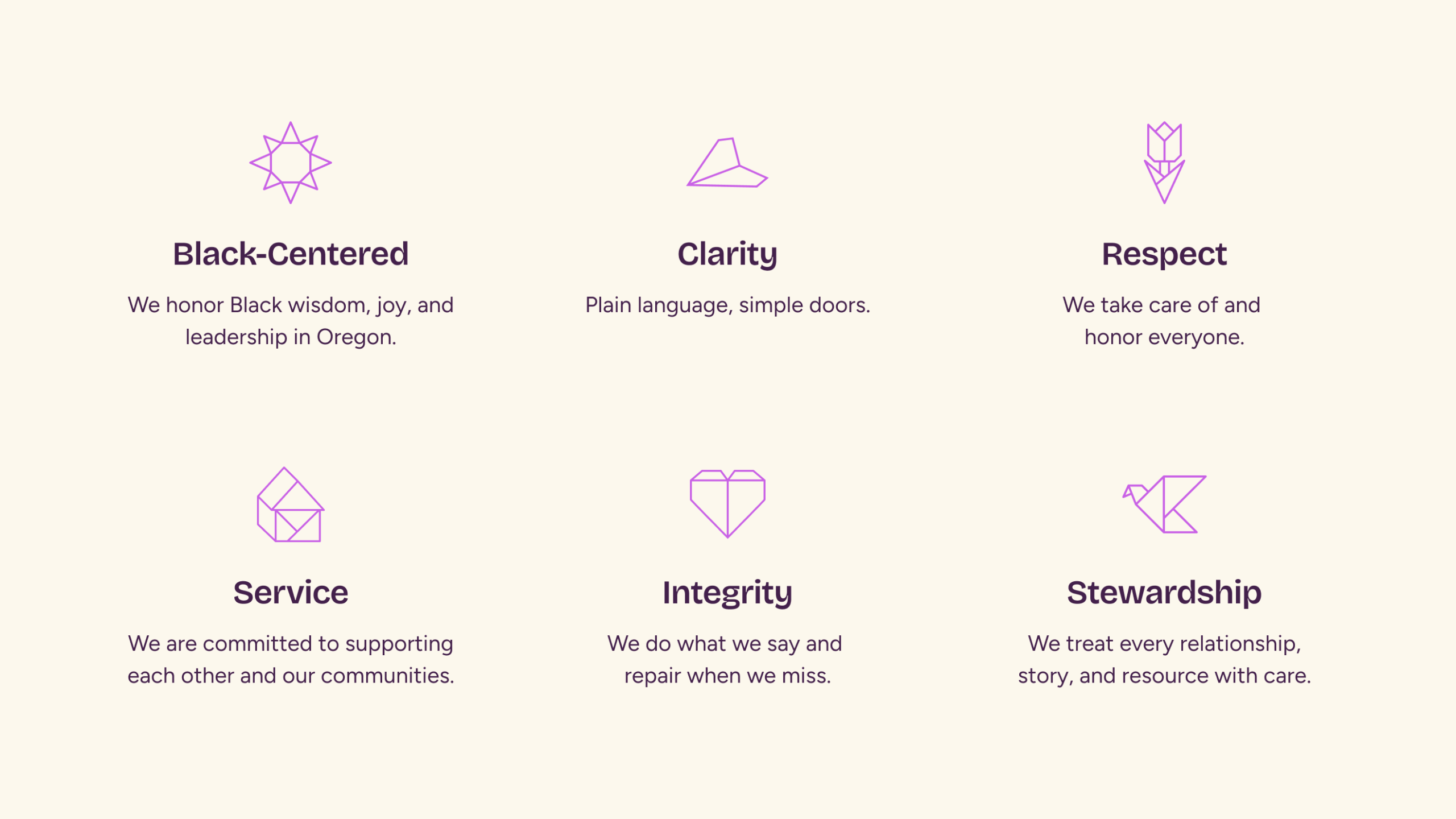
We facilitated conversations about who they really are as an organization, and where they were falling short in communicating those principles. We started with a new articulation of their mission, vision, and values and built up from there with the goal of establishing their new position as a proactive advocate for its community members. We helped the leadership visualize where they stood among their nonprofit peers and what space they could occupy with confidence.
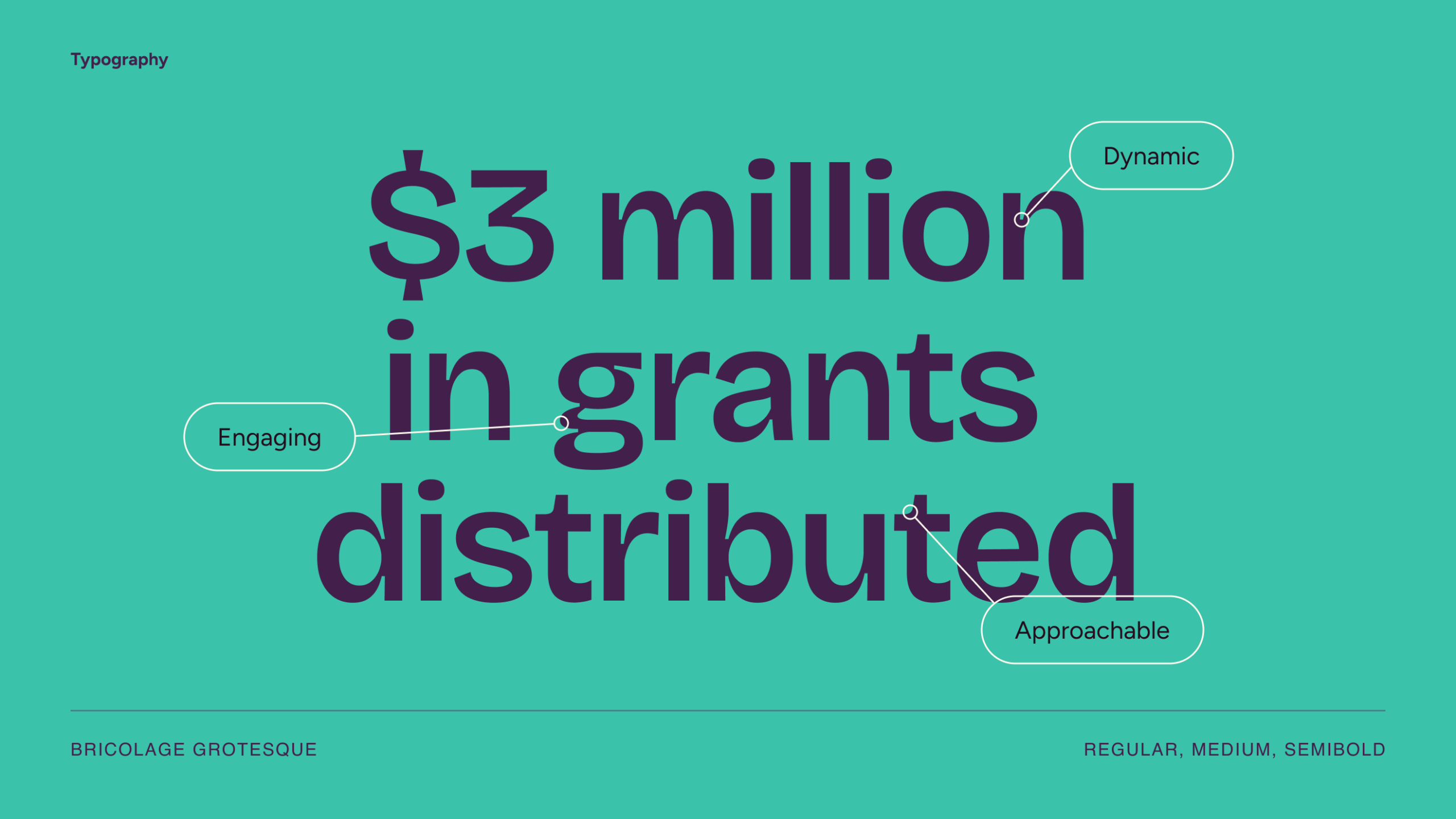
Their typeface choices are dynamic and conversational, adding personality and intentionality to the brand expression.
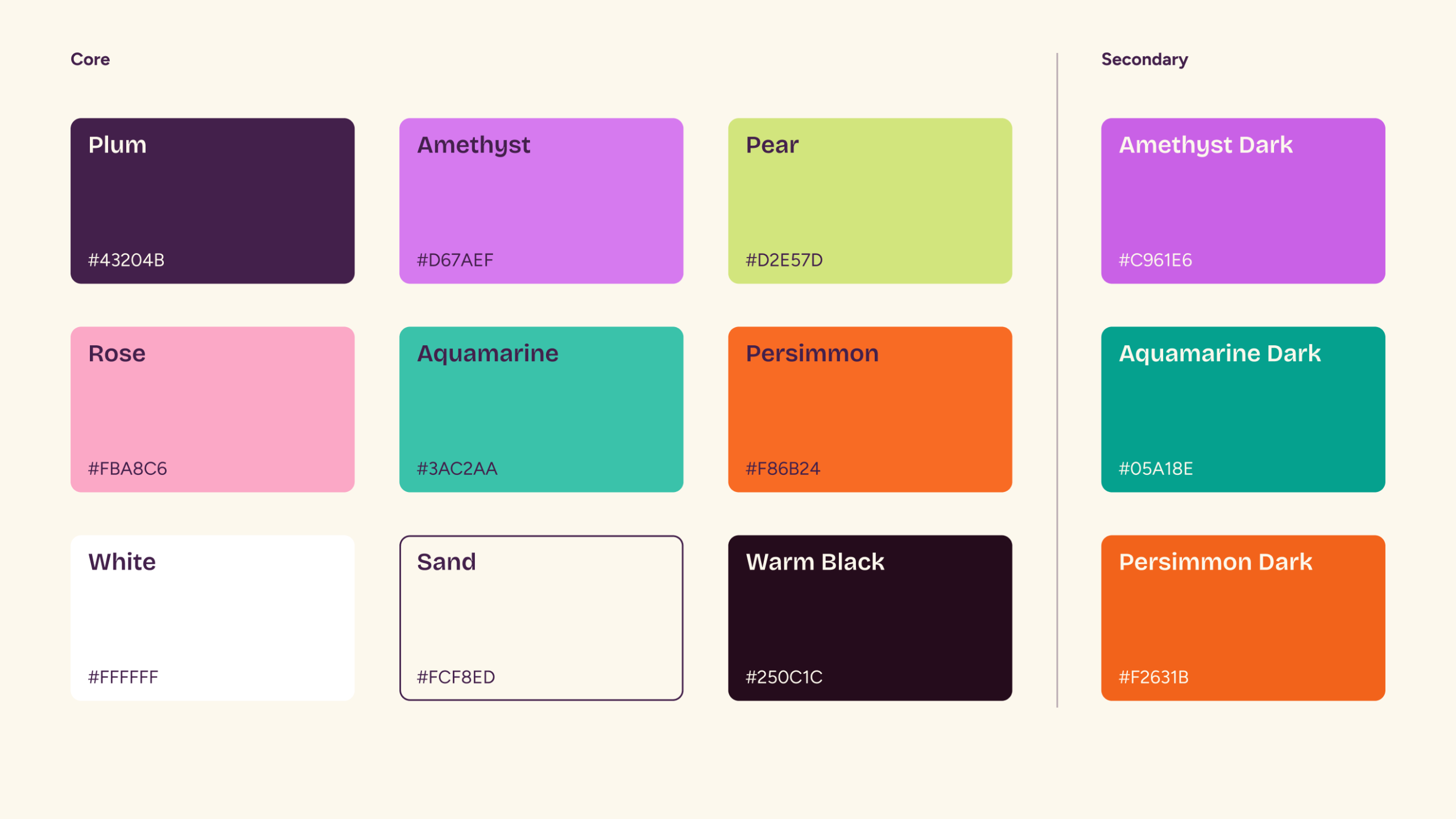
BUF-OR’s new brand colors are joyful, vibrant, sophisticated, grounded, and eminently usable: They allow for visual contrast and legibility in designs.
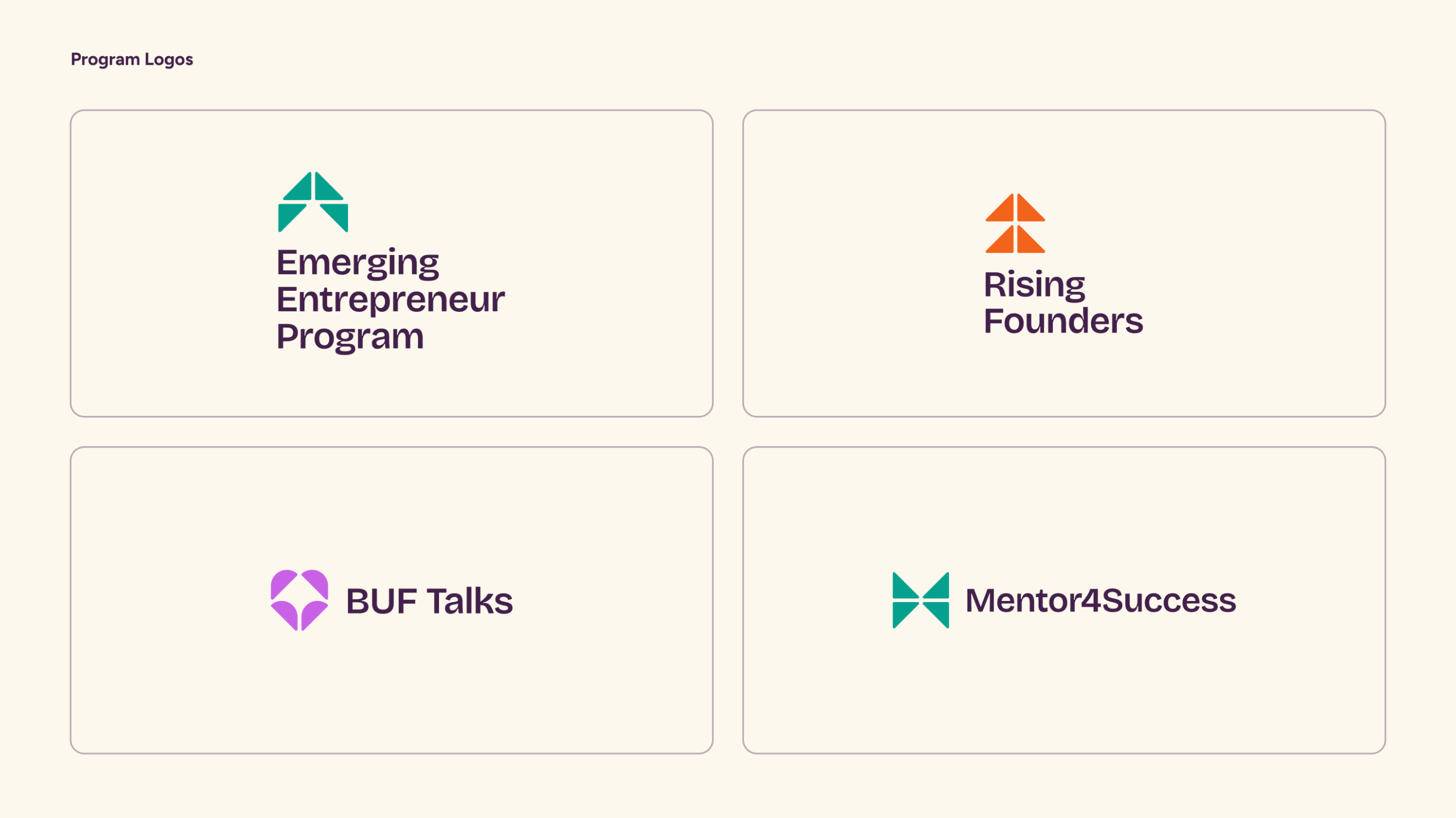
The organization’s initiatives got a visual refresh as well. They are distinct while also maintaining strong familial resemblance.
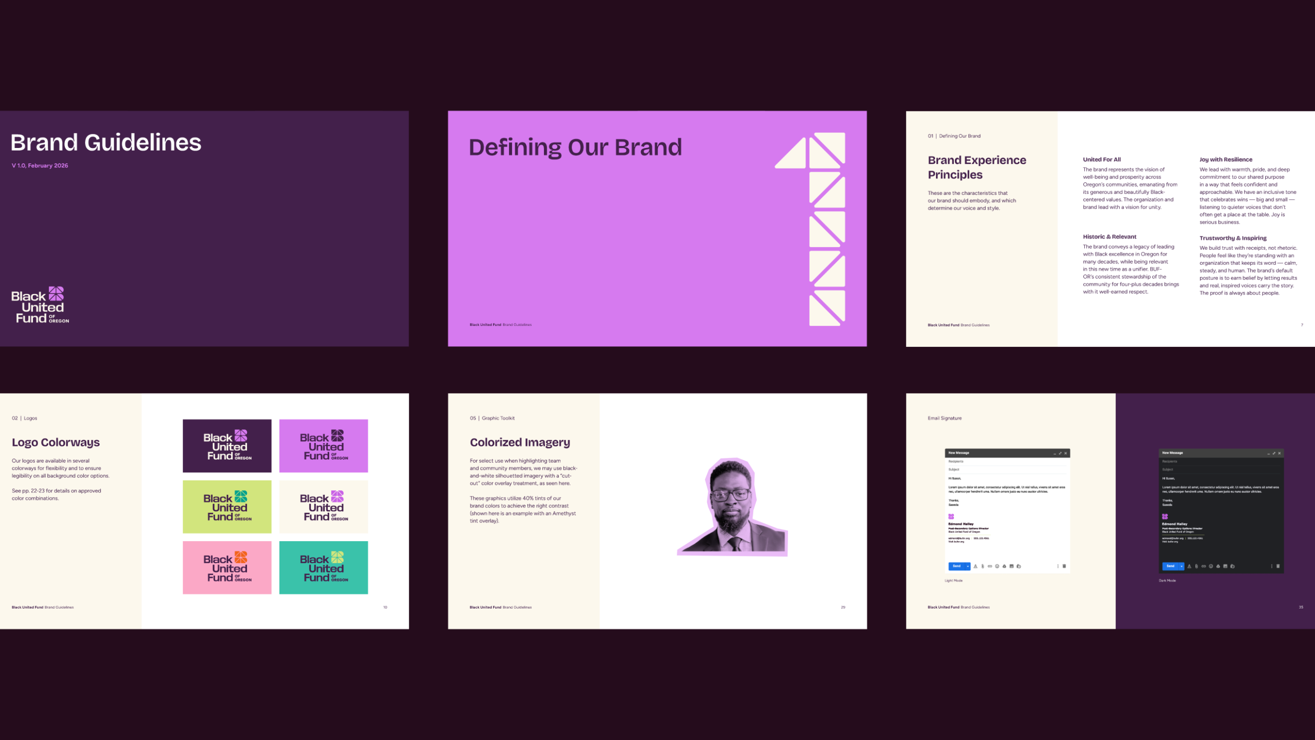
When we see everything come together, as in these slide deck layouts, the effect is dynamic, bold, and entirely branded.
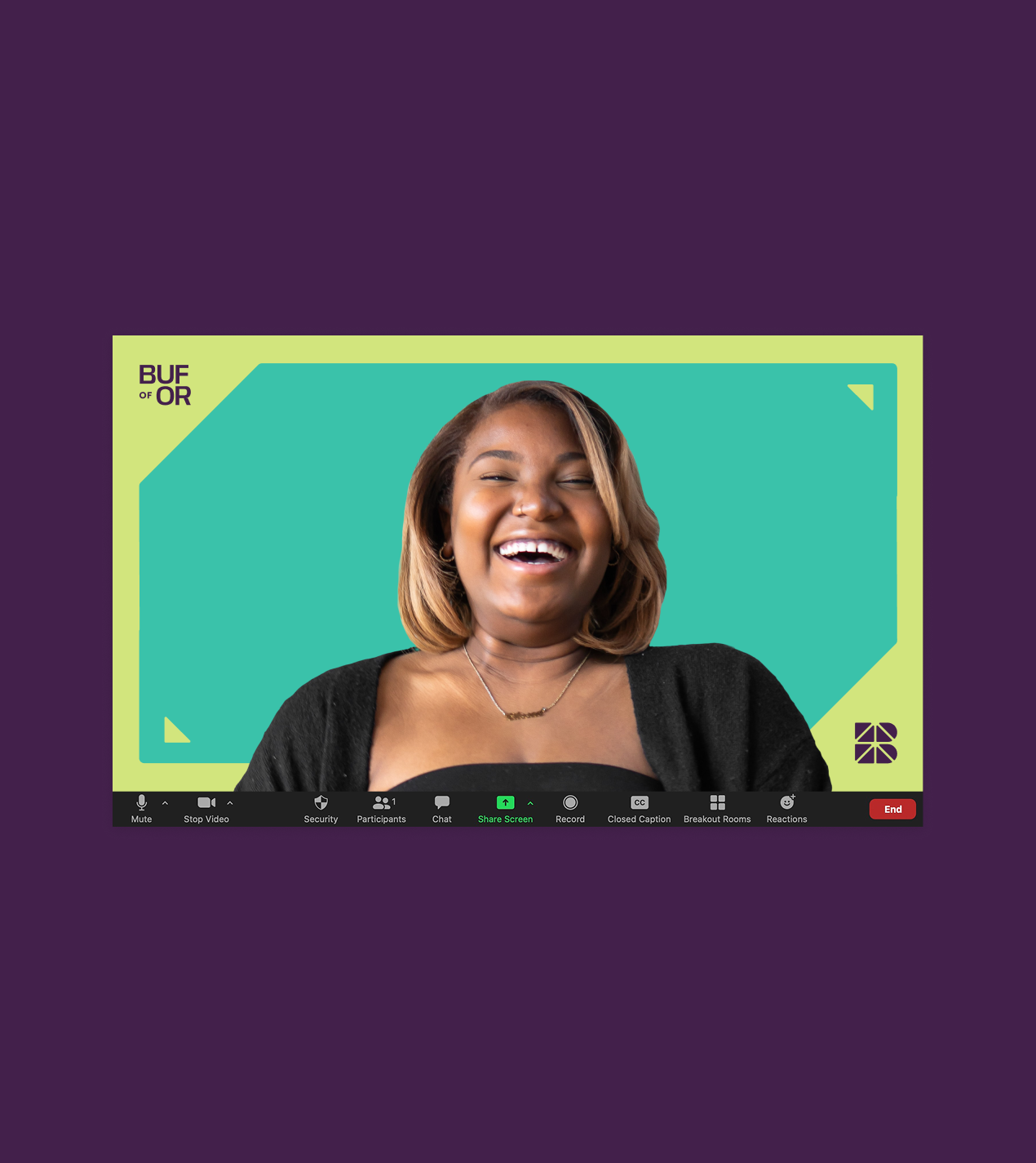
Our photography guidelines allow BUF-OR’s vision of joy, belonging, and self-determination for Black Oregon to come through. We designed simple visual framing elements inspired by the logomark that are easy for non-designers to use.
For contexts where BUF-OR wants more expressiveness and dynamism, we designed a custom suite of background patterns/graphics using the logomark shapes that build on the “bridge”/“connector” concept.
A Bold Vibrant Expression
Rooted in legacy with a new energy
We designed and built a robust new brand identity platform with careful consideration of honoring their important legacy, conducting a peer analysis of Oregon’s nonprofit and funding landscape, and capturing their unique voice and personality. We modernized their two core colors (purple and lime) and added a whole new secondary palette. The new vibrant system is designed so non-designers can apply it with relative ease. We used strategies and tactics like simple framing devices and clean layouts that give the brand a curated feel without making it complex to use.
Throughout the entire year of our engagement, we were greatly impressed with the depth of expertise they brought to our co-creative and client-centered work together. Our efforts resulted in identifying both strategies for refinements in mission and values and associated deliverables. They provided a comprehensive portfolio of information and materials to employ in the transformation of our services to the communities we serve. We are delighted with the attention paid to us and the energy and collegiality they brought to our collaboration.

Michael Alexander
Black United Fund of OR, Board Chair
Project Scope
-
Brand Identity -
Transformation & Alignment

Next Up: Meyer Memorial Trust Website
Meyer Memorial Trust Website


© Smith & Connors LLC