1803 Fund
Crafting community connection through branding
From the start, Rukaiyah Adams’ vision for 1803 Fund was place-making for Portland’s Black community through investment. Before launching the new organization she reached out to us.
Understanding that 1803 Fund’s mission-driven work required alignment both internally and with community. We conducted immersive “conclave” discovery sessions, built a targeted announcement website, created a brand strategy and visual identity, and equipped her team with comprehensive brand guidelines to unify their internal and external communications. Our collaborative approach positioned the 1803 Fund to clearly articulate their impact and foster trust across diverse stakeholders.
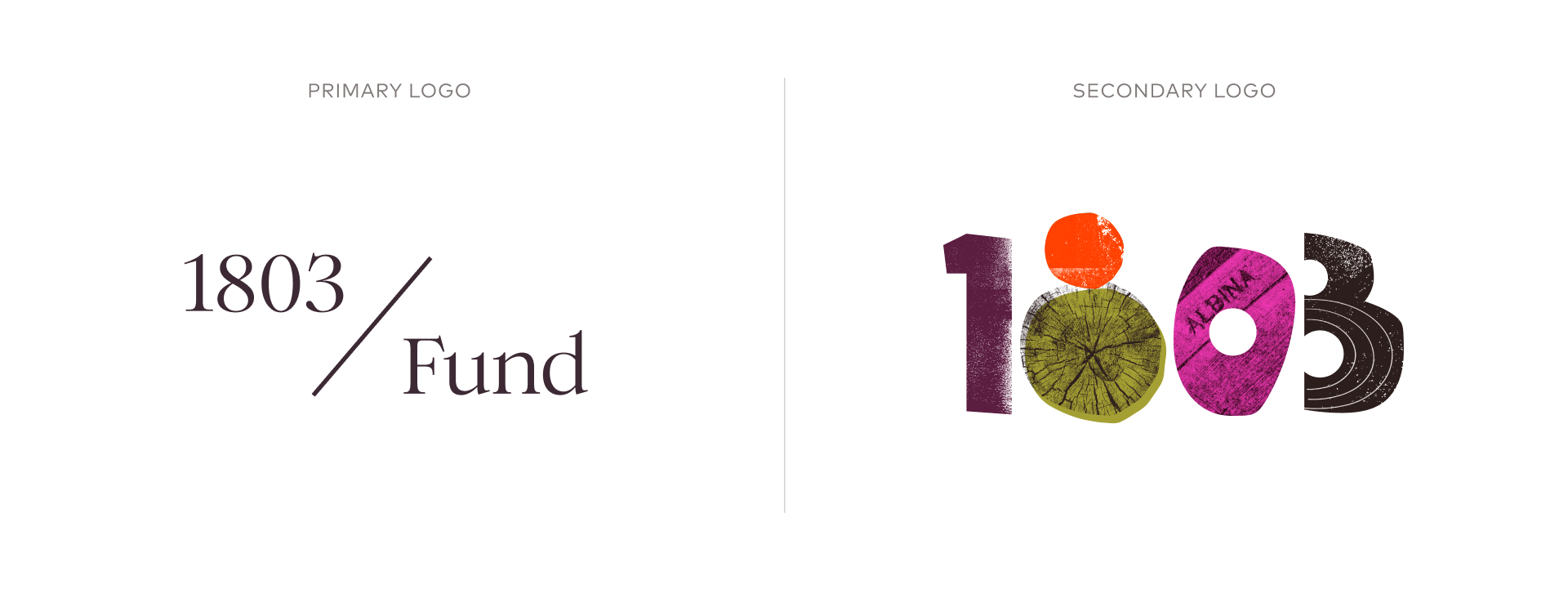
We designed two distinct logos to reflect 1803 Fund’s commitment to clarity, cohesion, and strategic alignment within their organizational culture and external community engagements.
Going deep to uncover the heart of 1803
To establish a strong foundation for meaningful communication, we had long conversations with Rukaiyah and D’Artagnan Caliman, the head of Philanthropy & Partnership. We listened and created a comprehensive brand strategy, creating a foundational layer that empowered the organization to authentically and effectively tell their story, ensuring resonance with their key audiences.
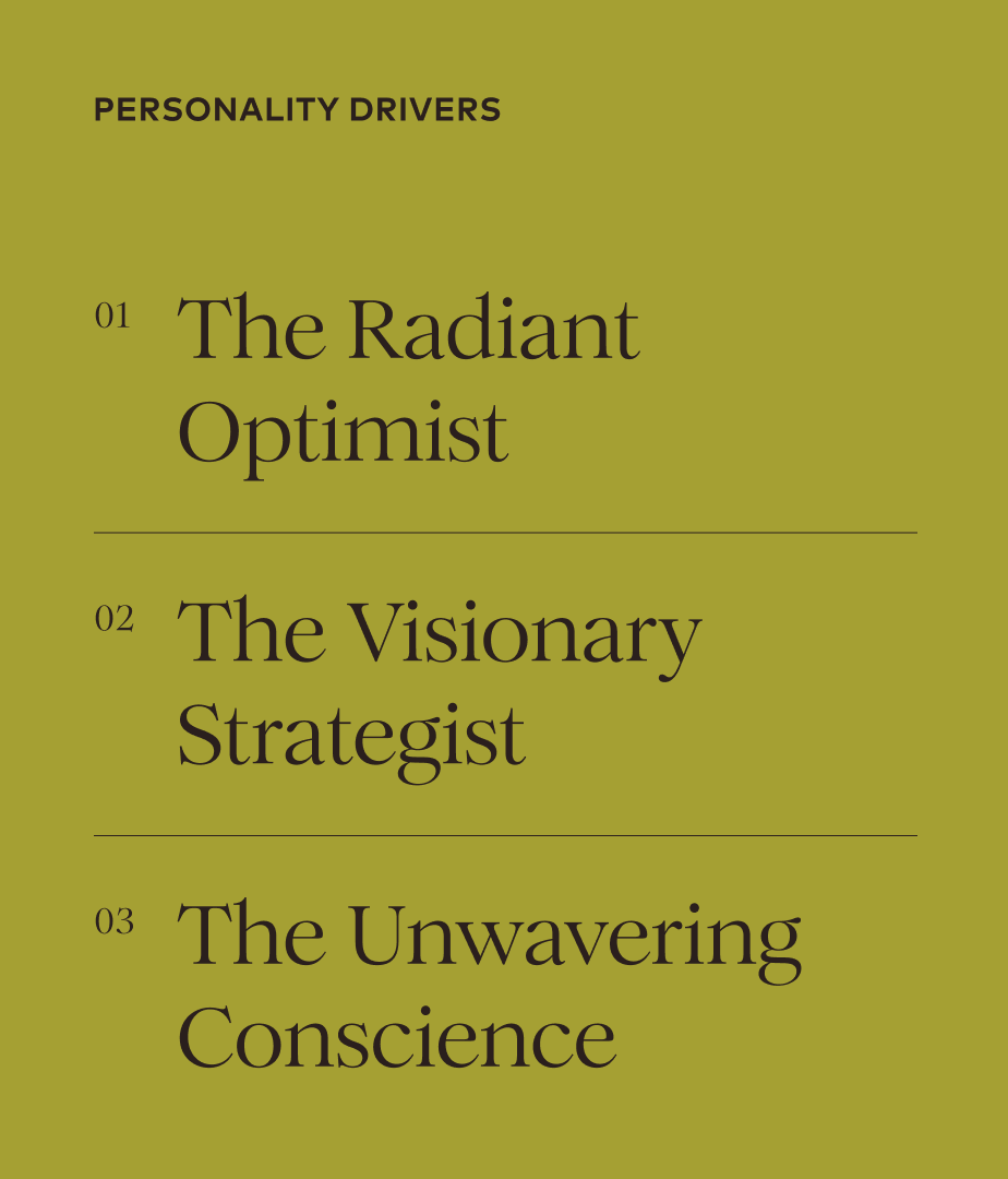
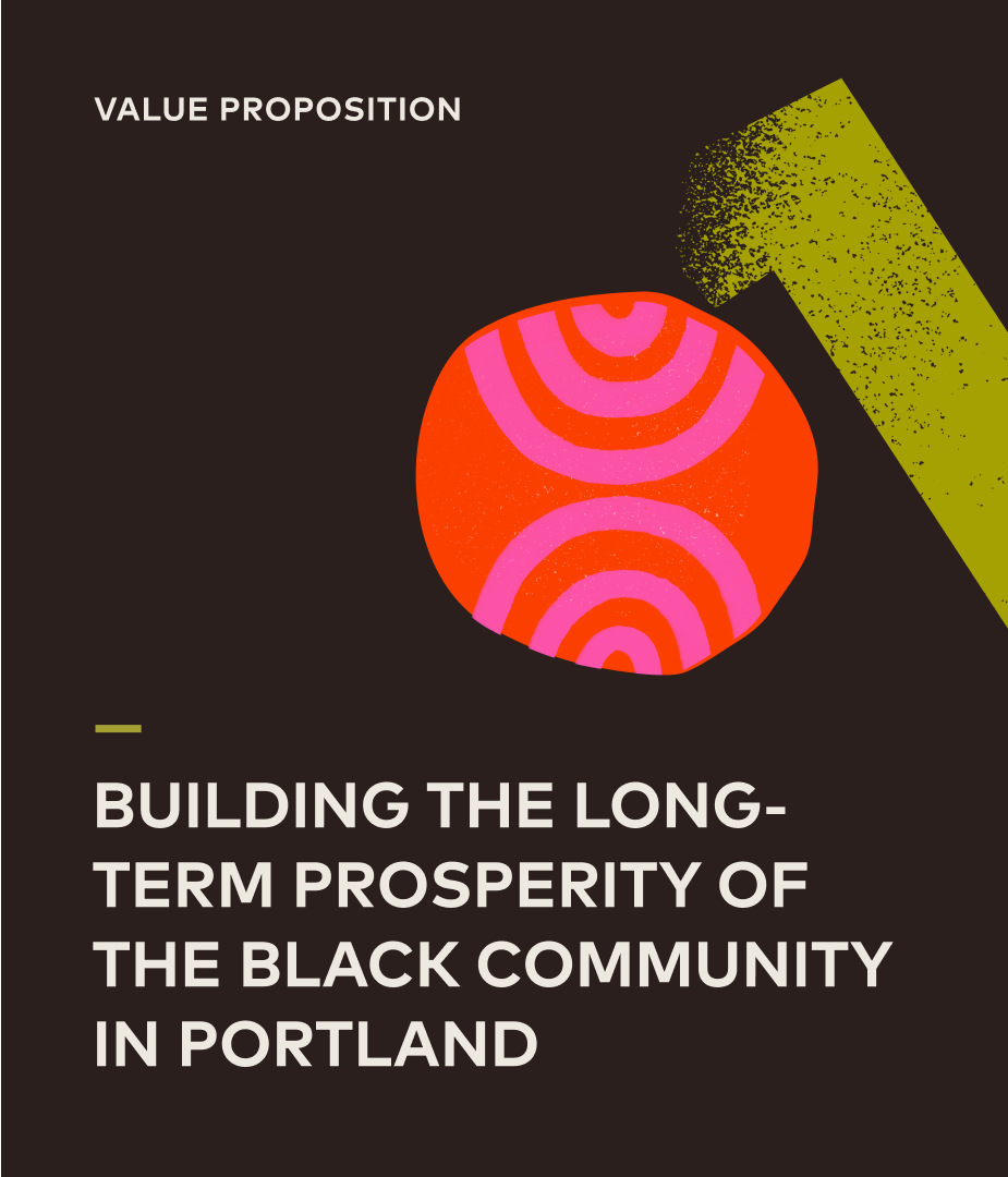
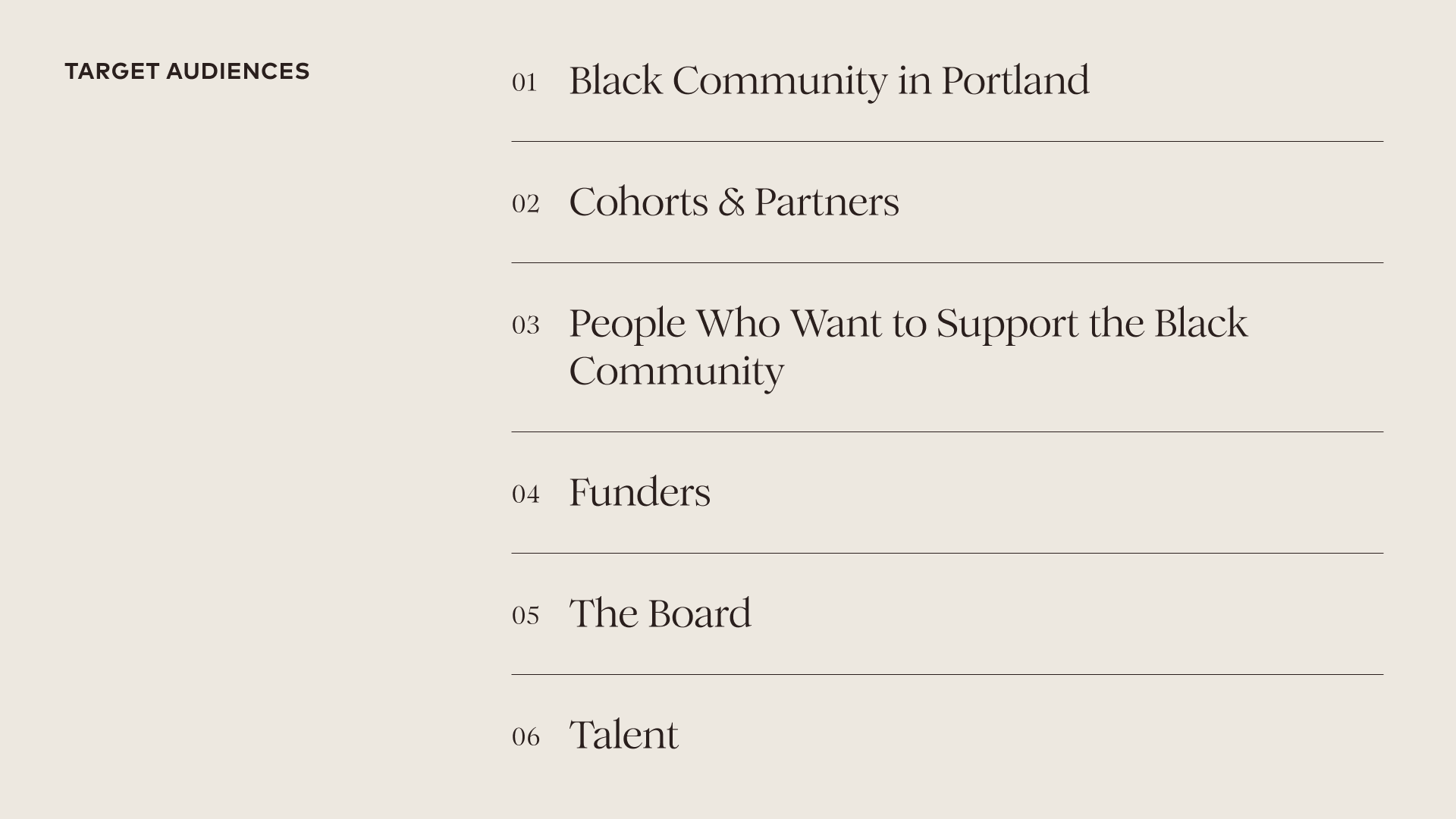
Understanding the audience for any organization is key to a brand strategy. For 1803 Fund, a new organization, we wanted to make sure we were meeting people where they were.
Rushing toward an announcement
1803 Fund launched at a press event with Phil Knight, founder of Nike, who pledged the seed money for the new organization. We created interim brand imagery and quickly developed an impactful announcement website on Squarespace, specifically designed to clearly and accessibly introduce 1803 Fund to the community. The site provided an immediate, engaging platform for stakeholders to understand the Fund’s purpose and mission-driven initiatives. This significantly enhanced initial stakeholder engagement and community connection — and provided an information hub to handle a flood of press inquiries.
The design of the interim site was informed by our discovery work and was a first step toward the dynamic visual identity.
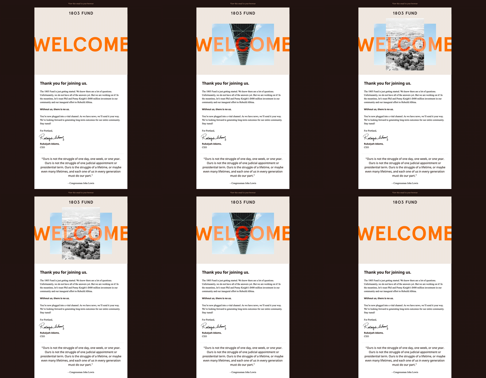
We designed and deployed an email newsletter template that Rukaiyah and her team could use to start a mailing list and communicate with the community.
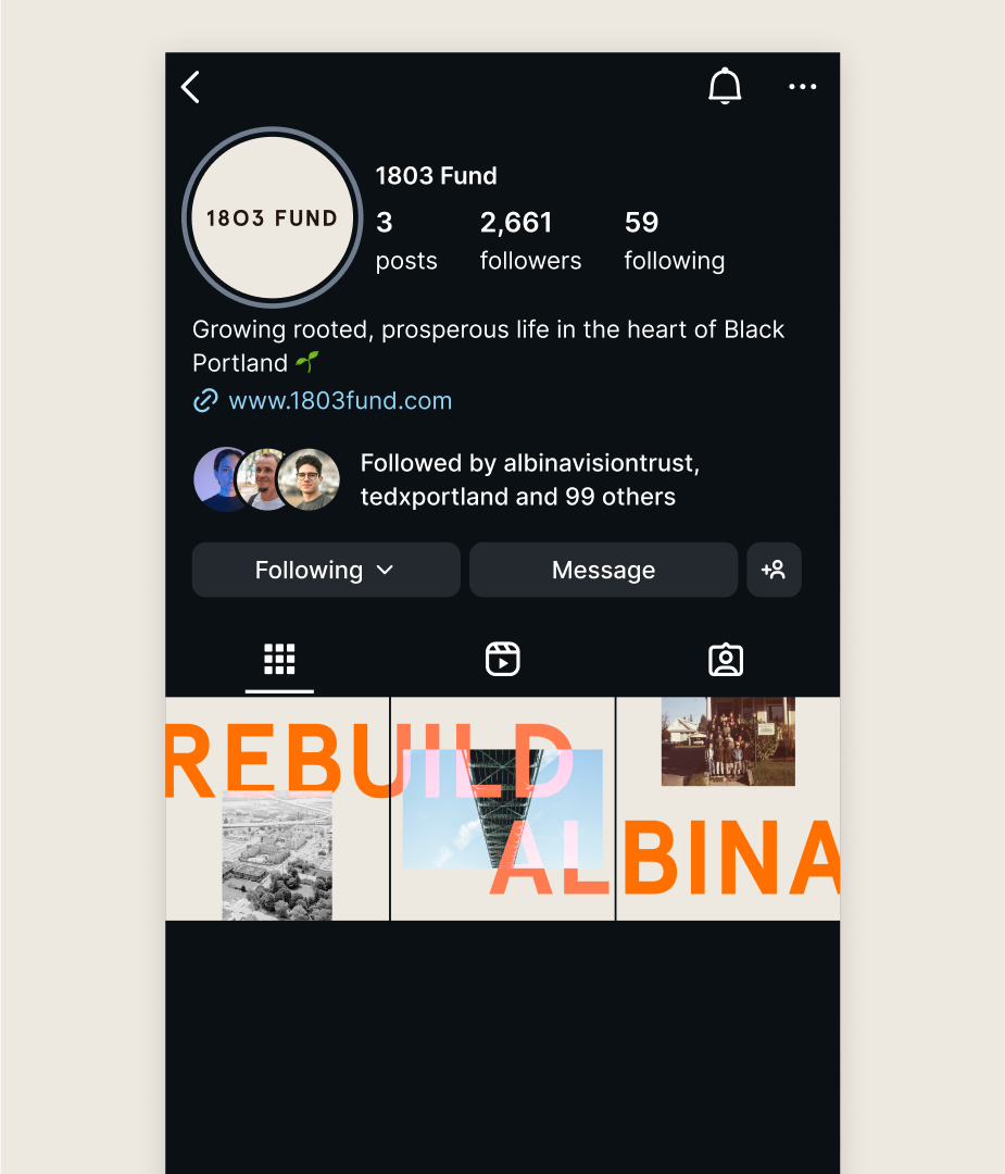
The first three posts on 1803 Fund’s Instagram account included a bold statement of purpose.
An announcement event
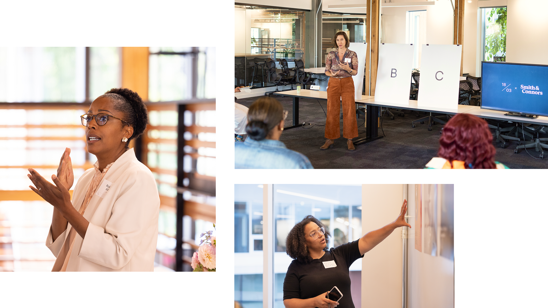
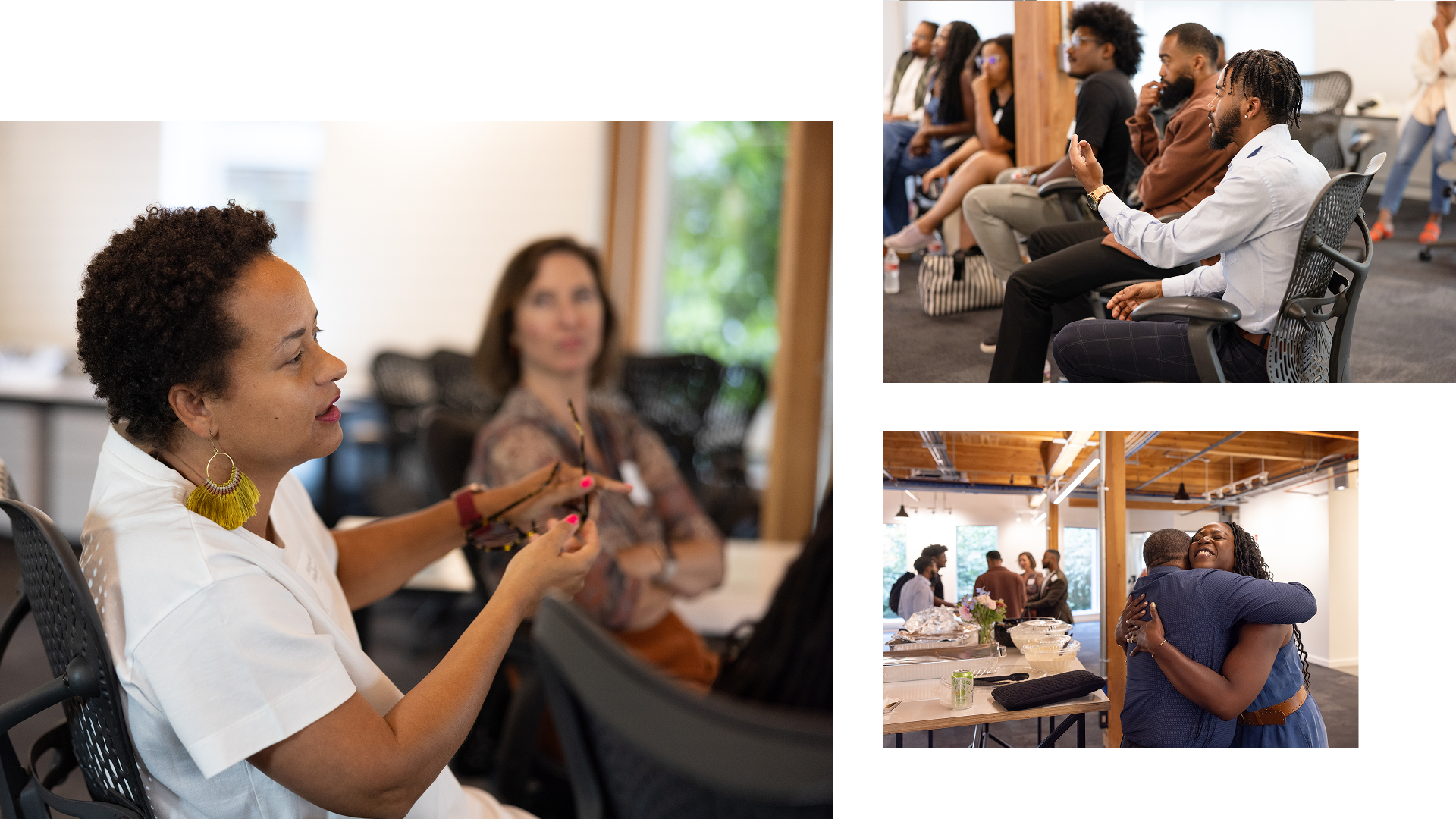
Once we had initial brand visuals, we paused to carefully consult with the community. In partnership with leadership, we designed an all-day “conclave” and facilitated structured, meaningful conversations with leaders from Portland’s Black community across various genders and age groups. The sessions were a way to test our initial messaging and design work with the organization’s audiences, but also to establish an opportunity for Rukaiyah and her team to share 1803 Fund’s goals and mission and hear from the community. We led lively conversations that helped seed support and buy-in of this new organization’s vision for the future.
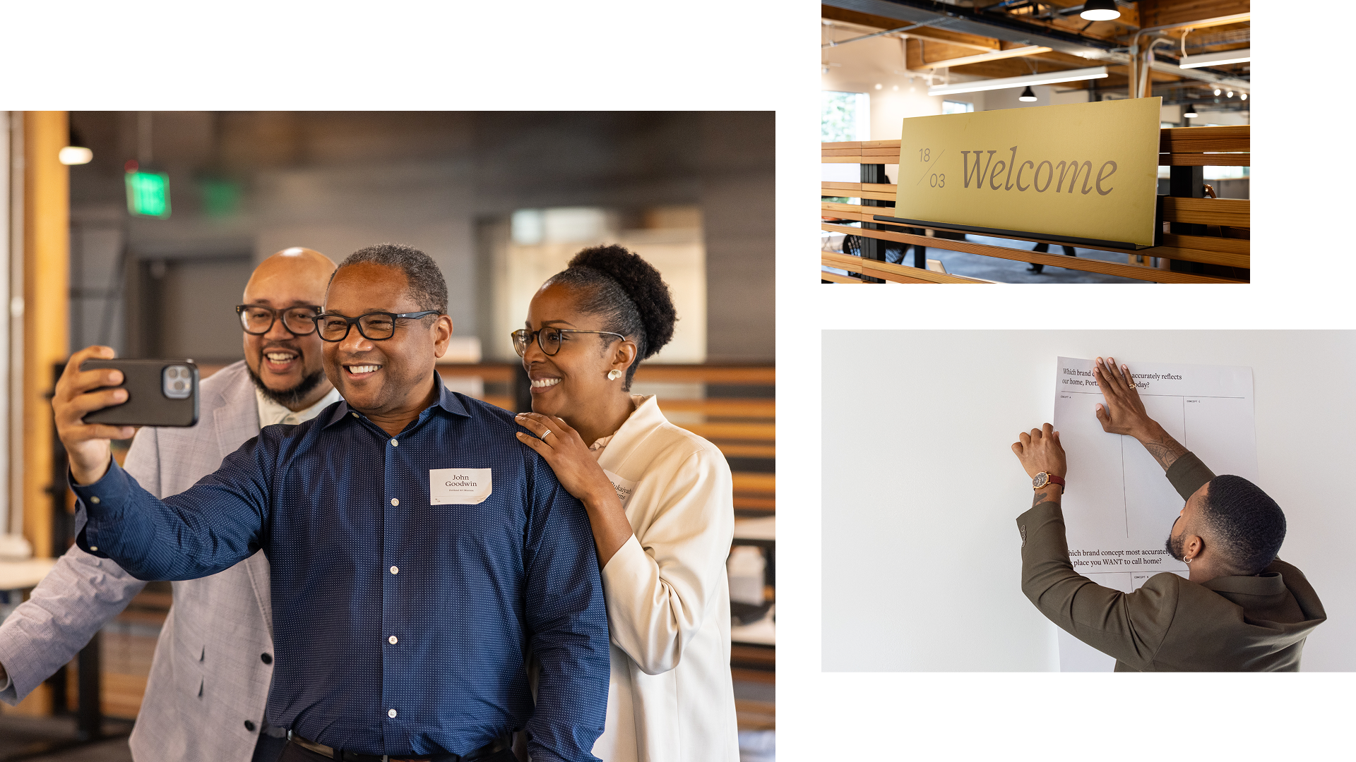
The conclaves were a way to raise big issues, build alignment, deepen trust, and provide insights that led to the next iterations of the brand identity.
A fresh visual identity
Next, we crafted a flexible and vibrant design system, co-creating bold patterns with the 1803 Fund team. The result: a visual language that captures a spirit of innovation, joy, and future-focused mission.

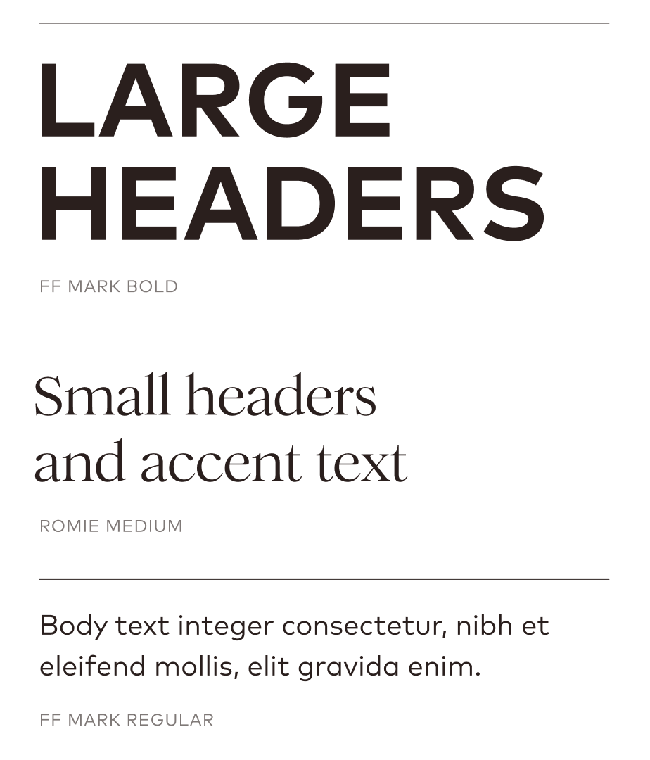
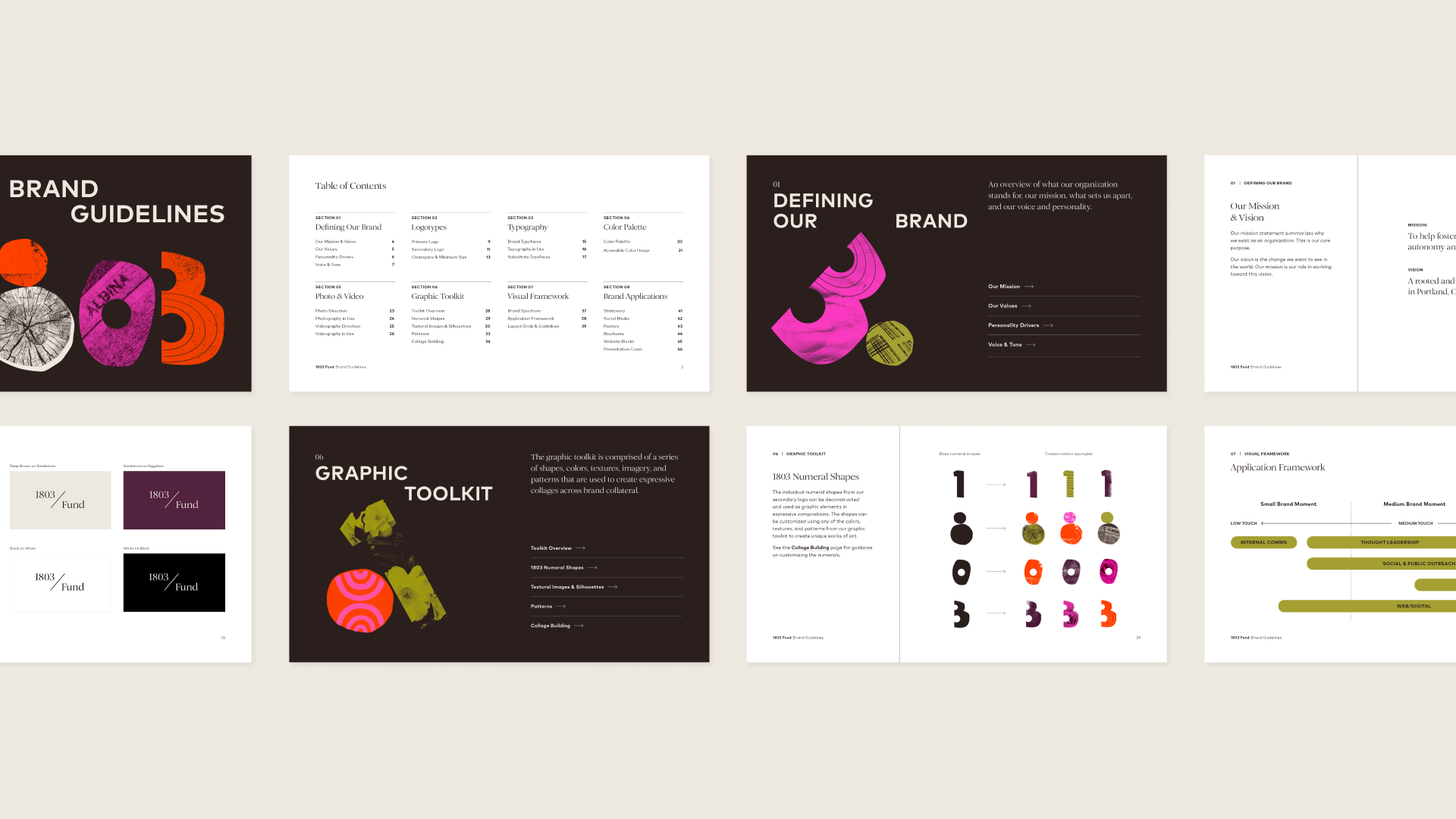
Detailed brand guidelines accompanied the visual system, providing the team with clear and consistent standards to ensure all communications reflected the Fund’s strategic intent and community-driven ethos.
Extending the brand into the world
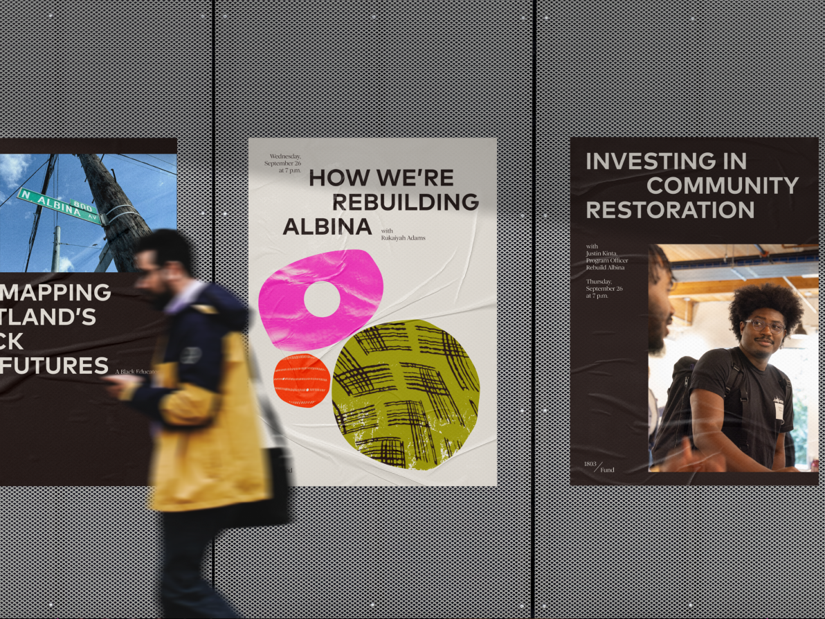
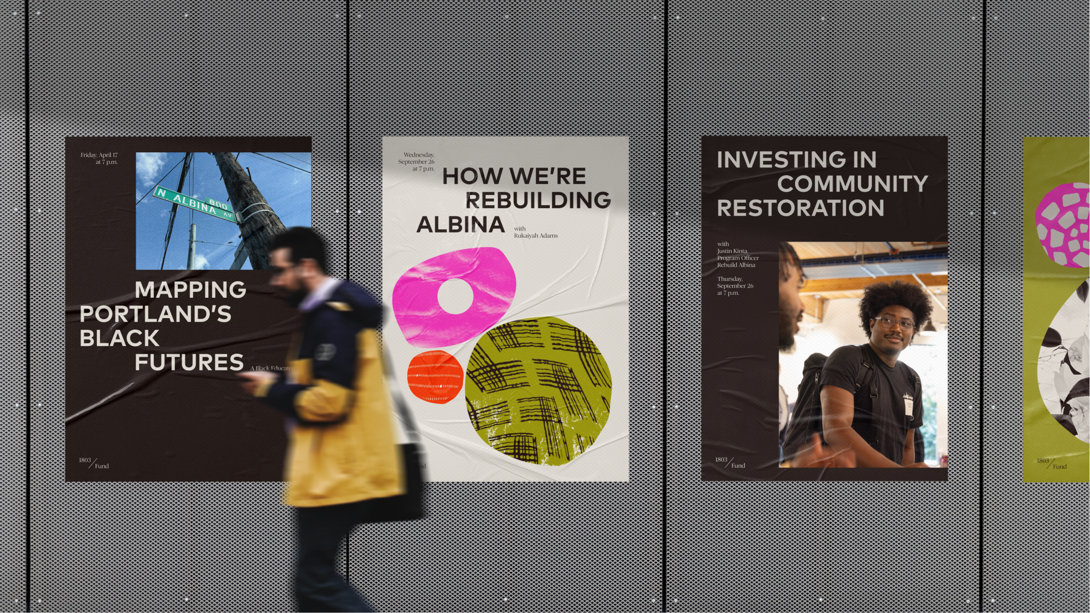
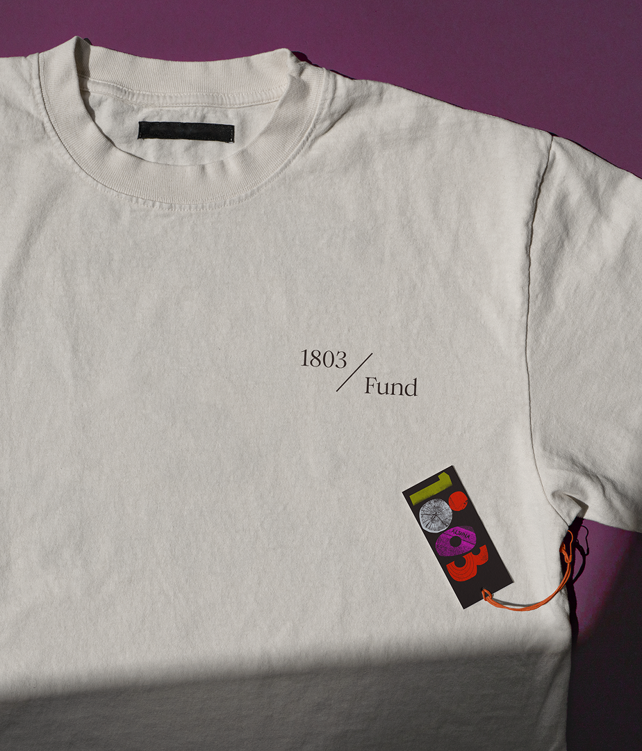
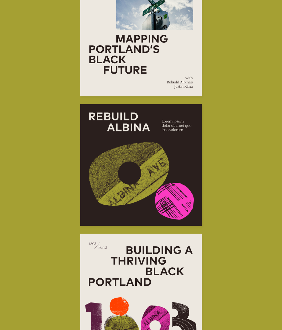
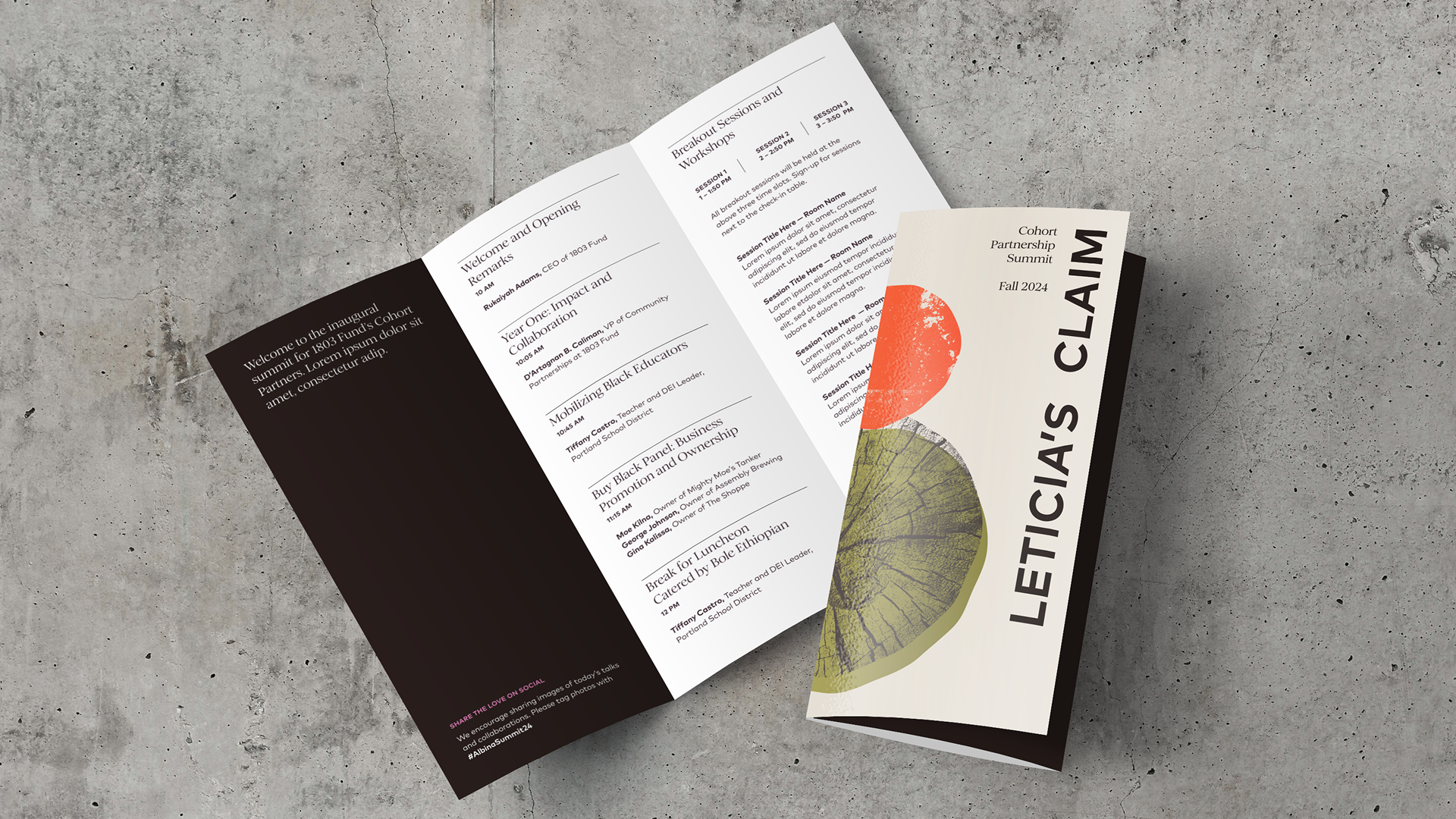
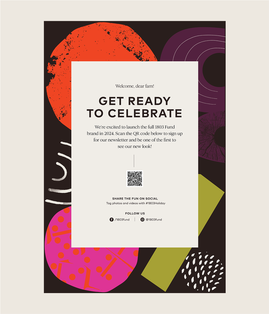
We brought the brand to life through a variety of adaptable collateral that showed how the logo, vibrant colors, and typography could flex across a variety of print and digital formats. These tangible examples gave the 1803 Fund team inspiration and guidance for applying their new identity with confidence and consistency.
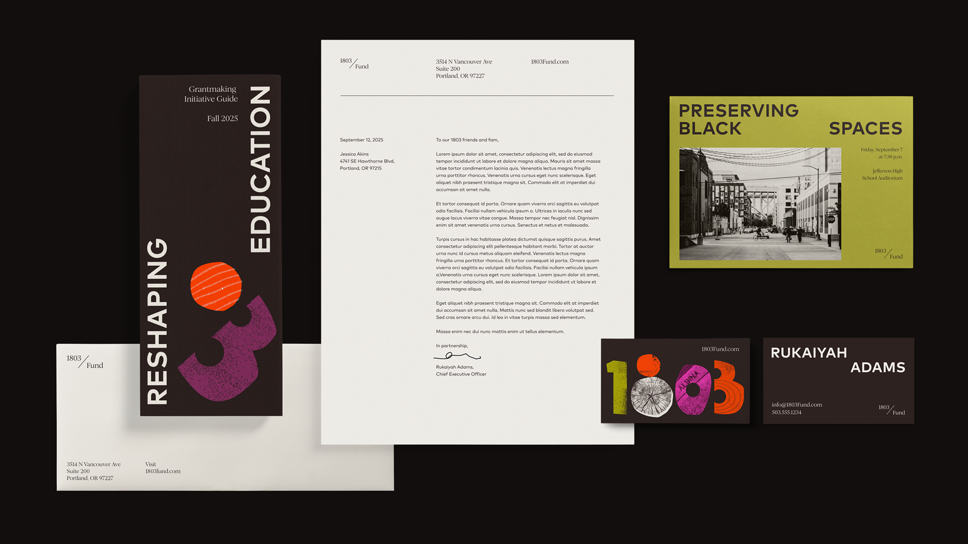
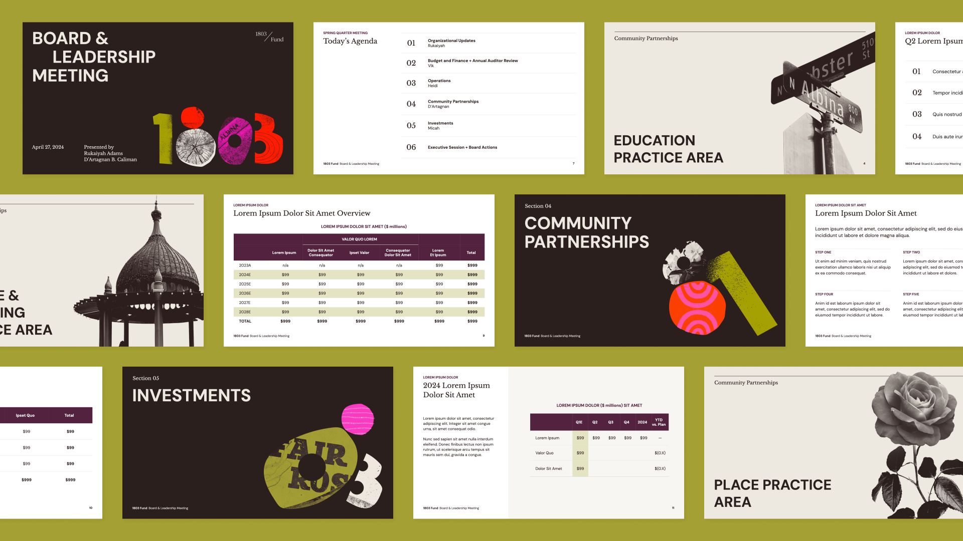
One of the applications that will get heavy use is this slide deck template, which gives the team multiple layouts and options to tell their story.
Evolving the website
As 1803 Fund hired staff and developed its program areas and platform, they quickly outgrew their launch website. We evolved the Squarespace site by designing and coding up a set of modular components their comms team could use to build their site as they go. And if requirements emerge as the organization changes, it’ll be easy to build new elements.
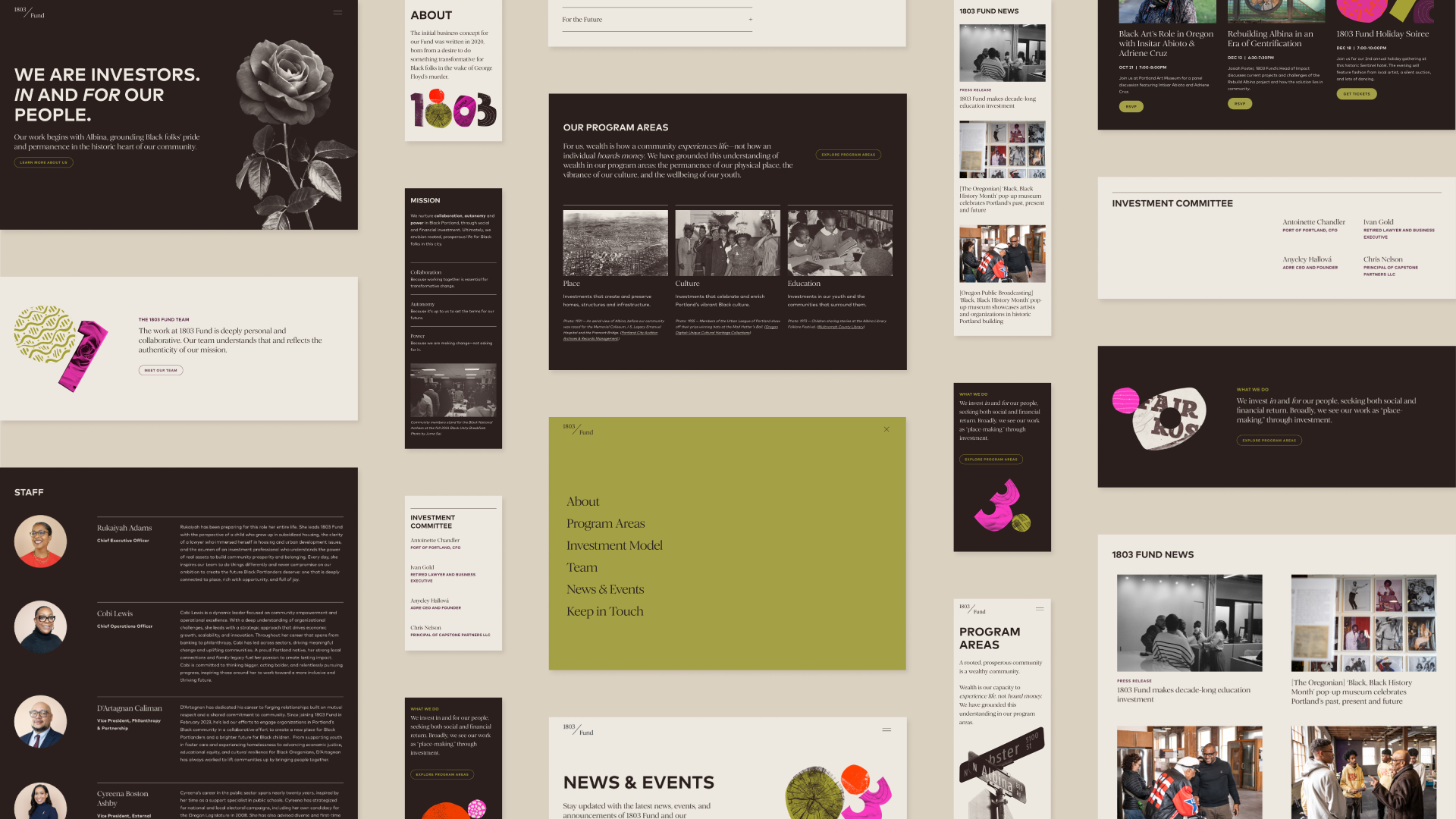
We designed 1803 Fund’s website in Squarespace to be inviting, charming, and serious to communicate the way they work with community.
Smith & Connors are brand partners who deeply understand community-driven work. They took time to listen to us and our Portland, OR community to ensure 1803 Fund’s brand captures our essence. Our new brand identity expresses both the joy and seriousness of our work. I highly recommend them for any organization seeking a thoughtful branding experience.
Rukaiyah Adams
Chief Executive Officer, 1803 Fund
Project Scope
-
Brand Identity -
Websites & Digital -
Marketing & Communications -
Transformation & Alignment

Next Up: Oregon Consumer Justice
Oregon Consumer Justice


© Smith & Connors LLC