
By Talie Smith
May 15, 2017
In April 2017 we hosted our first official Design Week Portland Open House. Rather than just invite people for cocktails, we decided to build something that would live beyond the event and that would tell a more complex story about what we actually do at Smith & Connors.
My role in the business is varied: I’m Creative Director; I head up our marketing efforts; I also lead business development and accounts. I’m often in a position to describe what we do. The easy answer is: we build brands, websites, and communication strategies for businesses and nonprofit organizations. But what does that actually mean? It’s an incredibly boring, uncreative way to talk about the impact and meaning of our work. Now, instead I start by sharing a case study that I think is relevant to the person’s interest or background. It’s way more interesting to learn about how we worked with Meyer Memorial Trust during a big organization-wide transition to help them figure out who they were and how they wanted the world to see them (branding + facilitation); or how the owner of The Whole Bowl came to us for an app she thought she needed, but we instead convinced her to rebrand her five Portland locations to properly express the personality of her business; or how we helped four co-owners of a new hotel in Portland come up with a name and brand that expressed their values of inclusion and adventure.
We’ve always experimented with showing our process in various ways to illuminate that depth for people. During a team brainstorm for the Design Week event, we came up with the idea of building an actual exhibit of some of these projects. We’d be able to feature polished finish products that spanned our disciplines while also uncovering layers of our process in creative ways. The projects we featured were local to Portland and combined branding, signage or print pieces, and a digital component.
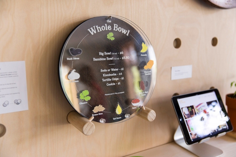
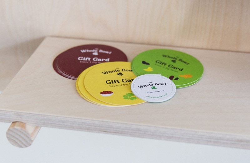
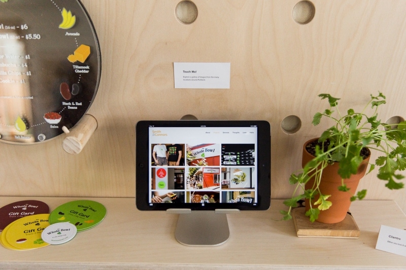
The Whole Bowl
We featured the real bowl of food under glass, honoring its deliciousness; a gallery of images on an iPad show the breadth of our work (signage, T-shirts, gift cards); and cilantro leaves (a real plant and the logo cut-out) framed the board with a little sign: Cilantro...you either love it or you hate it.

To show process, we created a prototype of the menu to uncover the layers of design and printing involved in building the menu: the hand drawn illustrations are decals that are applied to the top plexi, the lettering (which is laser cut into the wood) appears on a separate layer. Tali Ovadia, owner, kindly lent us one of the finished menus for the event.

The Society Hotel
For this exhibit, we couldn’t resist making a big deal about the sign. We had such fun designing it in the first place. We used our original design file to cut a piece of wood into its shape and laser cut the lettering. Then we hand painted it and mounted it with backlighting to make it stand out. Next to the prototype is a shot of the actual sign, mounted on a wooden back.
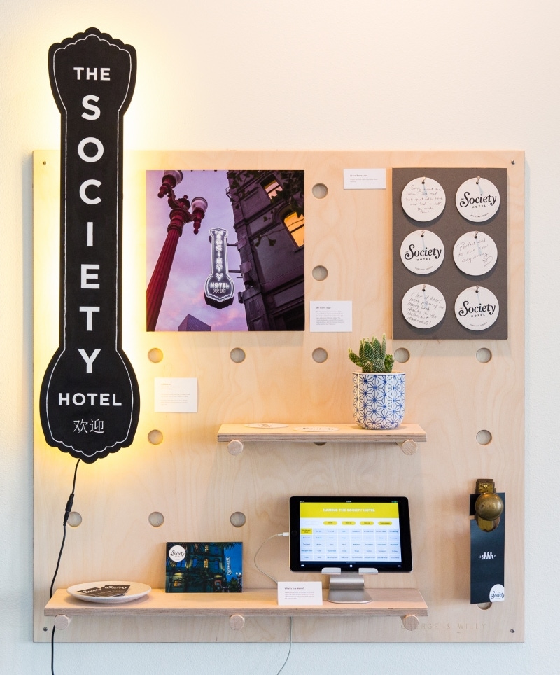
The sign is reminiscent of the classic Portland sign at the Schnitz. The hotel is in the heart of Chinatown, so we also referenced Chinese culture: The cloud-like design represents heavens and also “good luck,” and the Chinese characters at the bottom read “Welcome.”

COASTERS
We recreated an experience we designed for the lobby where guests can leave notes about their stay on the back of coasters.

NAMING
And we created a digital naming experience to let visitors explore the process of naming The Society Hotel. Check it out!

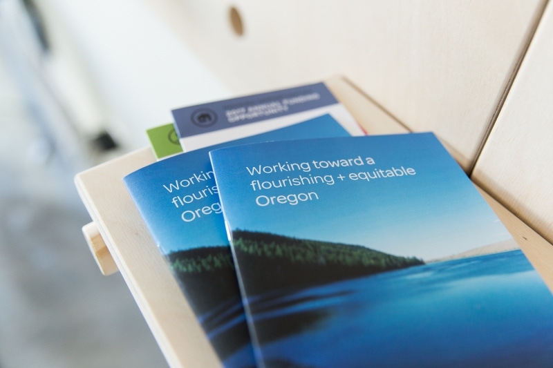
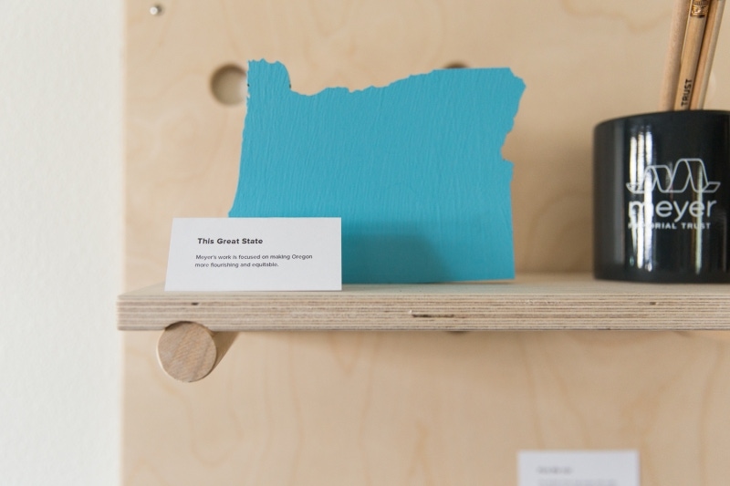
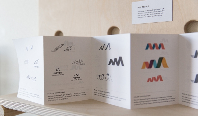
Meyer Memorial Trust
Our most complex project on display, we used two pegboards to show the depth of our work for Meyer.
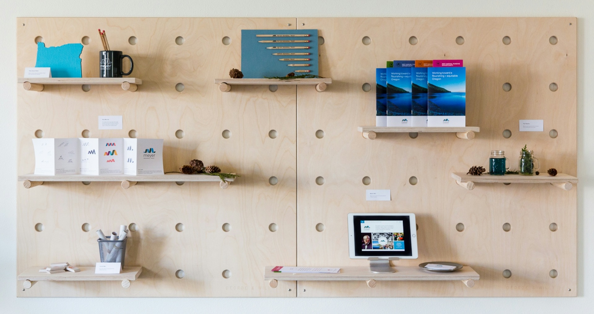
CREATING THE LOGO
We designed an accordion fold card showing the process of designing their logo, from sketch all the way through to full identity system.
UNROLL ME!
We created a Recycle Bin that had visitors exploring identity concepts that hit the cutting-room floor.


THE WEBSITE
We created a screencast that gave a tour of some of our favorite features of the website we built. Visit Meyer's new website here.
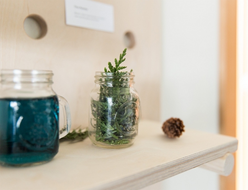
Meyer’s Palette
Meyer's colors evoke the blue of Oregon's rivers and the green of its forests. We displayed two jars to visually reference the meaning behind their palette.
CREDITS + THANKS
Pegboards made by New Zealand's George & Willy. Photos by Kylie LaCour.
Special thanks to:
– Tali Ovadia for her generosity and help in creating our shrine to The Whole Bowl
– Jessie Burke and Jacob Halverson at The Society Hotel for getting us images and merchandise
– Oregon Blue Print for being quick and creative about printing The Whole Bowl menu prototype
– Francis Printing for offering print services gratis for the event