
By Talie Smith
April 14, 2023
In many ways, it has never been easier to be a web designer. Between ready-made website builders, social networks that connect designers with developers, or direct design to code platforms that cut developers out of the process altogether, designers are bolstered with tools and resources to create websites that know few bounds. Dynamic web layouts previously only possible in print design are now easily mimicked on the web with contemporary code.
But while almost anyone can create visually engaging and dynamic websites with ease, something often gets lost in all the automation: accessibility. When the job of the designer is so caught up in how things look visually and stylistically, we can forget that we have a social responsibility to design for ALL humans, including folks who rely on screen readers and other assistive devices.
A screen reader is software used largely by blind and visually impaired people to surf the web. It reads metadata, like alternative (“alt”) text on images and titles on videos, and also searches for high-level information based on HTML tags. For example, it first looks for all of the H1s on a page and presents them as a menu. It then goes on to all H2s, H3s, and so on to organize information and give users a way of navigating the page to read the parts that interest them. This provides an experience of scanning a page quickly and jumping to information that you want to know more about. If that typographic system is complex or nontraditional, your content may get jumbled by screen readers, creating a confusing and useless experience.
So how do we design engaging, dynamic typography for the web with accessibility top of mind? Let’s start with an understanding of the basics.
Traditional Text Hierarchy
Let’s rewind all the way back to your Typography I course. A typographic system has levels of hierarchy that helps readers distinguish between high-level information like headers or titles, subheadings, body copy, and so on.
At its most basic, design rules say that if something is important, you should make sure it’s the first thing readers notice — make it big, make it bold, make it stand out. Other text styles should subsequently descend in size and weight as they descend in importance. Subheads are slightly smaller than headers, body copy is slightly smaller than subheads, captions even smaller than body.
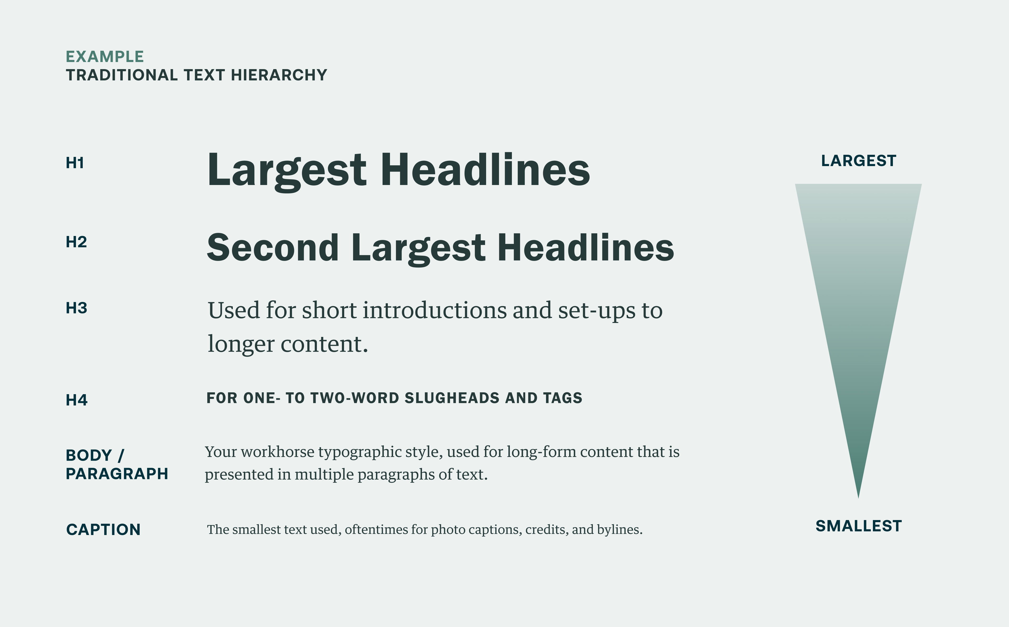
Simply laying out text from largest to smallest, from top to bottom, makes for super clear hierarchy, and visitors using screen readers may choose to skim page content based on that hierarchy — meaning they interpret H1 tags as the most important info on a page, then H2s, H3s, and so on — and then dive deeper on sections of a page based on these headers.
While this is the most basic and clear example of text hierarchy, commiting to displaying text styles in the correct order on every section of a website doesn’t always result in the most engaging visual design. Organizations, brands, and their audiences want websites that are more beautiful and expressive, which can mean placing headers in different orders to create more dynamic content experiences for the majority of their audience who are not relying on screen readers.
Bucking Basic Hierarchy: Trading Style for Accessibility
The playfulness of a more complex, nuanced typographic system is a key ingredient in the secret sauce of great graphic design. Primary pieces of information once considered high level might defy standard logic in a more complex typography system. You might make some of that copy smaller, subtler, and lower down in a layout.
For instance, a designer could take a section marker and make it an H3 so an engaging piece of body copy can shine. Take this call-to-action block design we made for the home page of Lawrence Berkeley National Laboratory (LBNL) as an example:
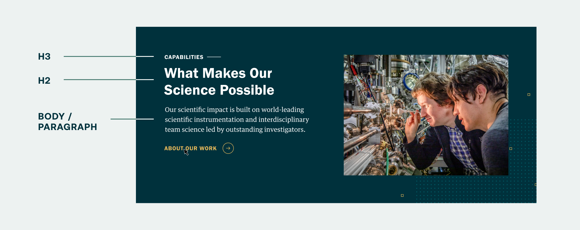
The content used in this block points the user to a landing page named “Capabilities.” By basic hierarchical rules, it would be assigned the primary spot in the hierarchy as an H2 as the largest text in a layout, and yet it’s assigned the most subtle text style of any piece of text shown here, as an H3. It allows the intro text,“What Makes Our Science Possible,” to take center stage as an H2 and creates a more interesting and engaging narrative about what LBNL does. The playfulness and mixing of text hierarchy is ultimately what makes for a more engaging design, and gives us designers the opportunity to highlight the most eye-catching brand messaging.
Nearly all web designers employ more playful text hierarchy to add visual interests to their website projects, but many of them aren’t aware of the problems this creates for accessibility. Here’s how screen reader would actually present this information:
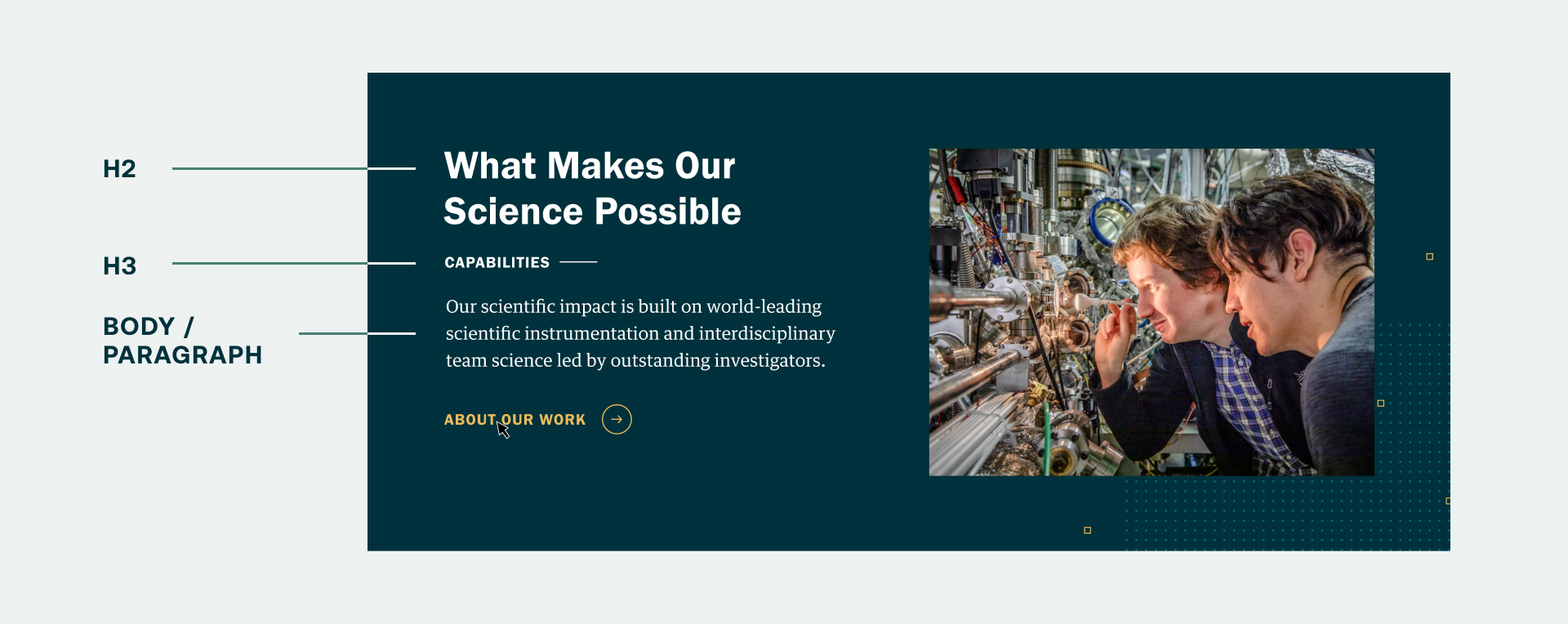
Based on screen readers interpreting the importance of information based on HTML tags, users would not have the immediate understanding of where this block might lead them. Screen readers can give visitors a list of all headings before other content, enabling them to effectively “skim” the page and jump straight to a section of interest. The content and user experience is muddled. While you may know that your H3 is actually intended to be understood as an H2, a screen reader definitely does not translate that. The intent is important, and that’s where simple website builders and WordPress templates fall short.
So does this mean we need to revert to a simple, immediately intuitive layout in order to make websites that meet the needs of all audiences? Absolutely not. There’s a way to make sure that even the most dynamic typographic layouts on the web are translated perfectly by screen readers and — sorry, Squarespace lovers — it requires great communication with a developer.
Overriding Style Tags with Classes: Translating Intent
Many services and templates offer designers and marketers the ability to create beautiful web layouts with ease, and largely without the aid of developers, but screen readers rely on HTML tags (H1, H2, H3, etc.) created in the code of any given website to present text information in the correct order. There is no default way to translate the intent behind a more complex typographic hierarchy. But, with the aid of a developer to help convey that intent through CSS, your more nuanced text layouts will be read clearly by screen readers.
Developers can manipulate how screen readers process your type styles using something called CSS classes. A CSS class is used to define a set of styles that will be applied to an HTML element or set of elements. It can create exceptions to, or expand upon, higher-level behaviors and styles already established in the CSS — in this case, text style tags. A developer could use classes to dictate a different level of typographic hierarchy than a piece of text technically has, and can thus reorder how screen readers process that text.
For example, a class written to manipulate a text style, regardless of how it displays visually, to read as an H2, but render as an H3, would look like this:
.h3 {
color: #333;
font-size: 1.2rem;
font-weight: 400;
line-height: 1.3;
margin: 0 0 20px;
}
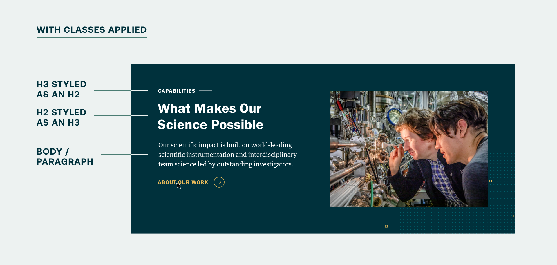
When applied to a text element in a website, this code would make a piece of text render like an H3, regardless of its initial style tag. Let’s revisit the LBNL block example. Applying the class “.h3” to the H2 tag surrounding “Capabilities” means it’s now read as an H2 by a screen reader, despite looking like an H3 in a website design:
<h2 class="h3">Capabilities</h2>
Additional classes could be written to move other pieces of text in a block design down in the hierarchy, giving developers the power to reconcile the intent of the designer behind any content block with the rigidity and practicality of a screen reader. Applying classes to our LBNL CTA block, we would be able to manipulate the text styles to be interpreted with the original design intent intact:
And because classes can cascade through specific block types, or even an entire website, these classes allow developers to apply these changes globally or specifically — to text fields or component types — with quickness and ease. Magical, right? It is, especially to those of us who don’t write code for a living, and who are looking to make websites that meet the highest level of accessibility standards.
Smith & Connors specializes in developing sites that make sure the design intent always gets translated into any text field, streamlining the experience for our clients when they enter content into their website's content management system and taking the pressure off their teams to make sure they meet accessibility requirements. Even so, there are still some basic considerations/best practices to take into account when writing content for your website.
Some additional, basic tips for making your website content more accessible
1. Only use one H1 in a page design, and make it the page title.
Knowing H1s are the first piece of content a screen reader conveys to a user, it’s especially important to let users know what page they are on. They may have entered your website through a backdoor via a search result or social media post, not through your homepage. Make sure you orient them immediately.
2. Review your website design and messaging with a screen reader “lens.”
Now that you know how screen readers work, put yourself in the position of someone who relies on one. Is that abstract piece of writing on your site translating correctly on its own? Do you need to rethink your text hierarchy and language to be more friendly to folks who use screen readers?
3. Be specific with button destinations and calls to action.
People using screen readers need an idea of what kind of content to expect next. Changing button text that points to an article from “Learn More” to “View Our Capabilities” makes for really obvious, pointed expectations of what the resulting destination page will be. As an added bonus, this also helps to improve your site’s SEO.
4. Add alt text to all images and titles to all videos.
Images are a key way to tell a story, but the narrative is lost when you simply add images without alt text describing what’s happening in an image, or you simply use closed captions without describing what’s happening in a video. Quickly describing what’s going on in an image or video ensures everyone can experience the full story.
Interested in learning more about making your website accessible?
Check out our blog post Making Your Website Accessible is Easier Than You Think. To receive insights like this one in your inbox monthly, subscribe to our newsletter.