By Scott Smith
July 14, 2022
Washington County Cooperative Library Services (WCCLS) a network of 16 libraries in suburban Portland, Oregon, serves thousands of patrons every year. When we first started working with their team, they were in the middle of a strategic shift toward greater equity and accessibility. They needed a brand refresh to emphasize this priority while also becoming more relevant and engaging to their diverse audiences.

Libraries are comforting places that evoke a sense of stability. As part of our discovery process, we looked at the results of a recent patron survey and sensed fear and angst in many of the responses at the prospect of change. But of course, public libraries have changed immensely from the old reputation of being silent and sterile places. These days they're a resource and community center. Books are still the core offering, but you can borrow everything from movies to board games, access the internet, find out about local elections or events, take classes. Libraries offer refuge, comfort, and access, and even better, they are free. Libraries are an important connector to things going on, especially in otherwise underserved communities. That is absolutely true in Washington County.
So what could we do as a brand partner to help them meet this moment of change? Our strategy hinged on crafting a new message and visual identity that elevated their existing brand, creating visuals and assets that felt inclusive and accessibility to all people within the county, while maintaining a sense of stability for long time patrons.
A refreshed identity
They were not ready to lose their logo entirely, so we redesigned their identity around the core element of their logo: the book. It’s the clear jumping-off point for people, with an opportunity to stretch its meaning.
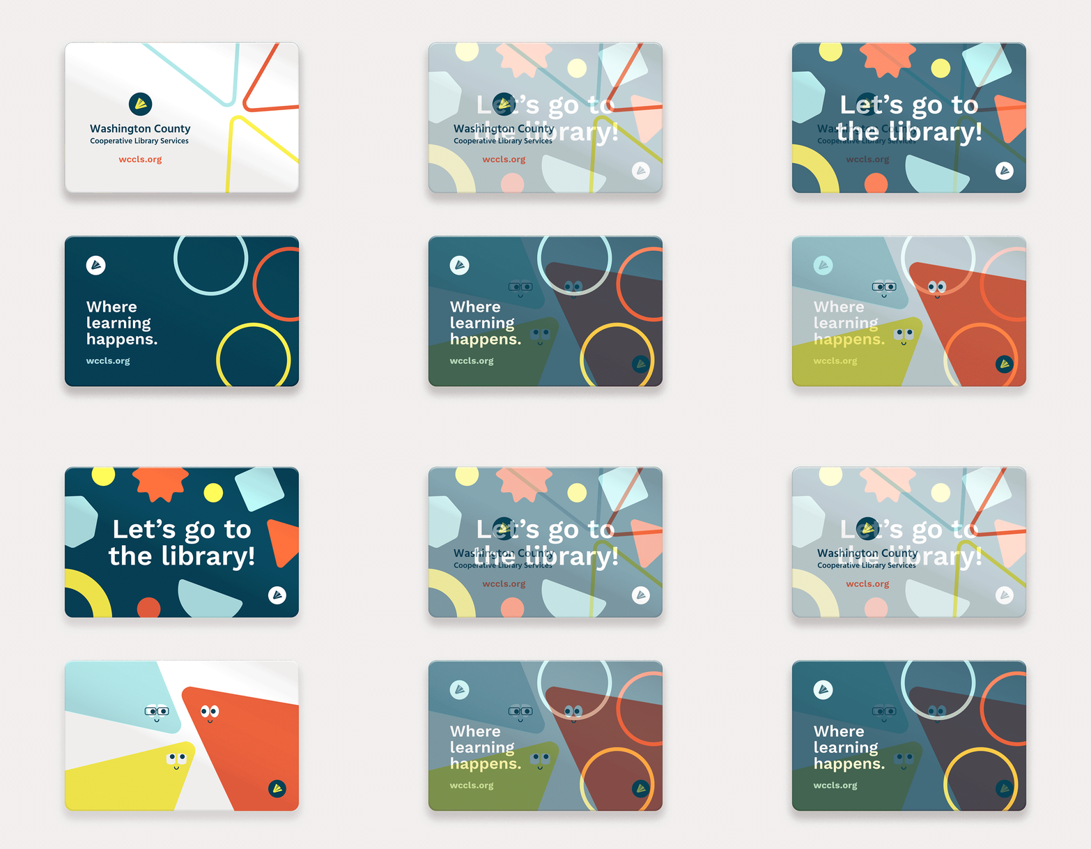
With the book logo the center of gravity, we then explored ways to express the brand identity as to represent the different ways a library contributes to the community. We used the curves and shapes of the logo as a starting point to conceive a visual language that felt related to their long-established logo.
The book icon became a recognizable stamp, consistently used across assets.


We updated their palette and created strong rules around its usage. We wanted to ground the palette in a deep, trustworthy color (blue) paired with vibrant, modern colors as accents.
The expressions can range from playful to classical, depending on the campaign or content.
Expressing the brand in the world
We then worked with WCCLS over the course of a year to conceive and launch various digital campaigns, merchandise, collateral, and signage to reach new audiences online and in the community.
We designed truck wraps with our core brand identity and positioning, along with new taglines we wrote to share the idea that the library is more than just a place to borrow books. The three trucks can be seen daily around the region, and at local events where WCCLS gives back to the community.
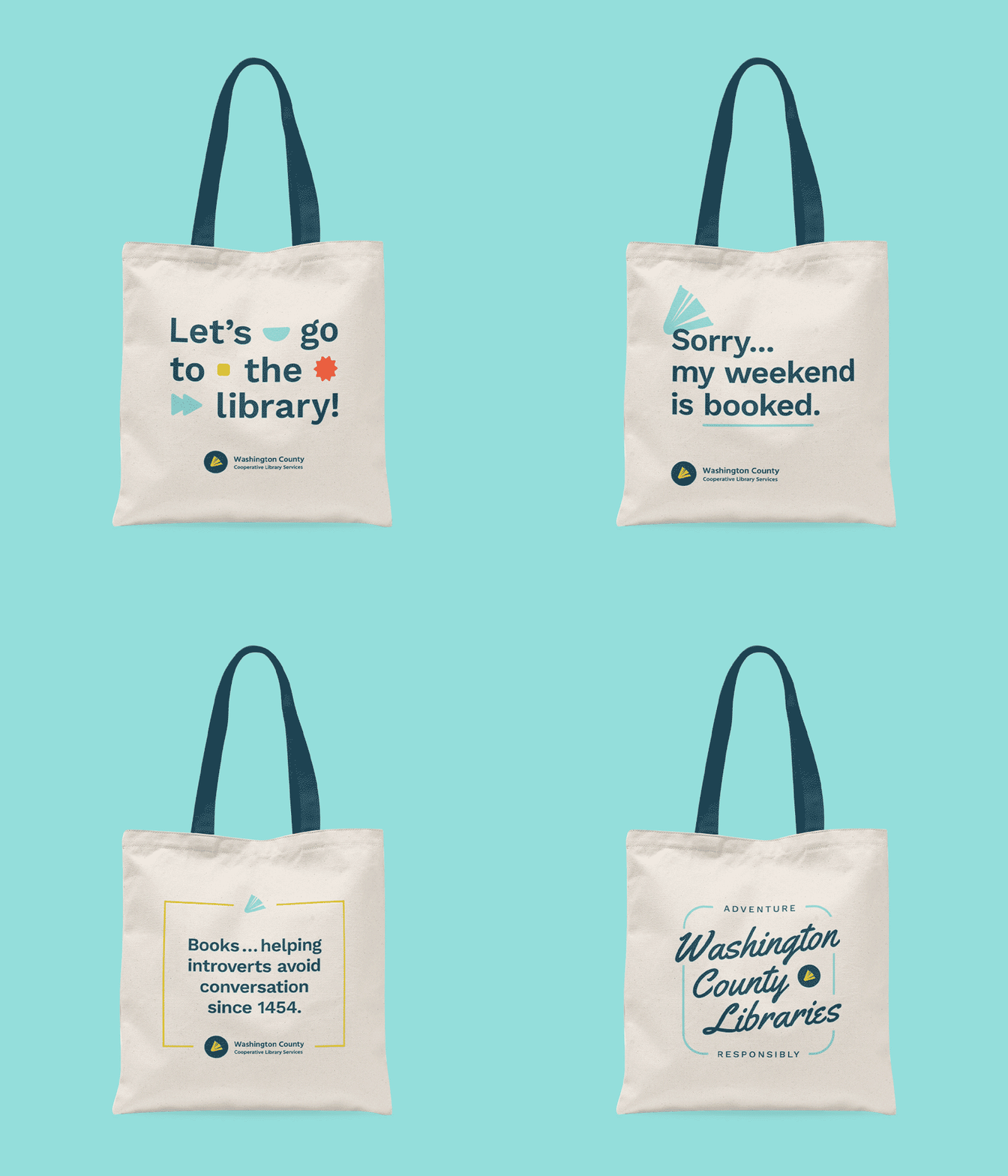
Next, we collaborated with their team and we designed a set of charming, lighthearted, cheeky, and stylish tote bags (available for purchase). The new identity was gaining ground!


Creating a robust social platform + campaigns
We designed a wide range of graphic templates and assets for social and helped the library create nine social media campaigns to promote initiatives and tell their story.


Paving the road ahead
To bolster the tremendous effort of updating their brand, WCCLS needed to enable their internal teams with the skills and tools to easily create consistent, on-brand content that aligned with their new look and voice. So, we setup a Canva account for them and designed a set of templates, along with a guide that outlines dos, don’ts, how-tos, and more that they could share with staff members. We conducted a series of trainings for their team so they could learn how to use this tool and the new templates successfully. The beauty of this collaborative Canva account is that we continue to add new templates as we build more assets and campaigns together.
