
By Scott Smith
July 22, 2024
Question: Why does your organization even have a website? (No existential crisis intended, we promise.) The answer is simple: Whether you're a nonprofit, a government agency, or a socially conscious business, you want your visitor to do something. Your site is more than a repository for information — it's a platform for inspiring action and driving meaningful engagement.
To encourage someone to act, we often use a call to action, or CTA for short. The CTA asks your visitor to do something: Donate Now, Sign Up for Our Newsletter, Add to Cart, Register for Our Webinar, Read This Article. For mission-driven organizations, especially, effective CTAs are about building relationships, fostering trust, and ultimately advancing your cause.
We assume that your website is not designed to get a quick sale. Our clients are trying to create social change or build community, so relationships are crucial. You’ve asked your audiences what they want, you’ve built your content strategy, and now you just have to get them there. How do you do it?
Well, just read on to find out more (that’s a CTA)...
Anatomy of a CTA
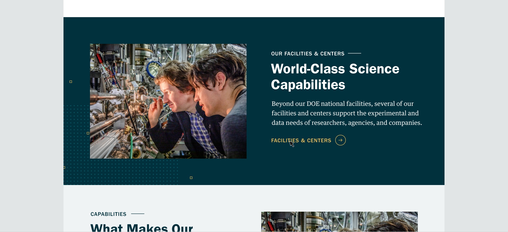
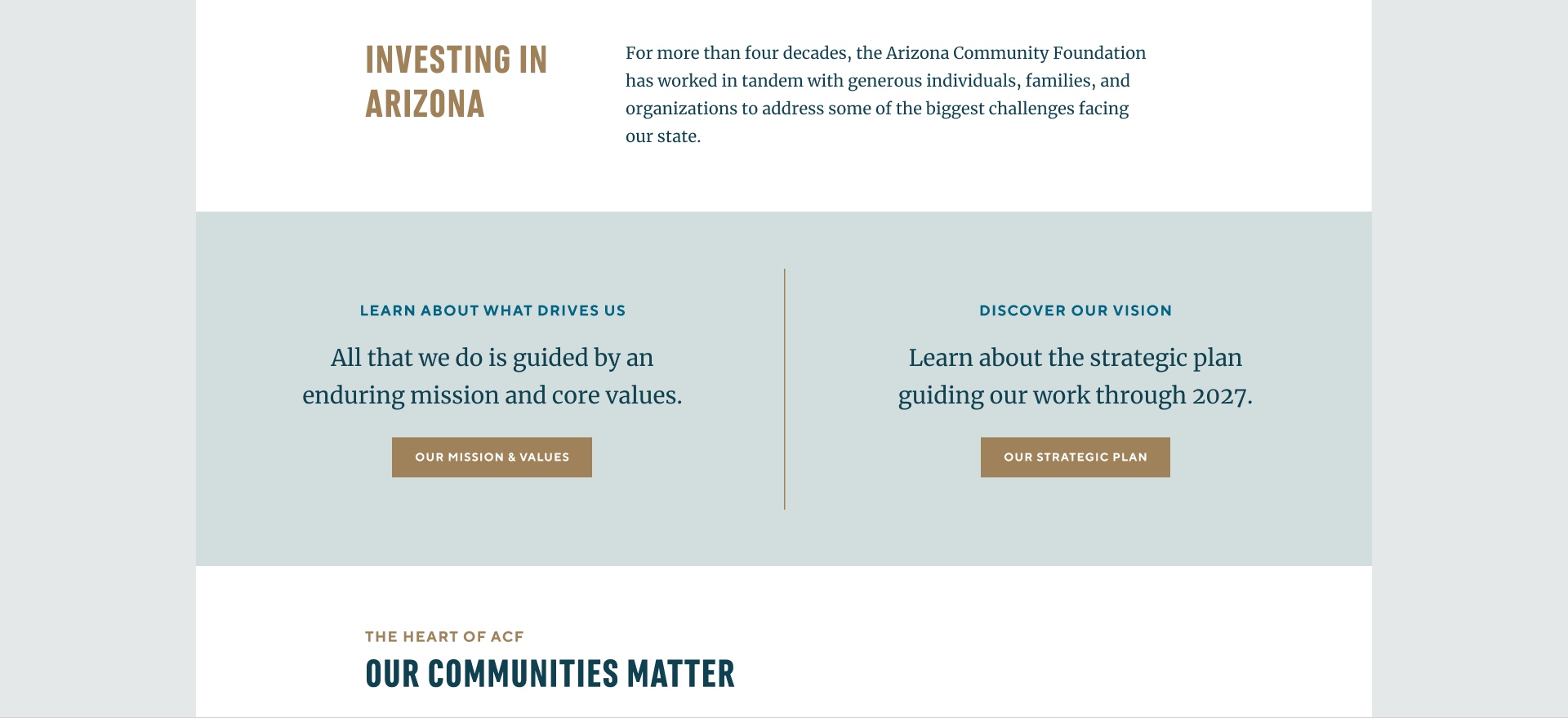
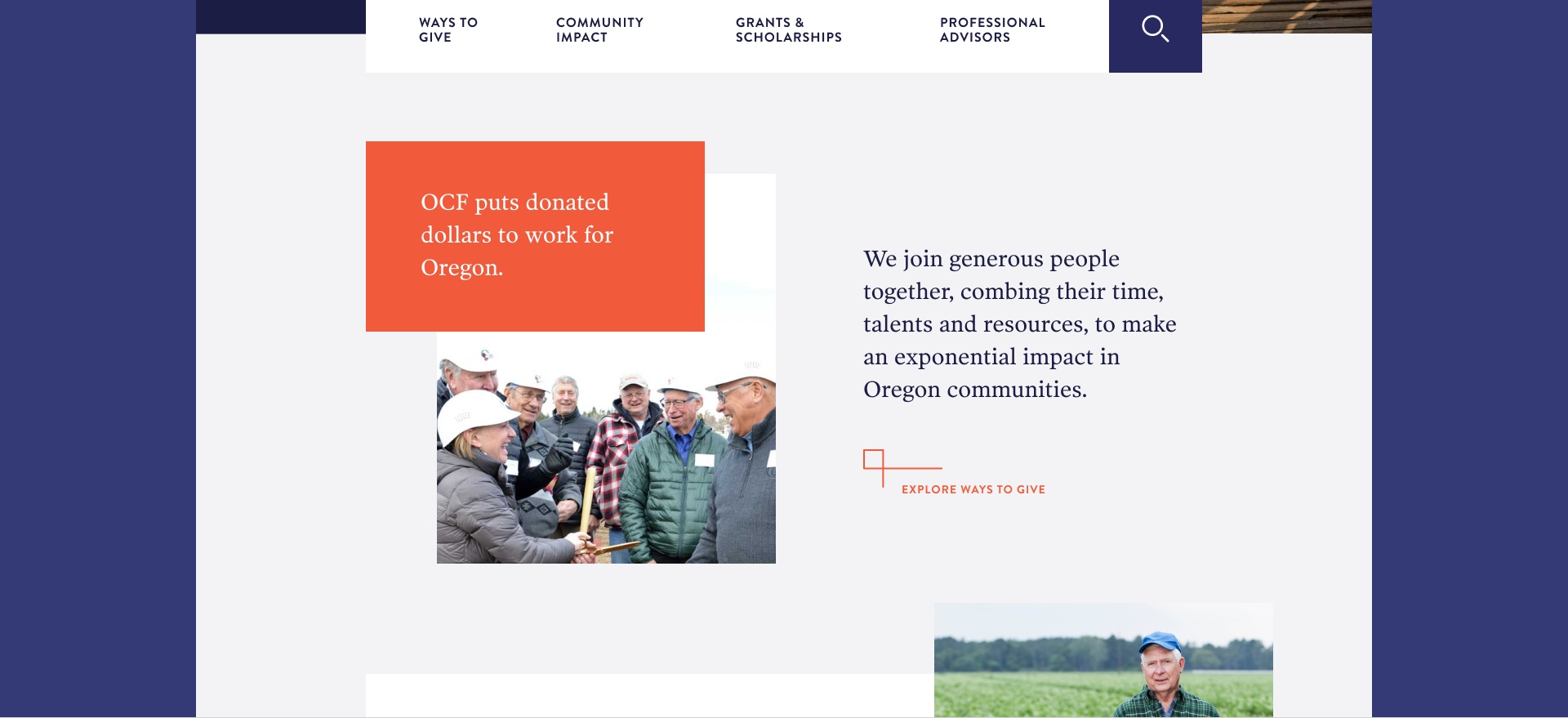
First of all, when we say CTA, we are usually referring to a specific type of component on a website that has some information and a link. A CTA should grab your attention. That’s non-negotiable. You’ll notice that there could be a bright background, a pithy headline, maybe an image, some body copy, and a button. Not every CTA will be like this. Sometimes there are two CTAs side by side. We'll show you many examples of CTAs throughout this article.
The Psychology of Attention-Grabbing Design
First of all, don’t put too many CTAs on your page. The problem is mostly in the hierarchy of information. The visitor should notice that something is prominent. If you have too many prominent things yelling at you, you will assume that none of them are important. Simplicity is the key here.
Also, you don’t want to dominate a page. The point is to get noticed, not to take over the rest of the content. So think less is more, and use tools other than size to create some impact.
Also, think about putting your CTAs where they naturally fit into the user's journey. If you know that most people aren’t going to scroll very far, then you should put your CTA up high on the page. We don’t really think much about “the fold” anymore, but not everyone will explore the entire page. Put them in a place where you know that people will pause after looking at a piece of content. Your page is a narrative. Draw people in, and then give them an option to take the action you want them to take. We’re not precious about the websites we make. Unless you’re just serving up content and want to keep people there as long as possible (in which case shame on you — people should pay attention to the world), you want people to only spend as much time on your site as they have to in order to get them to take action.
Certain colors elicit a sense of urgency in different cultures. But you don’t need to get all sociological about it. More important is that your calls to action use contrasting colors so they stand out.
Accessibility: Ensuring Inclusive Action
Which leads us to a more functional reason for color contrast. Some people with disabilities need that color contrast. There are some really good color checkers to make sure that your websites meet WCAG guidelines. It’s not just good practice, it’s often a legal requirement as well, if you’re getting public funding.
Consider the language that you use, as well. Use specific, descriptive text instead of generic phrases like “Click Here” or, even worse, “Learn More.” Someone using a screen reader to navigate through a site will be cycling through links and not have any idea what they’re going to learn by clicking that link. “Download Annual Report” is a lot better than “Download.”
There’s a caveat to this. As designers, we don’t want really long and descriptive buttons, which can reduce the elegance of a design. We have to try to strike a balance and get creative about language. The rest of the CTA can be more descriptive. Maybe “Download Report” would be good enough for that button language.
Be Persuasive and Use Your Brand Voice
The language on the actual button is often just one part of the CTA. Consider how you guide someone toward the button with compelling language. This is your opportunity to get someone to do something, so entice them. The button might say “Donate Now,” but the rest of the CTA can talk about why it’s so important to donate. So get creative and consider all the parts of your CTA.
This is also an opportunity to reinforce your organization's unique voice. A youth-focused campaign might use energetic language like "Join the Movement," while a more formal institution could opt for "Help Us Build a Strong Foundation." Make sure that the tone aligns with your overall brand voice and the expectations of your audience.
Visual design is an important part of this, too. A technology-focused nonprofit might prefer sleek, minimalist buttons, while an arts organization could incorporate more creative, expressive design elements.
A Note on Movement and Animation
One of the things we’ve done, where there’s time and budget, is to add animations to buttons in our CTAs. On our site we created two types of animations when you roll over an angled bracket. In both animations, the bracket slides and turns into an arrow. In one, it blooms into a circle, and in the other, a circle appears and contracts slightly.
We conceived these as little moments of delight on our site. They’re not going to blow you away, but they might give you a little lift and make you roll over a couple times, and give you a good feeling — that’s what we’re after. One feels like an expansion of possibility, and the other feels like a focusing of energy. Again, they’re subtle, but they are deeply considered and can reinforce your brand.
Conclusion: Activating Your CTA Strategy
So remember that effective CTAs are more than just well-designed buttons. They're strategic tools that guide users, express your brand values, and drive meaningful action. Real quick, here’s a checklist of key points to remember:
- Visual Appeal: Use contrasting colors and smart design to make CTAs stand out.
- Accessibility: Ensure all users can engage, regardless of ability.
- Smart Placement: Guide users through their journey with strategically placed CTAs.
- Compelling Language: Employ action-oriented, benefit-focused copy.
- Brand Alignment: Let your organization's unique voice shine through.
Remember, the goal is to create clear, ethical pathways for engagement that align with your mission and values.