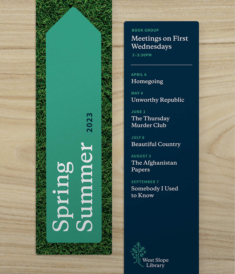
This charming library needed a modernized brand that feels rooted in its local heritage while reflecting a bright tone of accessibility and openness to all.
This project was an extension of our work with its parent organization, the Washington County Cooperative Library Services. WCCLS was refocusing its priorities on being more reflective of, and accessible to, all people in its community. They wanted to showcase their vision in West Slope, where the library is nestled in-between homes within a quaint neighborhood setting.
Design foundations
Experience Principles
Rooted in local heritage
Signal a sense of timelessness in style by carrying forward aspects of its existing identity and honoring its beloved history.
Warm & welcoming
Create a feeling of friendliness and accessibility.
Curious
Inject moments of cleverness to the visual experience.
Joyful & bright
Bring out the sense of joy in learning and connecting with community.
The Visual System
The massive fir tree that stands prominently on the library grounds was the inspiration for both our brand mark and a set of icons we created to support brand messaging. Each icon uses pine needles from the brand mark, creating a cohesive set that is centered around ideas of growth, reach, and community.

A visual system built for library staff
To accommodate their small staff and lack of in-house designers, we designed a versatile design system from a set of core shapes and iconography to create flexible use cases through engaging color contrasts, pattern, and image framing.


We had fun making a variety of collateral, including newsletter templates, bookmarks, T-shirts, social media posts, printed reports, and more. We also delivered an attractive and simple wayfinding system for the physical library.


S&C listened to our needs and ensured that the new branding reflected the library’s values of public service and a patron-first approach. We uphold the value that libraries are for everyone, and S&C worked diligently to make sure that the accessibility of the new design exceeded industry standards.


Project Scope
- Brand Guidelines
- Logo Design
- Positioning
- Signage & Environmental Design
- Visual Identity Systems
- Staff Engagement
- Workshops & Focus Groups
- Audience & Channel Analysis
- Campaigns
- Email Newsletters
- Marketing Assets
- Photography Direction
- Social Media


