With a mission to change the culture, the Steve Fund promotes the mental health and emotional well-being of young people of color.
The team at the Steve Fund was looking to redefine itself, expand its reach, and appeal to a new level of donors and partners. We helped the organization clarify its position and purpose through a new brand strategy and visual identity.


Establishing the foundations
Building a strong brand strategy
During the branding process, we took a deep dive into their many audiences, from students to college executives and administrators to donors and philanthropies. We simplified the story by preparing several detailed personas that gave their leadership insights into how to tell the story. We looked at other mental health organizations to understand the Steve Fund’s key differentiators, and wrote a declarative brand position statement that gave them a clear direction.
Defining the brand personality
Spirited
The organization brings a daring, enthusiastic dynamism to everything it does.
Determined
They are committed to making an impact in the community. They bring power and focus to their unapologetic demands for change.
Intentional
They are discerning and thoughtful about their work, bringing an evidence-based approach to every decision.
Trustworthy
They are empathetic and compassionate. Colleges and businesses are entrusting their young people to the Steve Fund, and their caring, sincere style is what sets them apart.

A memorable, distinctive visual identity
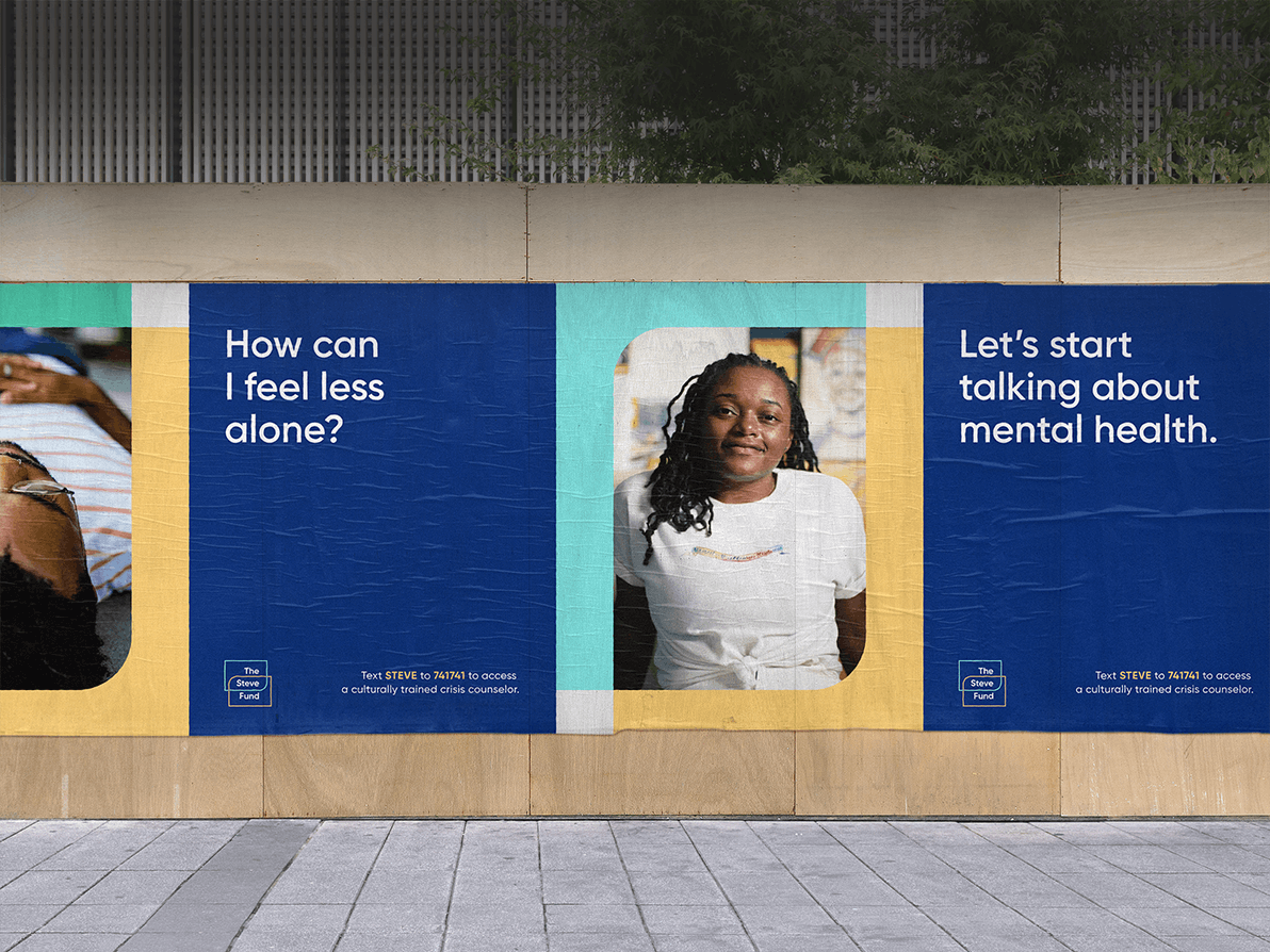
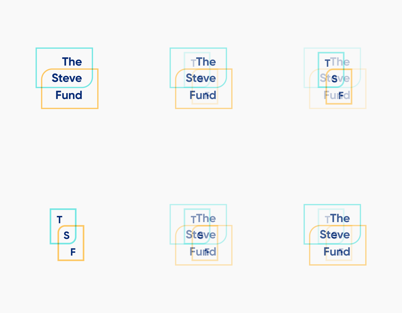
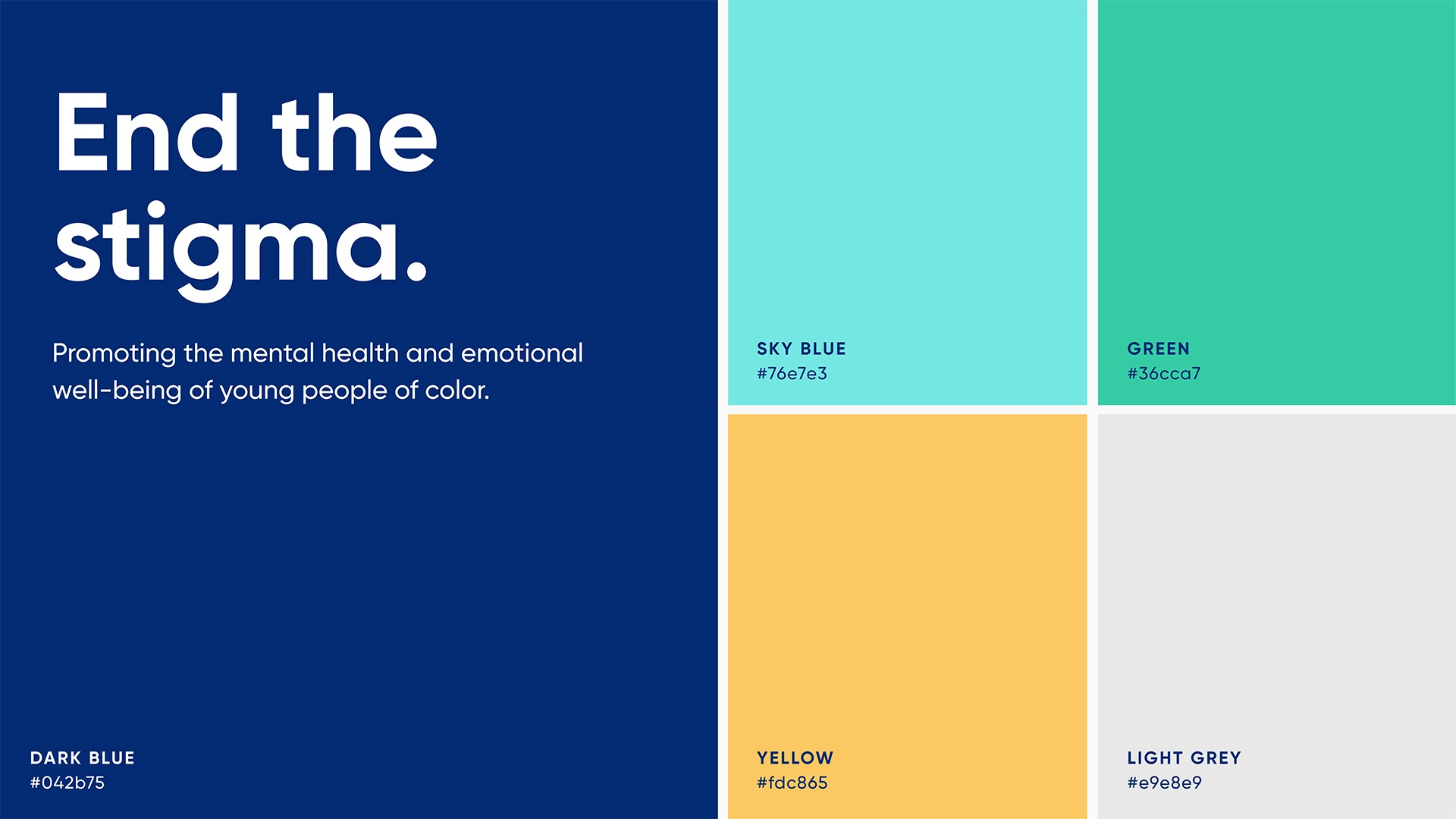
The new logo and visual identity of the brand grew directly out of the brand strategy. The logo represents a coming-together of resources, tools, knowledge, diverse mental health expertise, and an inclusive community of action to support people of color in college and professional settings. The color palette is bright and sophisticated with touches of warmth. Our photography direction is based on conveying confidence and optimism.






Project Scope
- Brand Guidelines
- Brand Strategy & Messaging
- Core Messaging
- Logo Design
- Positioning
- Visual Identity Systems
- Voice & Tone Guidelines
- Change Management
- Interviews
- Surveys
- Workshops & Focus Groups
- Audience & Channel Analysis
- Campaigns
- Communications Strategy
- Email Newsletters
- Marketing Assets
- Marketing Strategy
- Photography Direction
- Presentations & Pitch Decks
- Social Media
- Digital Tune-Ups
