Local community-minded entrepreneurs were building a new hotel in downtown Portland and needed a brand that articulated their vision.
We helped the four co-founders gather to dream and distill their various perspectives into a singular vision to rehabilitate what was once the home for the seamen’s society into a place for all people in the community to come and find respite. We helped them name the project as a nod to the building's history and then designed a logo and brand identity that feels both classic and contemporary.
The visual identity became the basis for bringing their budding brand to life inside the walls of the new hotel, including door hangers, postcards, a Choose Your Own Adventure physical interactive, T-shirts, business stationery, and a massive exterior sign inspired by the great Portland signs. They used the brand identity to inspire and guide their interior design effort, ensuring that when you walk in the doors of their Portland or Bingen, WA hotels, you are walking directly into the essence of the brand.


A new brand for an old neighborhood
Developing a brand strategy and name
The hotel was a new concept in Portland, home of cooler-than-cool boutique hotels from Seattle or stuffy institutions. The brand needed to represent what’s important about Portland: an accessible place filled with adventuresome spirit combined with a love of life and honoring without fetishizing the past.
In the 1880s, the building was called the Mariners Home, built by the Portland Seamen's Friend Society as temporary sailors’ quarters. We chose the name The Society Hotel to connect with the building’s history and its future as a welcoming cornerstone of a neighborhood.
Defining the essence of the brand
Accessibility
At the center of the city, reasonable pricing, non-snooty experience, friendly.
Authenticity
Smart and open, about being who you are, not putting on airs, independent.
Comfort
Warm and rustic refinement, quality accommodations, well-designed, an “urban lodge.”


An icon in the spirit of Portland’s great neon signs
The owners wanted a monumental sign mounted on the corner of the building that would be a beacon for weary travelers and a new landmark image in Downtown Portland. As the hotel is situated in the heart of Chinatown (and Jessie, one of the co-founders, is Chinese), they wanted to honor the community in which their new hotel would sit. The Chinese-inspired cloud shapes at the top and bottom of the sign represent hope, and the Chinese word for “Welcome” invites visitors to the hotel.

All the things that make a hotel brand special
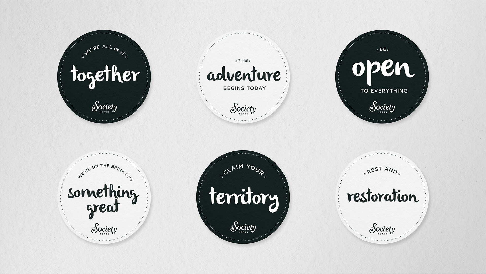
Once we had a contemporary and eternally classic logo, that’s where the fun started: We designed cheeky door hangers that patrons love; coasters that inspire adventure for the lobby cafe and in the rooftop bar; and in the lobby, a physical interactive experience that asks visitors to write about their Portland adventure for the benefit of their fellow guests. This feature has become a living wall of communication — a sign of the community the founders were trying to create.


Smith & Connors has an uncanny ability to exactly understand the concepts in my head and bring them to life. Their guidance and partnership in helping create the iconic brand of our hotel, when it was just thoughts and ideas in 4 co-owners’ heads, was a truly exceptional experience. Their work became the basis for all of the decor and marketing that followed. They are an incredible team, and know just how to facilitate our work sessions to develop our vision. I’ve hired them for several projects, and had my expectations exceeded every time, which is not easy to do!

Project Scope
- Brand Guidelines
- Brand Strategy & Messaging
- Logo Design
- Naming
- Positioning
- Signage & Environmental Design
- Visual Identity Systems
- Interviews
- Workshops & Focus Groups
- Marketing Assets