Oregon Health Leadership Council (OHLC) is a uniquely neutral table where healthcare leaders from across the sector meet to improve care, lower costs, and solve workforce issues. They came to us to find ways to intensify their impact.
OHLC faced the challenge of presenting a more cohesive and warmer image that would resonate with a wide range of healthcare leaders and beyond. They needed a new way to tell their complex and compelling story to show how much change they’d already effected, and all of the possibility of the future. With a vision of equitable, sustainable, and accessible healthcare, OHLC needed a brand that could unify its diverse audiences and communicate its mission effectively.
Awards & Recognition
Research and Brand Strategy
Simplifying a complex story
We conducted one-on-one interviews and group workshops with OHLC’s various audiences to explore the organization’s audiences, goals, and challenges. We then developed a strategic brand framework that encompassed audience definition and segmentation, a clear brand position, and revised mission and vision statements. With the strategy in place we could move into design.
Brand personality drivers
A crucial element of OHLC’s brand strategy is their voice. What are the roles they play in the world, and how do those drive the way they speak? They need enough flexibility within a strong framework to embody their powerful brand. These personality traits also help shape the visual identity later in the process.
The Connector
This driver speaks to OHLC’s approachability and community orientation and its ability to build harmony.
The Pathfinder
This speaks to OHLC’s dynamism and vigorous work in illuminating a way forward.
The Steward
This speaks to the organization’s sense of responsibility, thoughtfulness, and diligence.


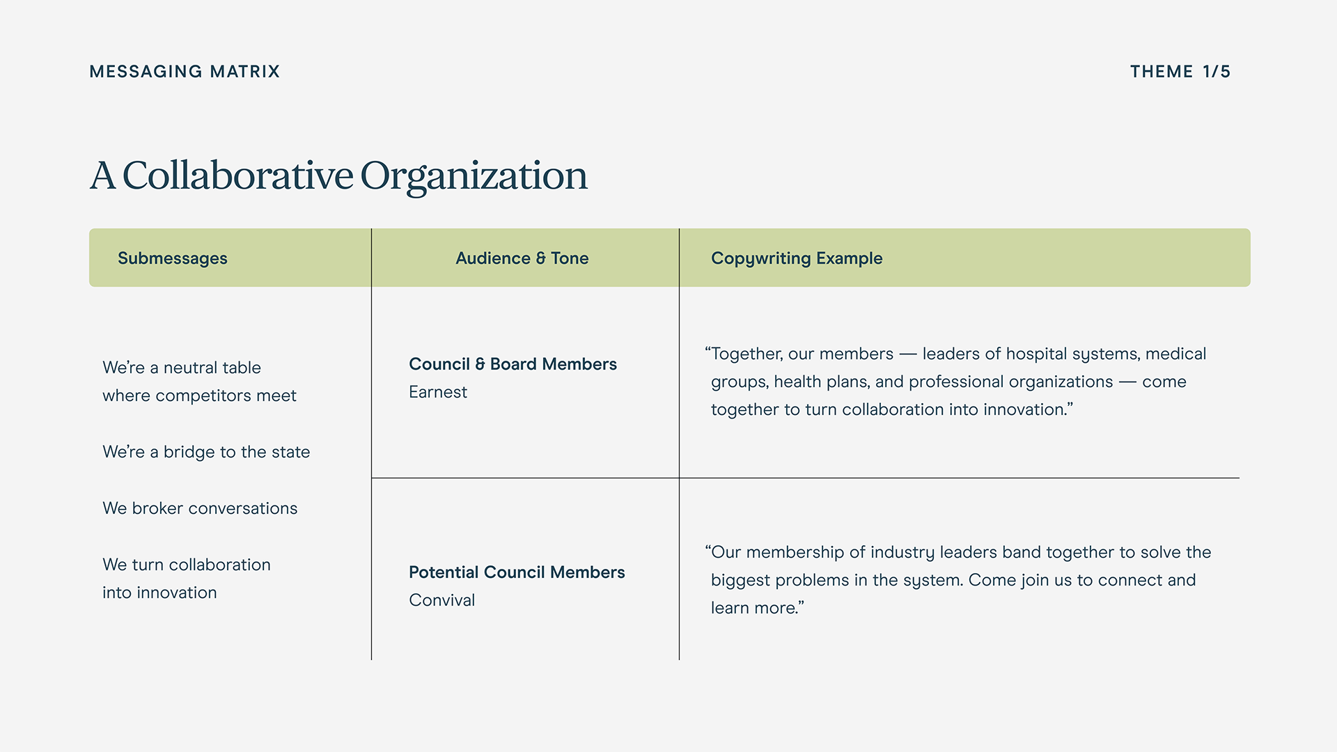
A messaging matrix
A key part of the strategy was identifying and crafting a strategic messaging framework for OHLC that communicates the value it provides. These messages form the foundation of all communications and ensure a unified voice. They can be tailored to specific audiences who are particularly receptive, but overall these messages, supported by proof points and examples, help to reinforce OHLC’s credibility and impact. Board members and staff can easily follow the framework to help strengthen the brand.


Creating the core brand elements
OHLC’s visual brand needed to embody the organization’s values of trust, collaboration, and innovation. Our team developed a modern and professional visual identity that included a distinctive logo, a thoughtfully curated color palette, and clean, legible typography. The color palette, featuring deep blues and greens, symbolizes stability and growth, while complementary shades of orange and teal add a touch of vibrancy and approachability. We also designed custom patterns that visually represent OHLC’s commitment to connectivity and collaboration.
Additionally, the iconography was crafted to be both functional and symbolic, representing key areas of focus and initiatives in a clear and engaging manner. These visual elements work together harmoniously to create a cohesive and compelling brand identity that resonates with OHLC’s diverse audiences.


Extending the brand into the world
A brand is nothing if it doesn’t live in the real world. OHLC is always out there speaking to the sector in Oregon and telling their story around the country. We developed designs for a variety of applications, including print and digital reports, slide deck templates, Zoom backgrounds, and of course, letterhead and business cards. The more consistent they can be, the more receptive people will be to their compelling work.


Making social media communications easy
Many organizations such as OHLC do big work and have small communications teams trying to spread the word. We developed a content pillar framework so they could focus their energies. We also developed a fully custom Canva template library, so making beautiful, on-brand social media assets is a breeze. With various colorways and content elements, nothing ever has to look canned or tossed-off. We built a reference guide for how to use the Canva system to maintain continuity and institutional knowledge.


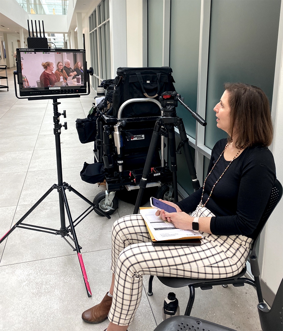
Telling the story through video
OHLC’s story is complex, and we had an opportunity to create a singular asset that leadership can use to reintroduce themselves to the world and communicate their purpose and value. We wrote a script, made storyboards, shot, and edited an explainer video that elegantly and beautifully tells their audiences what they need to know to want to know more. The video featured interviews with council members and staff, as well as motion graphics sequences to help illustrate their story. Watch the video below.

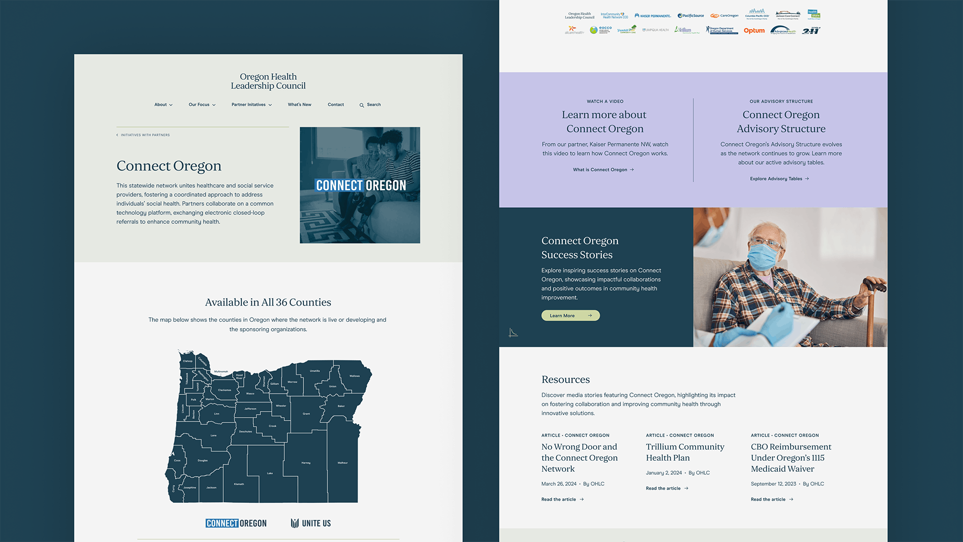
A flexible and powerful digital home
OHLC’s website was out of date and was difficult to update. We created a new site for OHLC built on WordPress using modular components. The site is dynamic, user-friendly, and has an intuitive structure that allows users to easily find what they’re looking for. The site’s clean aesthetic effectively communicates OHLC’s impact and fosters stronger connections with their audience. And OHLC’s internal team now has a tool that is easy to update. They can create new content and new pages. As the organization changes over time, the site will remain relevant. As initiatives sunset and new ones are added, they can easily add stories and resources.


Smith & Connors’ brand transformation exceeded all expectations and positioned us as a true leader in healthcare. They took the time to fully understand our company, its culture, and future goals, ensuring that their design work reflected our brand's true essence. Their collaborative and flexible approach has significantly improved our business. We’ve seen a high uptick in engagement—real ROI—and our members have clarity and pride about the mission of OHLC. We love the final logo, identity & website, and I couldn't imagine our brand looking any better than this!

Project Scope
- Brand Guidelines
- Brand Strategy & Messaging
- Core Messaging
- Logo Design
- Naming
- Positioning
- Print & Collateral Design
- Visual Identity Systems
- Voice & Tone Guidelines
- Change Management
- Interviews
- Staff Engagement
- Surveys
- Workshops & Focus Groups
- Audience & Channel Analysis
- Campaigns
- Communications Strategy
- Copywriting & Content
- Marketing Assets
- Marketing Strategy
- Motion Graphics
- Photography Direction
- Presentations & Pitch Decks
- Social Media
- Video Storytelling
- Content Development
- Content Strategy
- Digital Tune-Ups
- Documentation
- SEO Strategy & Optimization
- Web Design & Development