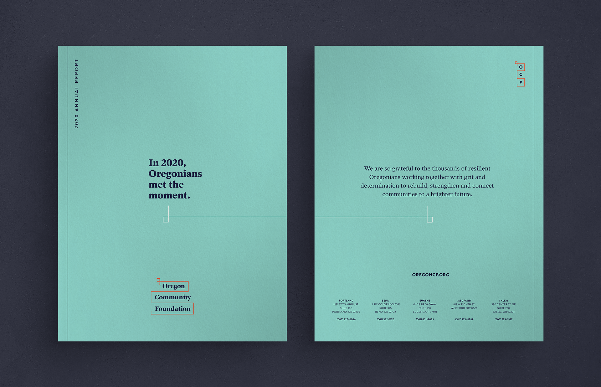
At the end of 2020, the year when racial injustice, wildfires, and a pandemic converged in force on our state, Oregon Community Foundation needed their annual report to tell a complex and uplifting story.
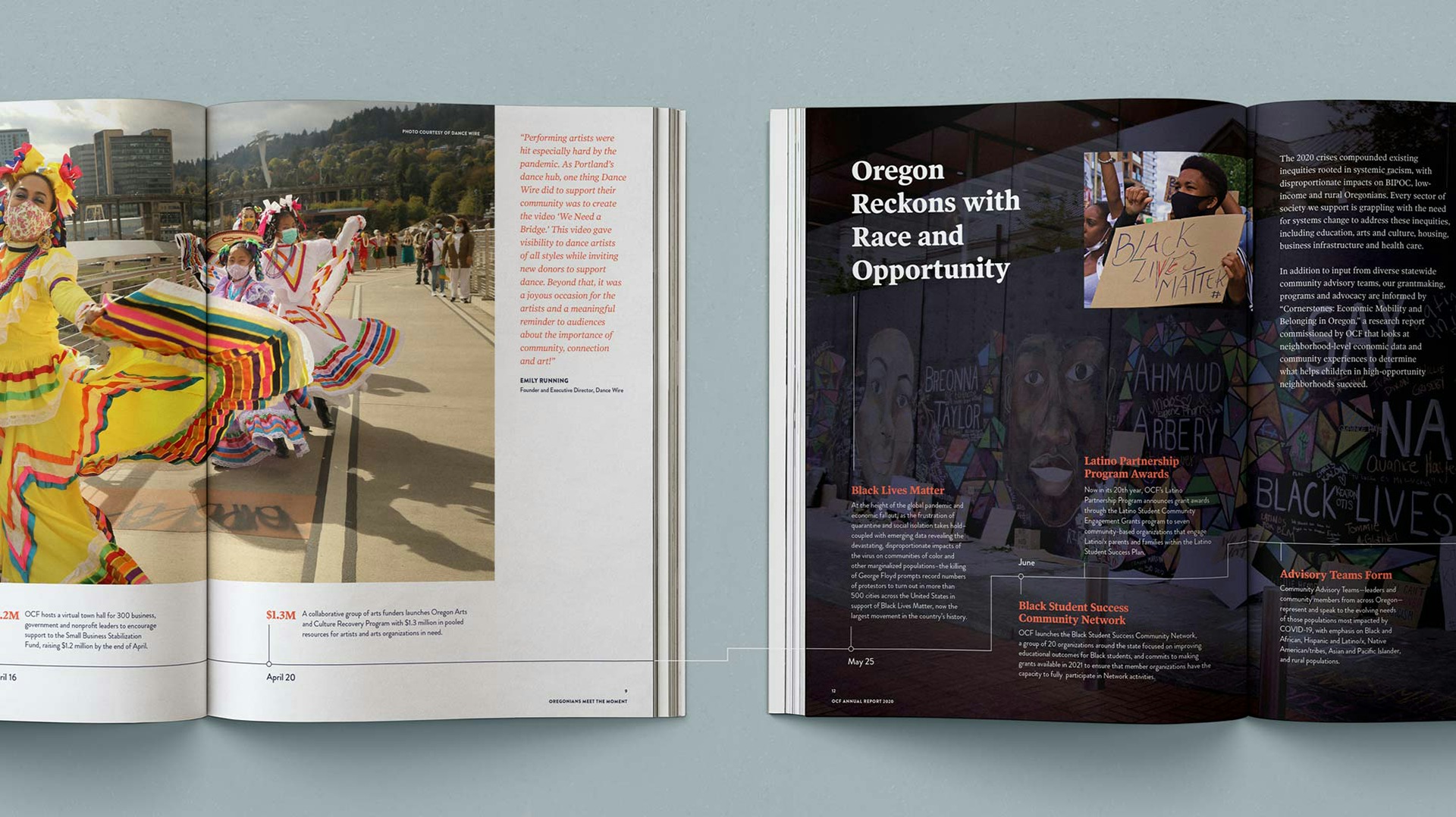
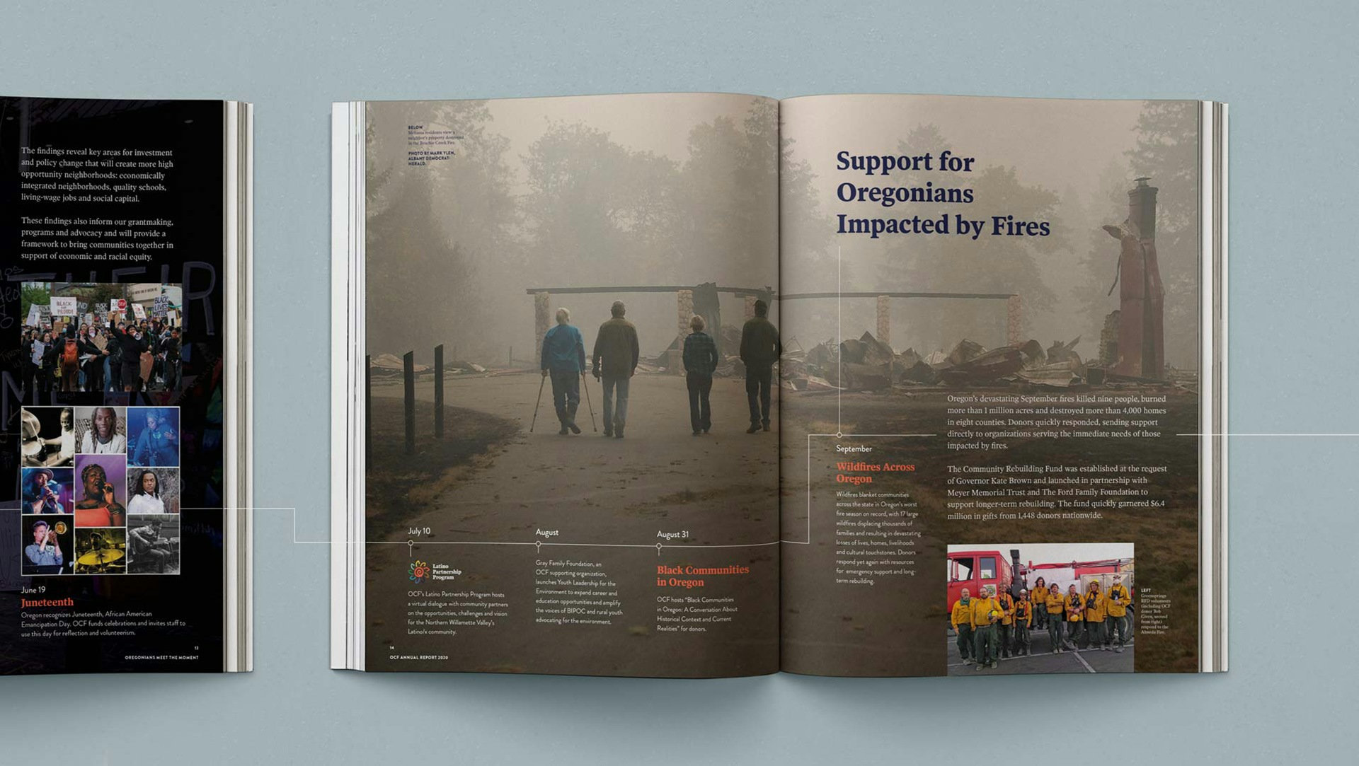
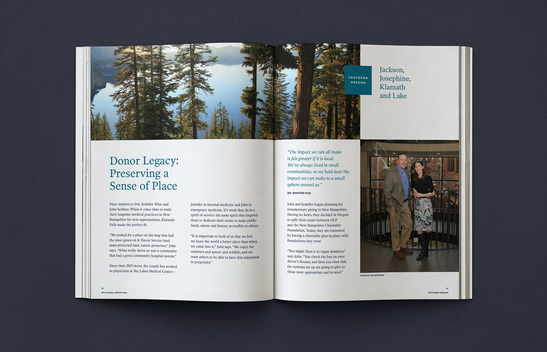
This year’s annual report needed to carry a different weight. It needed to match the gravity of our experience, reflecting both the dark and the light. We worked with OCF’s leadership to conceptualize the publication based on real people, real stories, real communities that rose up, showed up, and made a difference. The emphasis was on the people of Oregon, not the organization — those donors, partners, nonprofits, and volunteers who met the moment with generosity, love, and mighty effort.
The strategic foundations
A consistent throughline
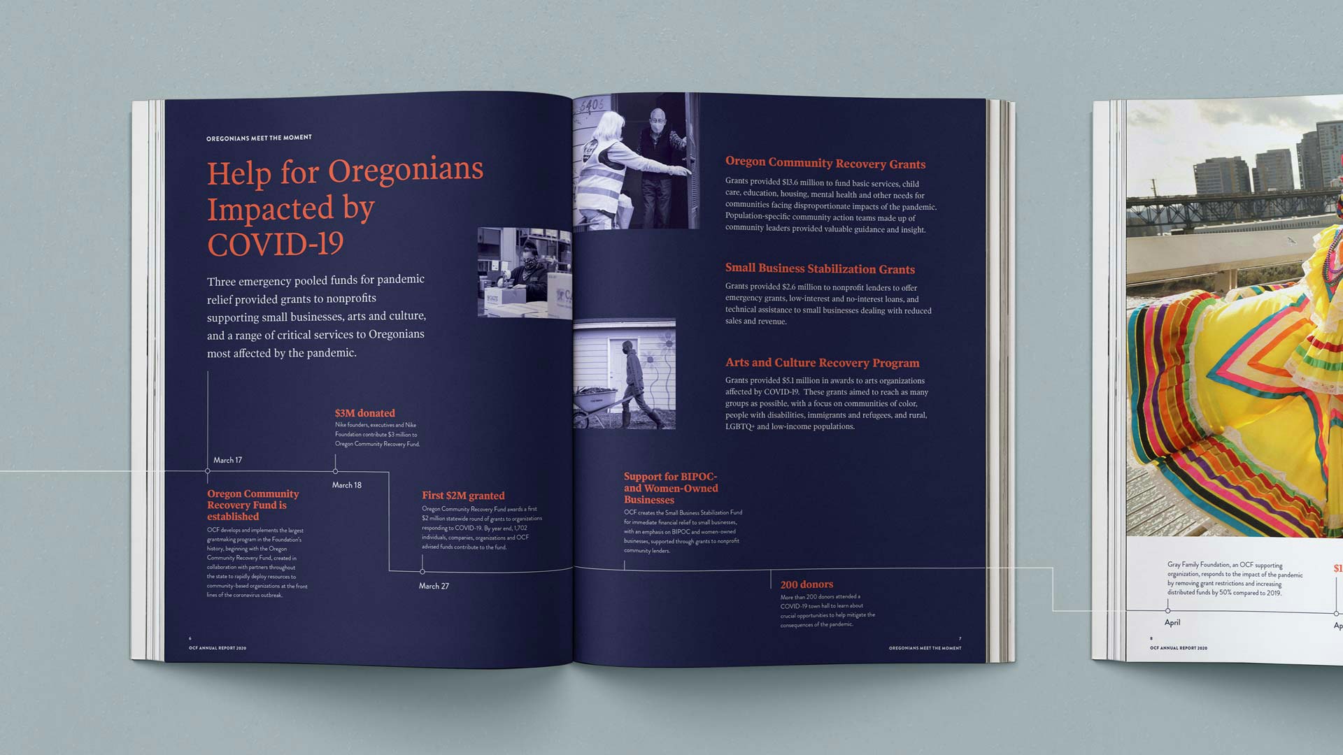
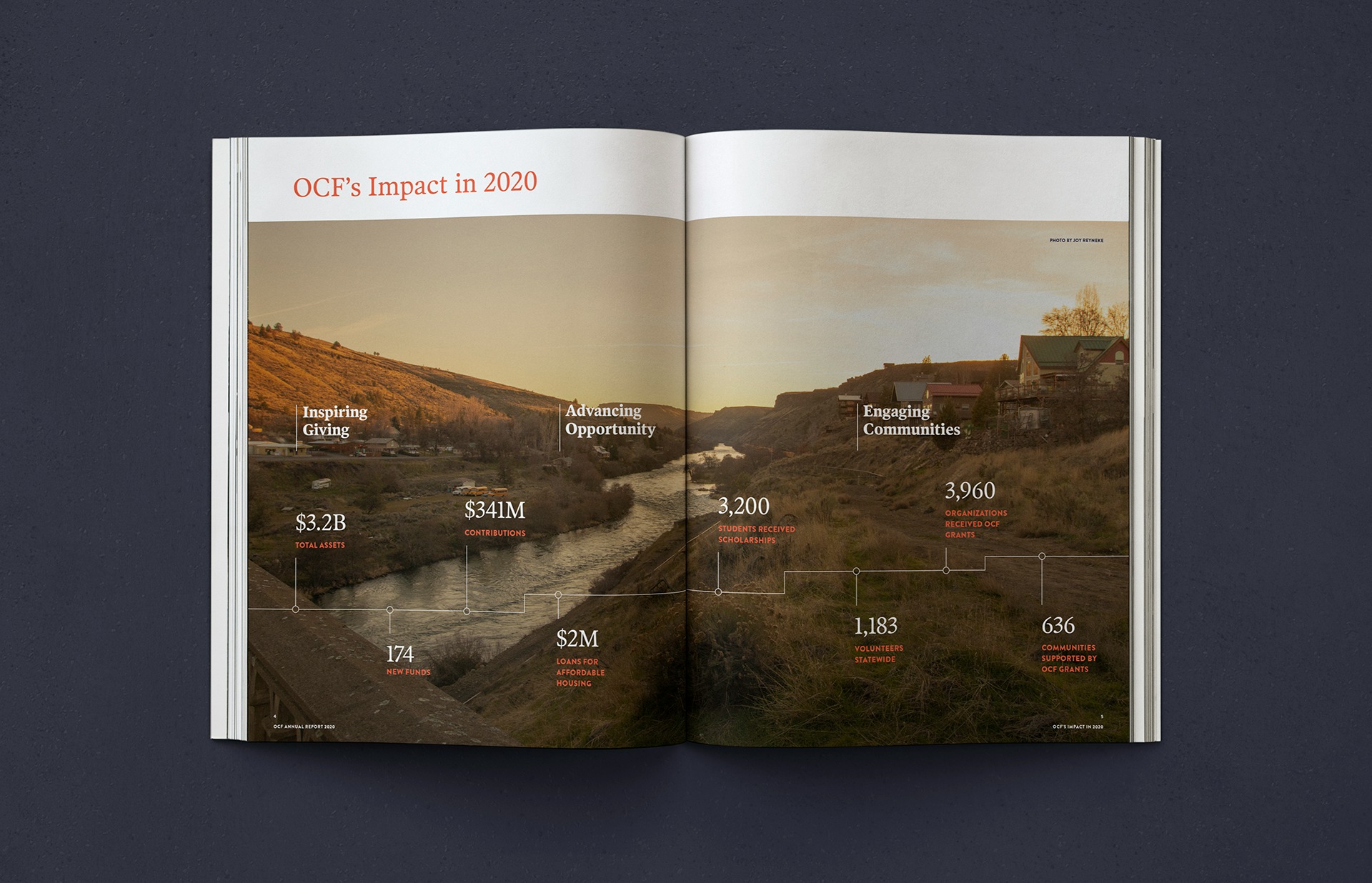
We used the brand element of "the line" to create a timeline throughout the report, starting with a stark cover and a bold statement. The line winds through the pages, through despair and joy, until it reaches the back cover to a statement of gratitude. It connects people, events, stories in the report. At times, you'll see the line packed with events and stats to dramatize how much effort was mounted in such a short time. Page by page, the imagery hints at extreme highs and lows throughout the difficult year. (Check out our Insights post where we delve deeper into the use of the line.)
Defining the experience goals
Contrasting dark and light
2020 was a tough year but through adversity we also saw hope.
Revealing complexity
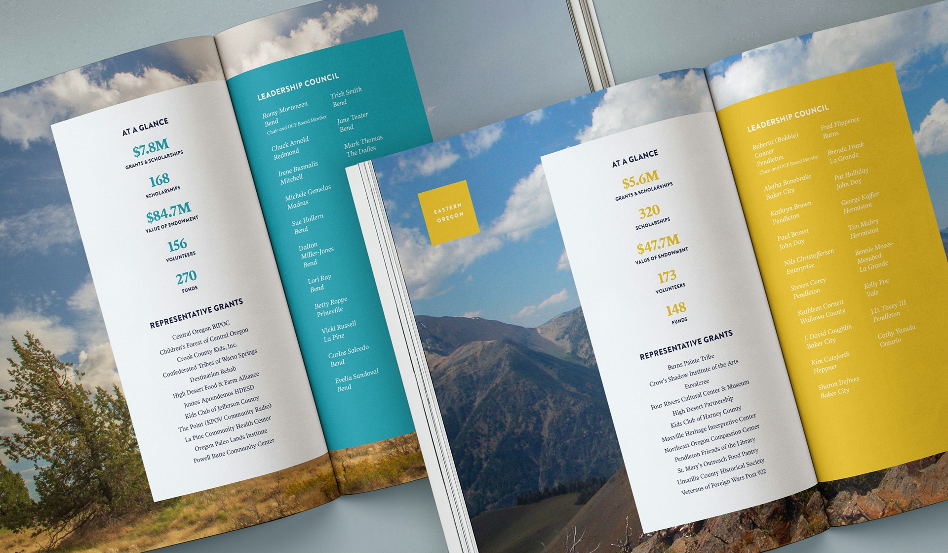
There was so much effort and action. It is important to show all of the different gears that were turning that year (and every year).
Stability and consistency
OCF is stable, consistent, and a bridge across Oregon, difference, issue, and need.
Humanity and connectedness
Oregonians — the people themselves — proved that our communities of donors are resilient, connected, and believe deeply in equity.
Smith & Connors’ design talent stands out in our 2020 Annual Report. They capture the urgency and challenge of the moment, emphasize Oregonian humanity in delivering important work, and strike just the right balance of gravitas and hope as we look to a future of working together to address thorny, entrenched issues facing our state.
Project Scope
- Workshops & Focus Groups
- Marketing Assets
