With five regional offices, 45 years in service, and almost 100 staff members, Oregon Community Foundation is the state’s largest public foundation.
Their brand had become out of date and didn’t reflect the dynamism of the organization. They were struggling with brand awareness and people didn’t understand what they do. And like many institutions, over time their visual identity and messaging became inconsistent and misaligned with their strategic direction. OCF worked with us on a multi-year project to reposition their organization from the inside out and revamp their entire identity. Our work started at the core and cascaded outward to every asset, media, and channel.
“The result of our work with Smith & Connors has been an extraordinary and transformative shift in culture and communications.” —Stephanie Swanson, VP of Marketing & Communications.

RESEARCH AND BRAND STRATEGY
Bringing everyone to the table
OCF’s brand process kicked off with an extensive research and discovery phase, which included more than three months of audits, interviews, focus groups, and workshops. All in all, we talked with more than 100 people both inside and outside of the organization, including leadership, staff, the engaged board, the nonprofit community, donors, partners, and more.
Brand personality drivers
Early on in the process, we establish brand personality drivers. These are accurate and aspirational roles that the organization inhabits. It drives our process of moodboard creation, voice and tone, visual identity, and more.
The Approachable Guide
Responsive, helpful, flexible, caring, welcoming, inclusive, consultative
The Steadfast Steward
Knowledgeable, stable, wise, trusted, data-driven, sophisticated
The Tireless Optimist
Committed, energetic, passionate, proactive, confident
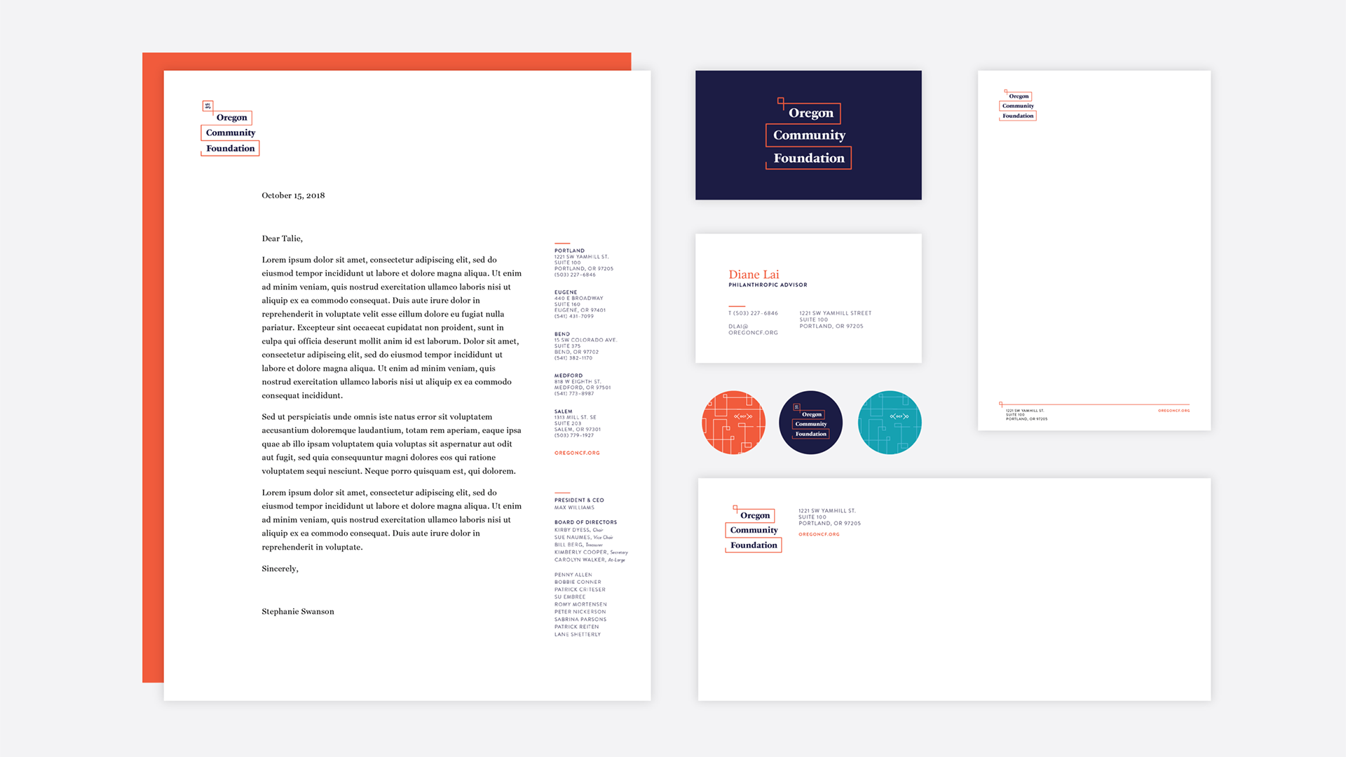
A New Visual Identity
Vibrant, inclusive, and stable
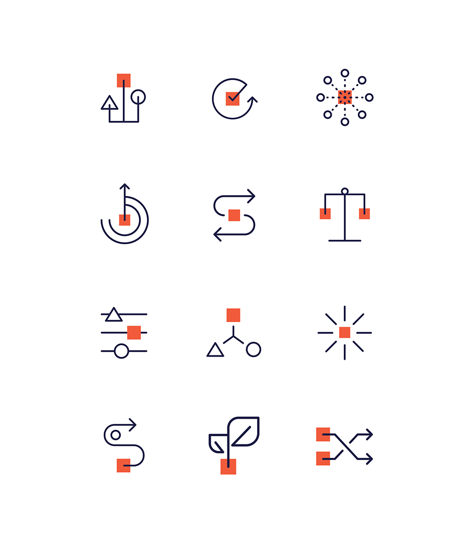
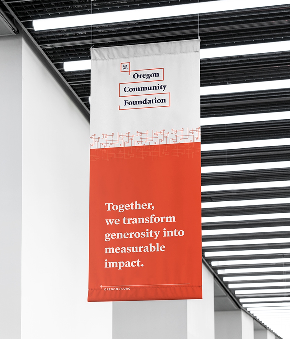
The new logo reflects all of OCF’s brand attributes while also being modern and timeless. The red line signifies the stability and openness of OCF’s mission. At the top it ends in a square loop, a nod toward its heritage and inspired by vintage, structural design concepts. The line weaves around its name set in a bold, conversational serif typeface to convey approachability, connectedness, and seriousness.

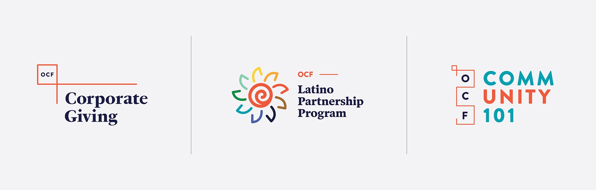
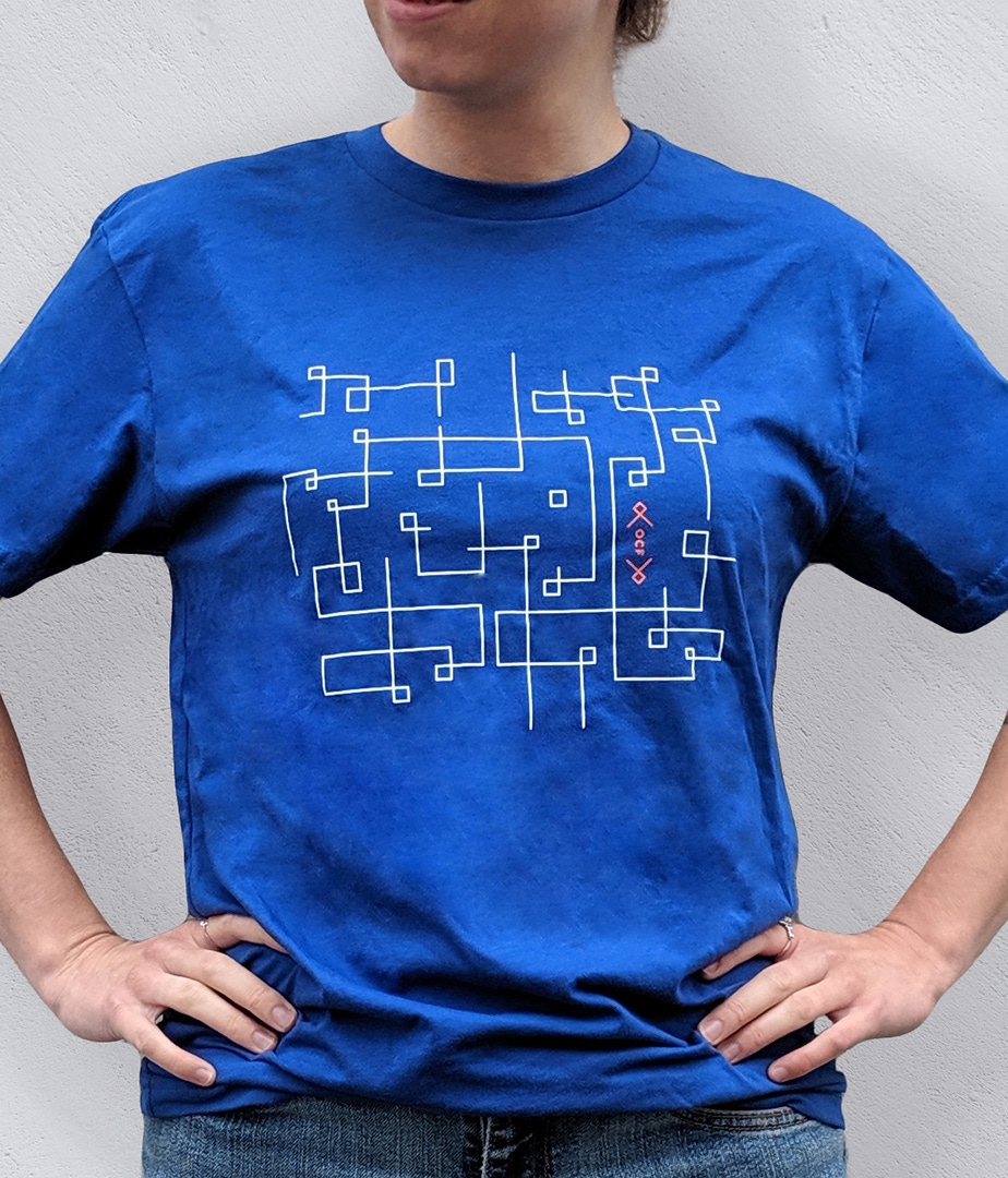
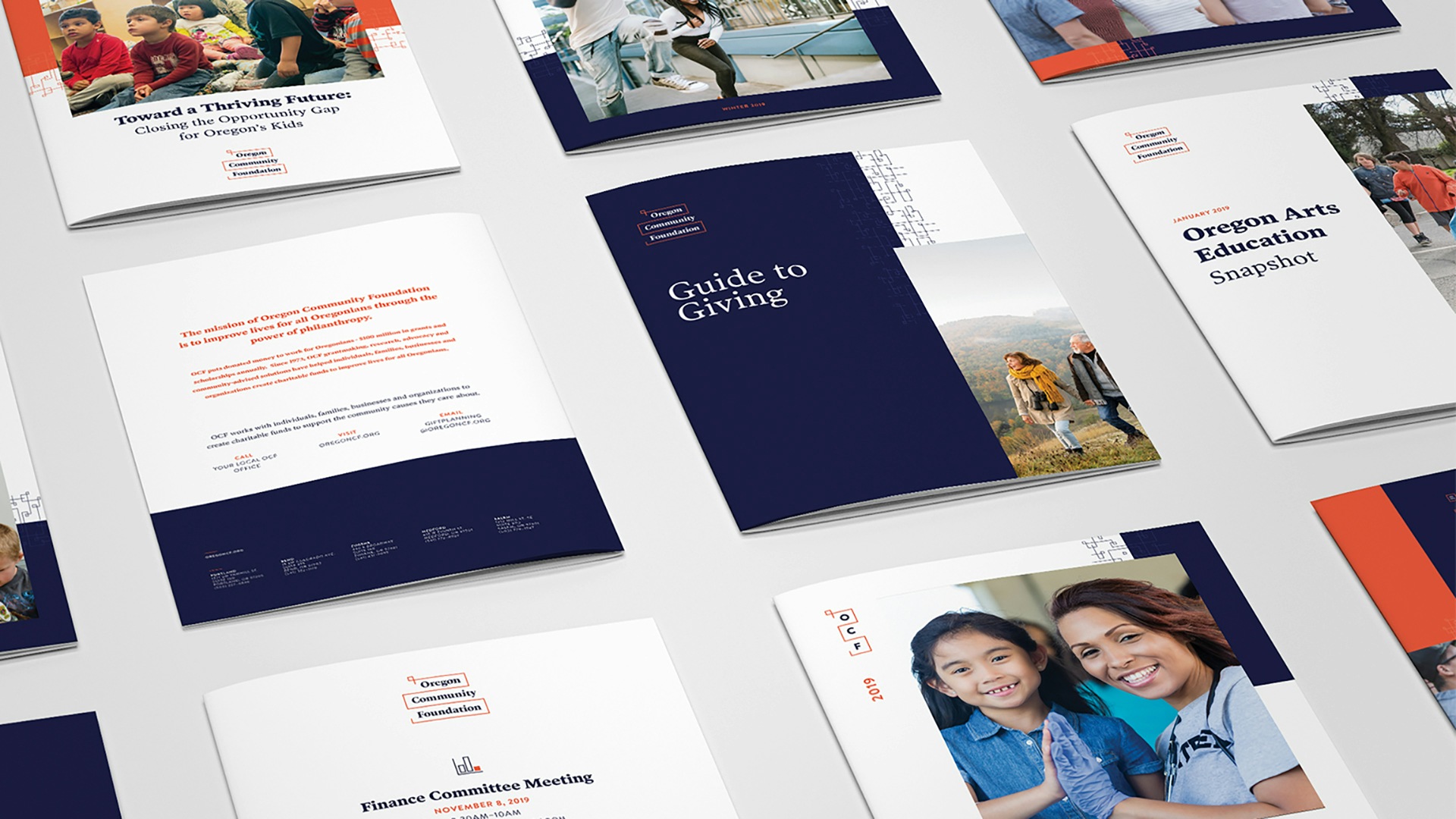
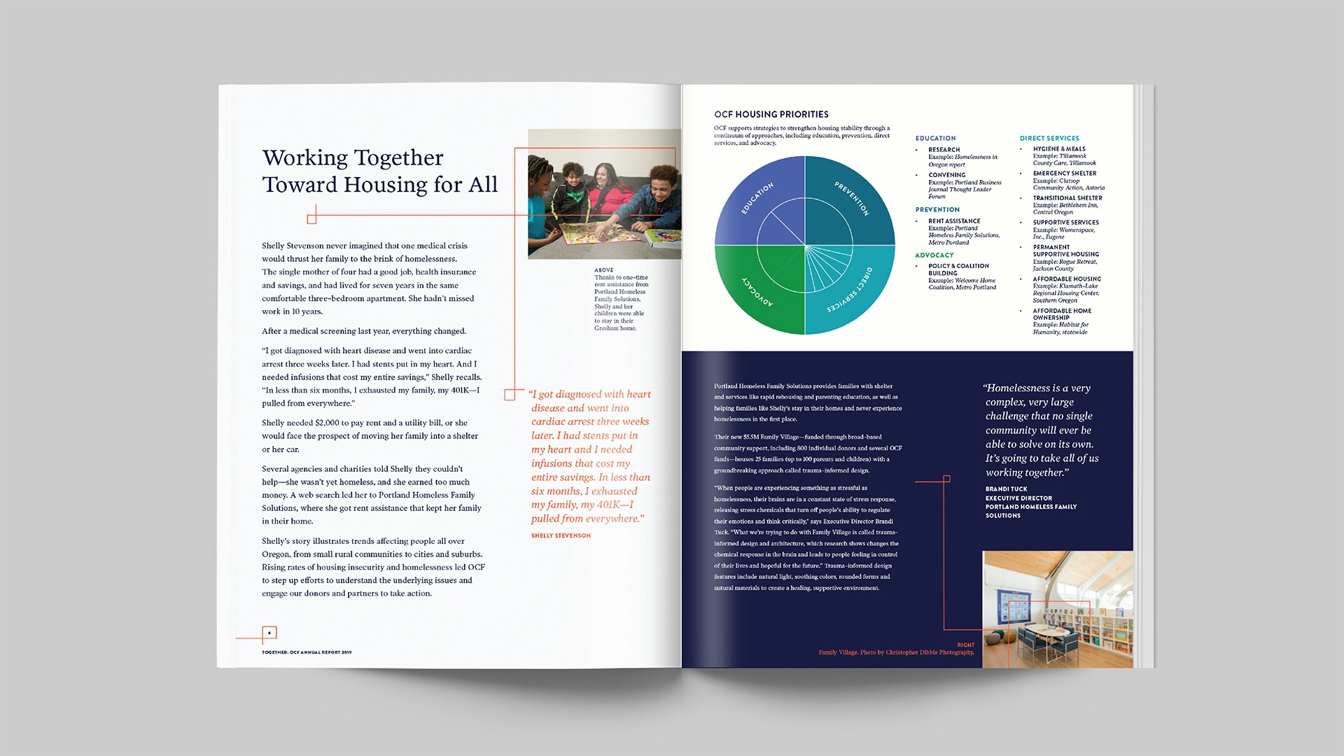
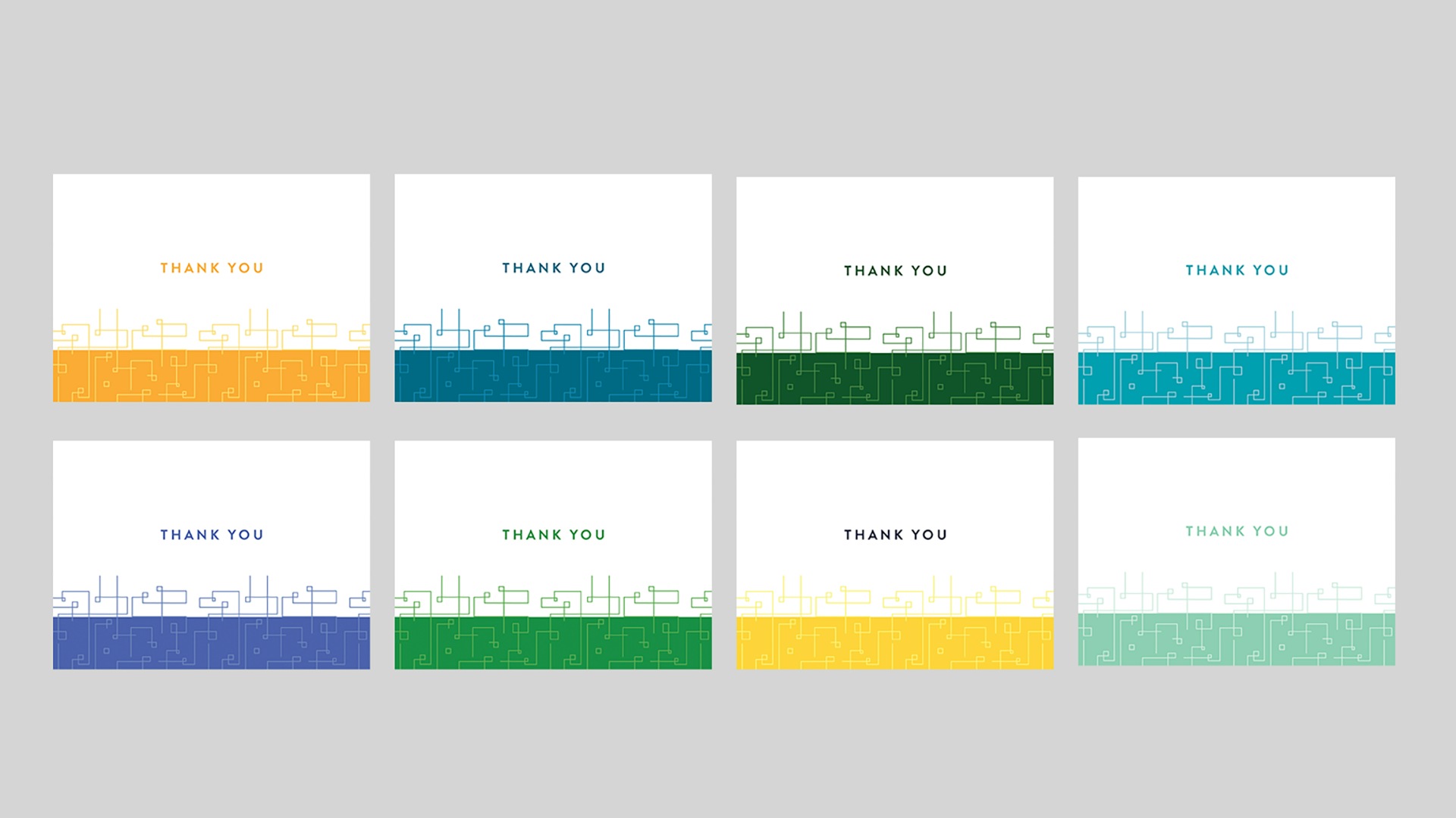
A wide range of brand expressions
A visual identity isn’t useful unless it can adapt to many different types of media. For an organization like Oregon Community Foundation, it’s important to be consistent and clear on the web, but also to have a presence in the real world. The brand shows up in different tones of voice depending on the context.
We designed many different types of materials for OCF, including banners for the their annual donors meeting, T-shirts, totes, brochures, and takeaways. The brand expressions are widely varied and flexible, all while maintaining a true center.

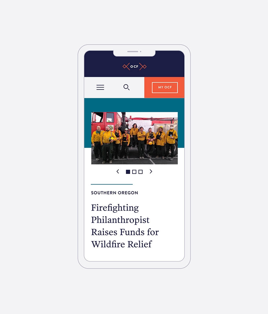
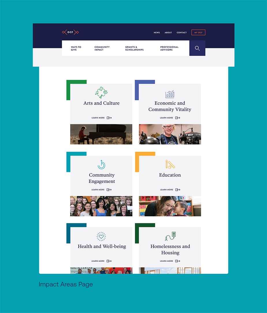
A re-envisioned website
OCF’s website is more than just a source of information. It’s the the first impression of potential donors, a portal for young scholarship seekers, an entry point for overworked nonprofit staff to find grant opportunities. We completely rethought the website experience to make visitor pathways efficient, delightful, and fast. And of course, we made the site easy to update and flexible, so that as communications evolves, so can the website.
Smith & Connors leaves no rock unturned. I worked closely with them for nine months to completely redesign our website and to migrate to a new CMS. From strategic direction and design to technical expertise and execution, their team provided attentive service without ego. And we appreciate the attention they paid to the backend admin experience. Our users love how easy it is to build and update pages. We’ve seen 100% buy-in and positive feedback on using the new system.

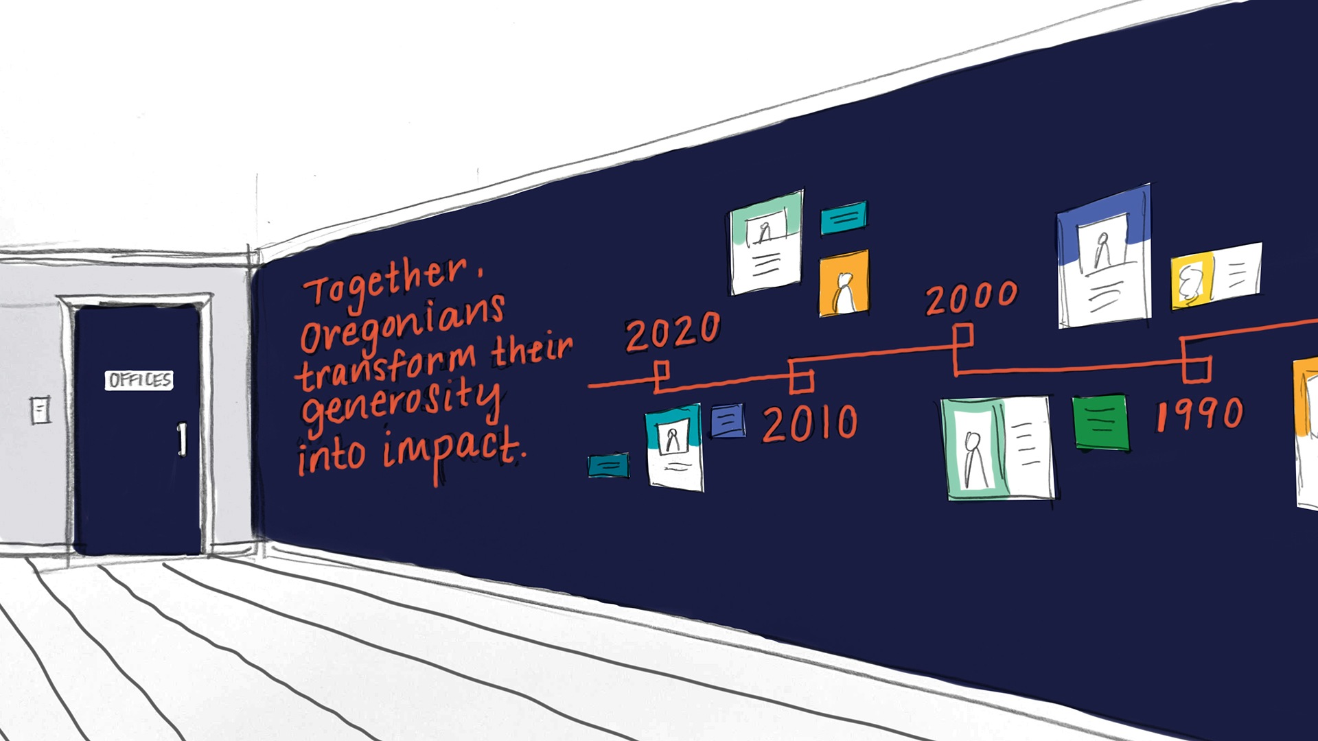
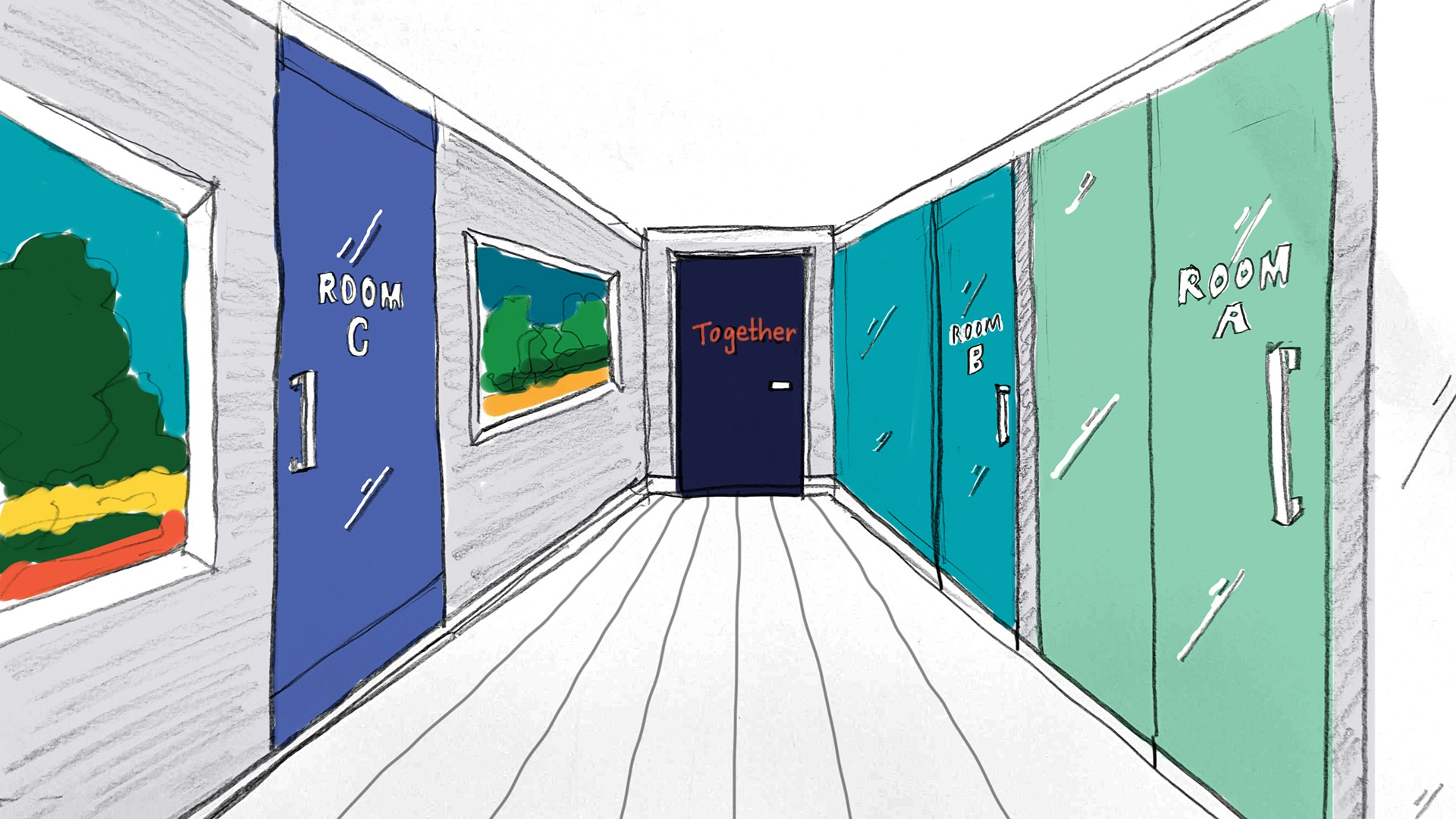
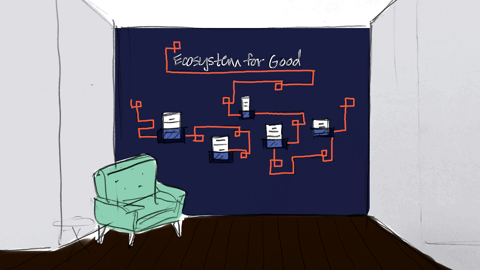
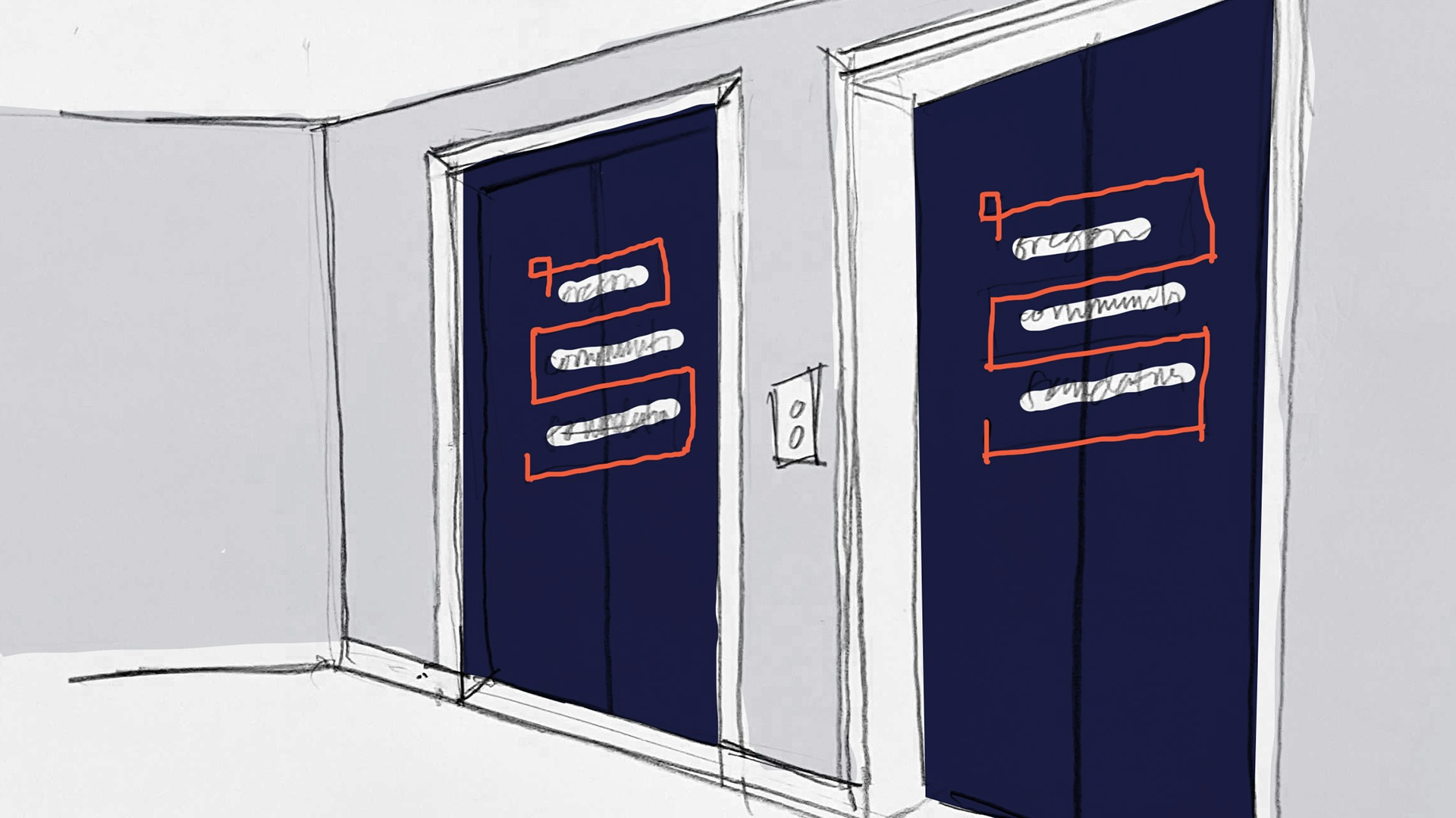
Branding in 3-D!
Just before the COVID-19 pandemic hit and derailed OCF’s plans for their physical space, we designed concepts for branding some of the spaces in their Portland offices, including a timeline, signage, and a visualization of how they work across the state to bring together an Ecosystem For Good.
Many firms understand design — far fewer understand the intersection between design and brand strategy to advance business goals. Smith & Connors deploys both. They embedded themselves in the inner-workings of OCF — a large and complex organization who's business had long out-paced our brand story. They are a team of great listeners, thinkers and designers who make the work smart, interesting, and FUN!

PROJECT SCOPE
- Brand Guidelines
- Brand Strategy & Messaging
- Logo Design
- Positioning
- Signage & Environmental Design
- Visual Identity Systems
- Voice & Tone Guidelines
- Change Management
- Interviews
- Staff Engagement
- Surveys
- Workshops & Focus Groups
- Campaigns
- Email Newsletters
- Marketing Assets
- Photography Direction
- Content Development
- Content Strategy
- Documentation
- SEO Strategy & Optimization
- Web Design & Development