Sector
Link
Morrison Child & Family Services is a nonprofit that provides culturally responsive, trauma-informed services for children and families.
They had grown and needed a contemporary update to their website to better reflect the vitality of their impactful work and to engage with their diverse audiences more effectively. They brought on S&C to get to organize a new story for their incredibly complex set of services and audiences, streamline the site architecture, enhance the visual design to make it clearer and more inviting, and ensure that the content was accessible and easy to navigate for all users.


A new content strategy
Clear goals and success metrics
We articulated a set of goals for the website that guided the entire content strategy process. The site needed to create a better user experience for visitors, more brand clarity, and increased engagement. Because Morrison has many audiences, we needed to create a site that could inspire brand alignment for all while tailoring the experience for each audience group.
Experience principles
Safety
The site needs to be trauma-informed, in both its language and its visual design.
Leveling
The hero of the site is the visitor and their experience, not Morrison. They need to feel confident in Morrison’s expertise but know that their lived experience is primary.
Simplicity
The story, experience, and presentation — everything should be easy to scan. We want to avoid overwhelm.
Hope
The point of the website is to inspire hope and encourage people to take action — to seek help, donate, volunteer. There is no action without hope.

Hope, joy, connection, and representation
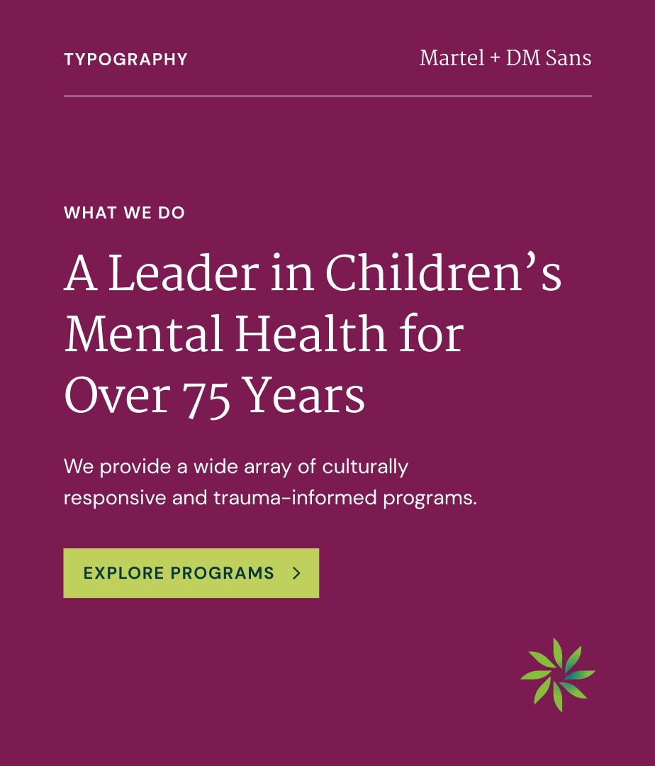
Every element of the design, from the color palette to the imagery, is crafted to evoke a sense of positivity and inclusiveness. Our customization of Morrison's new site equips their team with the tools to customize and create the mood they want, where they want, throughout site pages. This flexibility ensures that their online presence reflects their mission and resonates emotionally with their diverse audience, fostering a deeper connection and engagement.


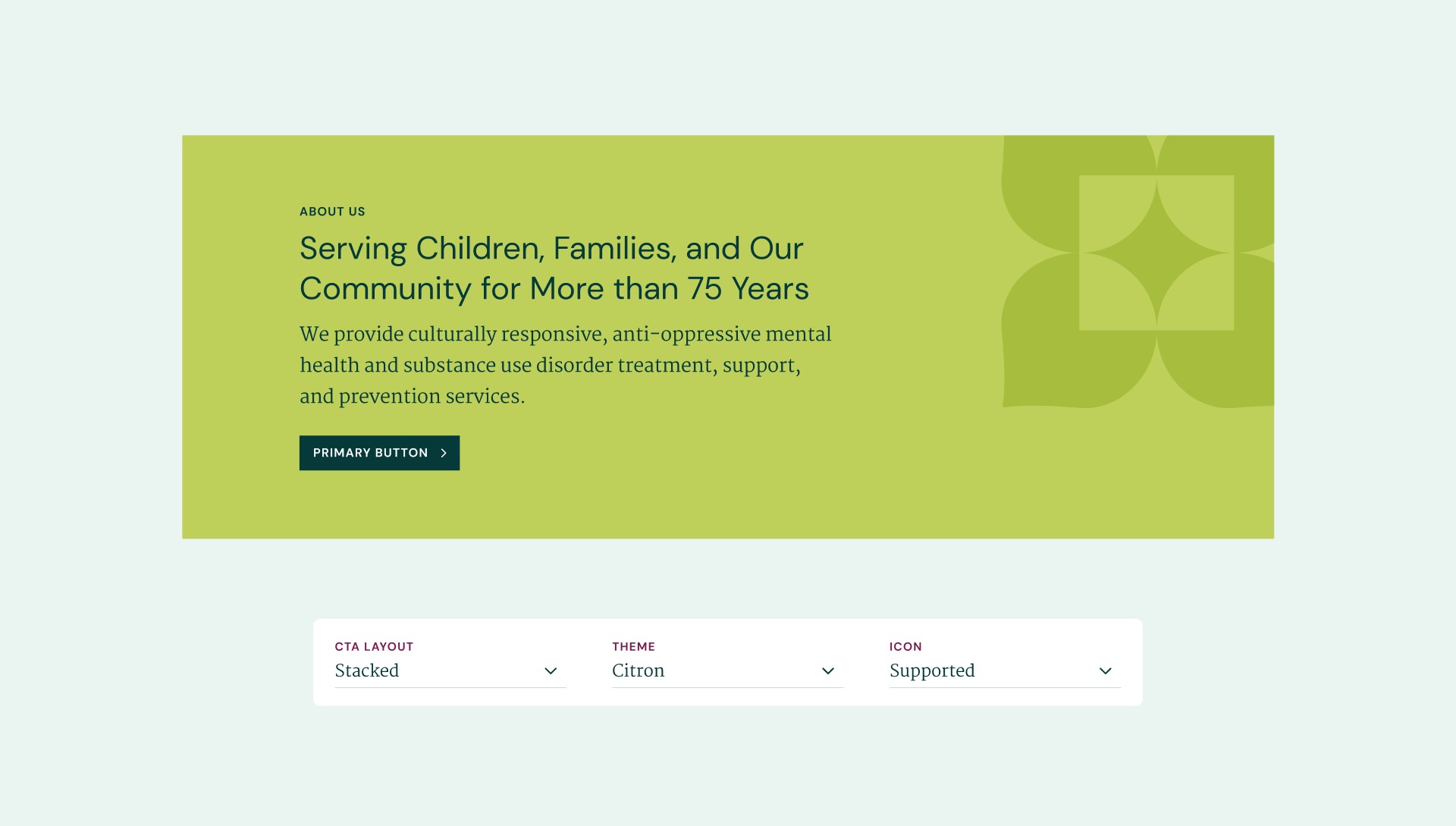
Good text hierarchy makes things easier
We designed Morrison’s site to enable visitors to quickly scan and find the content they need. A lot of information needs to be on each page, so we created a way to strategically place headings to guide users effortlessly through the site, allowing them to access relevant information with ease. The clean, uncluttered layout ensures that key messages stand out.

Editing and coaching on content
To ensure that Morrison effectively conveyed their messages, we provided comprehensive content support. We developed a collaborative process that allowed Morrison to work closely with us as editors and coaches. We guided them in selecting impactful headlines, reducing word counts, and creating a clear information hierarchy. This approach ensured that the content was both engaging and easily scannable, making it accessible and effective for their diverse audiences.


We absolutely love our new website and loved making it with Smith & Connors. They are talented, creative, responsive and adaptive. They effectively communicated and partnered with us to design and build a beautiful, highly functional, and flexible website on time and on budget. We now have a website reflective of our brand and the quality of our work.

Project Scope
- Staff Engagement
- Workshops & Focus Groups
- Content Development
- Content Strategy
- Documentation
- Web Design & Development