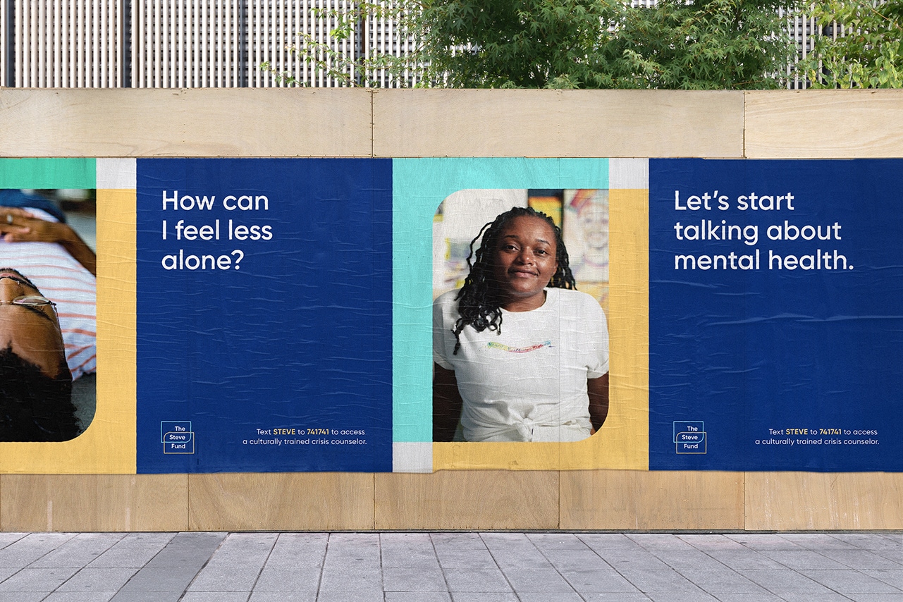
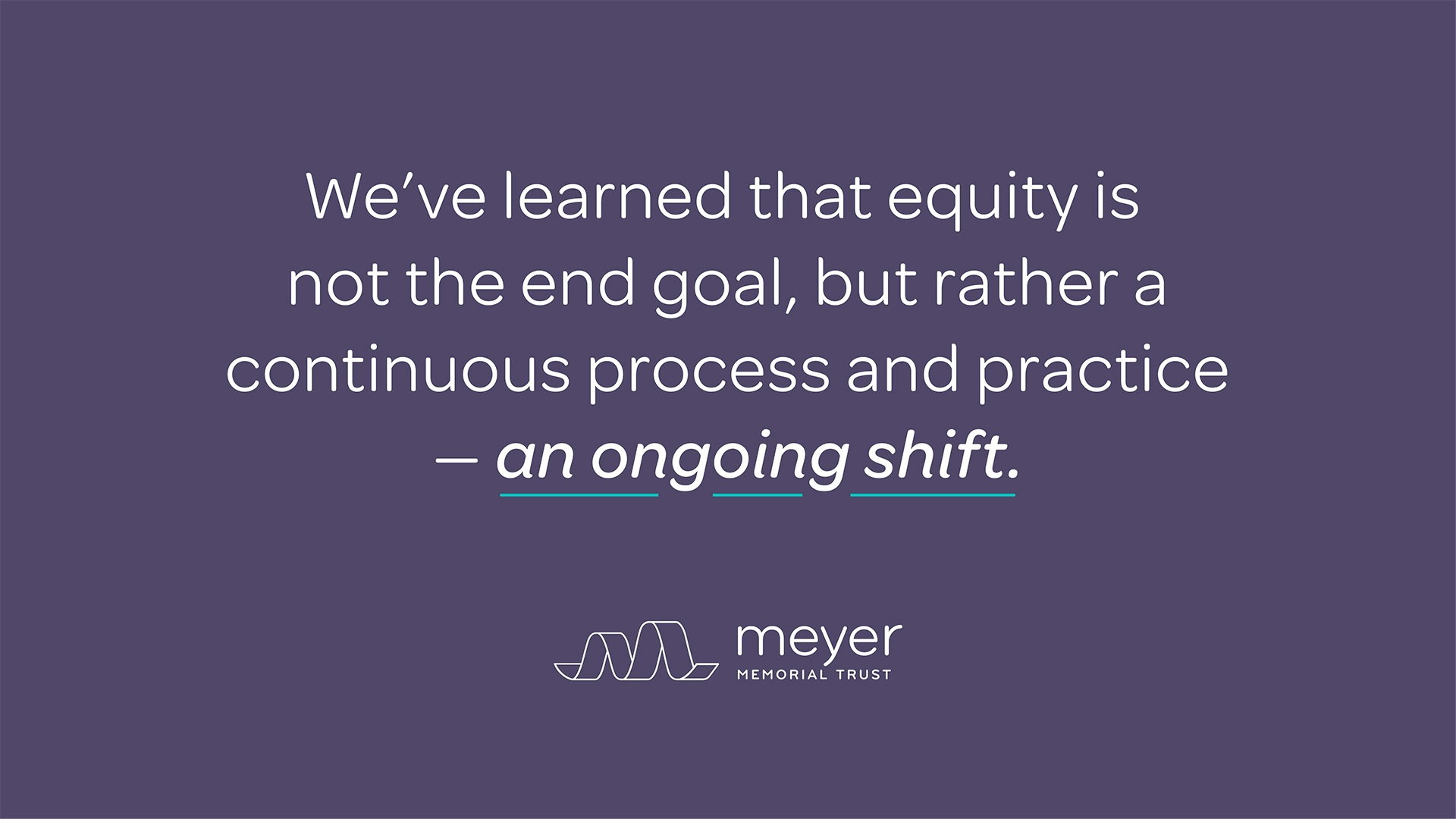
Meyer Memorial Trust, a leader in philanthropy for their transparency around their own equity journey, wanted to create a presentation to share their journey with their peers and community.
The Portland-based foundation, a long-time client of ours, has openly and boldly moved toward equity within their organization and with their grantmaking. Their path has been full of twists, turns, and bumps along the way, though this hasn’t stopped them from sharing insights and missteps with their community. They’ve become a beacon because of this work. They decided to share a visualized narrative in the form of a presentation to take people through the learnings and insights of their journey in an effort to encourage more organizations to do the work. We worked closely with their DEI Manager and Communications Specialist to design this Prezi presentation as a tool to spread the word.
Telling a complex story
Storytelling and experience goals
Hold to a high standard of design
Be attractive and easy to use for facilitators and audiences.
Be simple but not overly simple
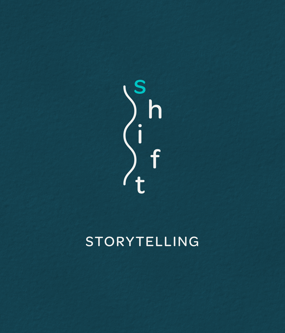
Be clear about what s.h.i.f.t. is and what it is asking for and offering.
Be revealing and transparent
Frame the story as an offering of Meyer’s unique experience and what we learned. Ask others to try the framework. Encourage vulnerability.
be highly experiential and interactive
A presentation is a one-way medium. As much as possible, design it to be a tool, asking people to take part in the conversation.
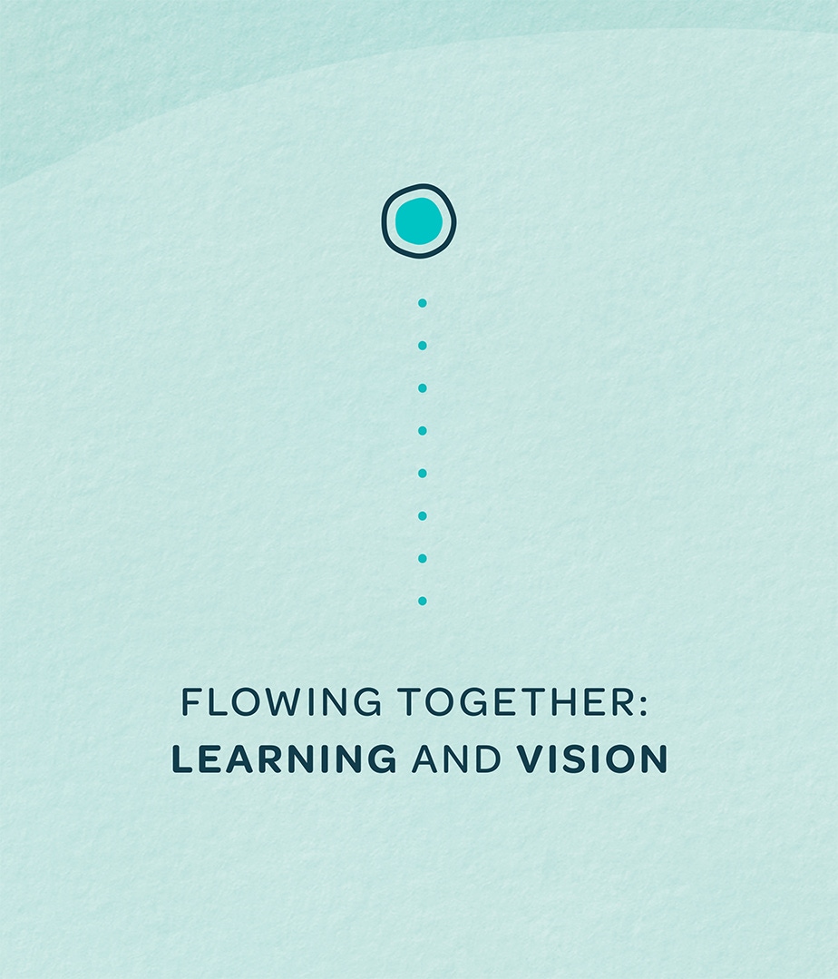
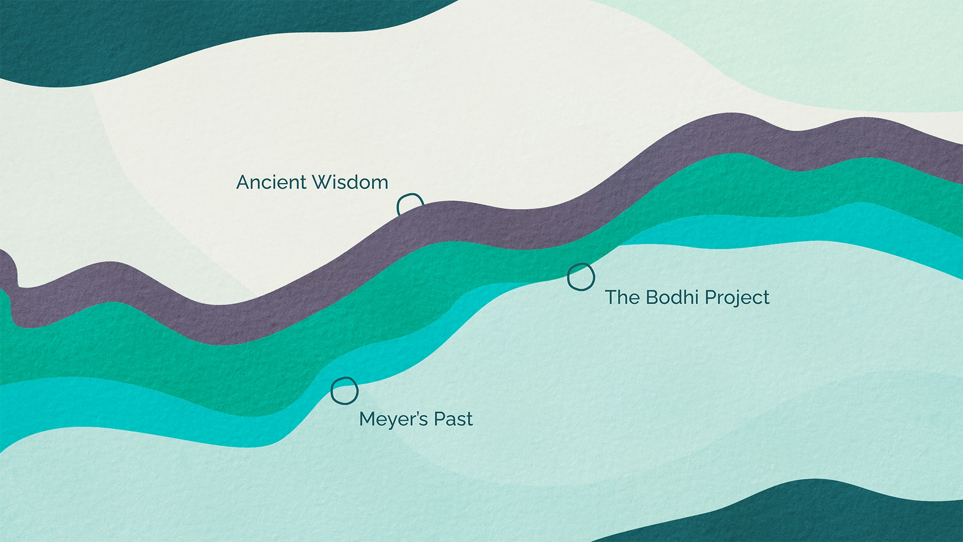
Getting into a flow
The starting point for the design was the metaphor of a river: It’s not a straight line, not a simple experience, but we’re all moving together in one direction, toward greater justice. Along the way, there are eddies and stepping stones where we can stop, take stock of where we’ve been and where we’re going. We used paper textures and cutout shapes to increase the sense that this is a journey we all have to make ourselves.

Smith & Connors was such a good fit for the story we were trying to convey, in part because the approach we took in the project is, I believe, one they support in their organization as well. It requires removing the sense of urgency, breathing through challenging moments and tasks, being inclusive of many ideas, and supporting diverse approaches.

Project Scope
- Presentations & Pitch Decks