
Pacific Northwest foundation Meyer Memorial Trust was in the midst of a seismic change to how they approached grantmaking. They needed a new brand story and identity that matched this new era.
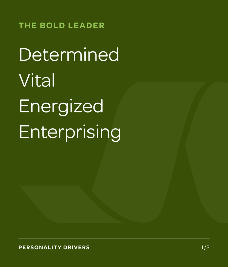
In 2015, Meyer was at the forefront of shifting their philanthropic approach toward an equity lens. As they changed the very basis of their grantmaking, they partnered with us over 3+ years to rethink and redesign their brand strategy, image, positioning, voice, and website. The new brand identity we developed conveyed Meyer's core values: equity, collaboration, humbleness, innovation, and transparency. Our main focus was ensuring that we were serving Meyer’s key audience — the nonprofits that rely on the support of philanthropy to create impact in Oregon.
a deep dive
New conversations
Over three months, our discovery work took us into conversations, interviews, and workshop sessions with dozens of people inside and outside of the organization, including all members of the staff, the Board of Trustees, and grant partners all over Oregon. We delivered a comprehensive insights report that set the stage for a new strategy.


Shifting Meyer’s positioning
Meyer was an institution in Oregon and its branding at the time felt institutional. With a mountain of data and primary research at hand, we framed up a new way for Meyer to present more accurately as the responsive and dynamic organization that it is. Our strategic repositioning became the underpinnings to differentiate it as a leader working together with its grantees toward a better and more equitable Oregon.

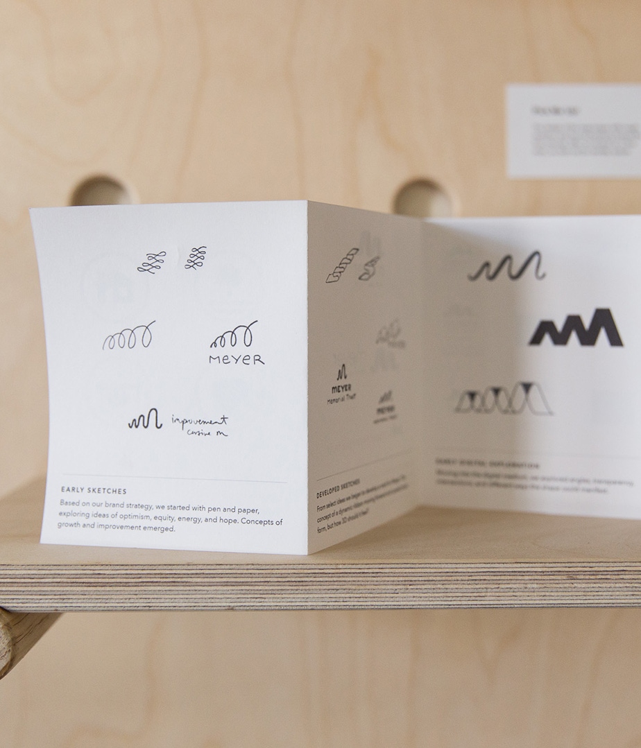
Connecting all brand elements
A brand has to be cohesive across media and channels to be credible. We worked closely with Meyer to redesign all elements of their communications materials, from photography direction to a new color palette to typography, print, and digital channels, including a new website and multiple email newsletter templates.


A new way, a clear message
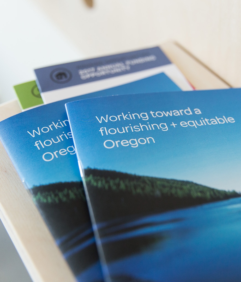
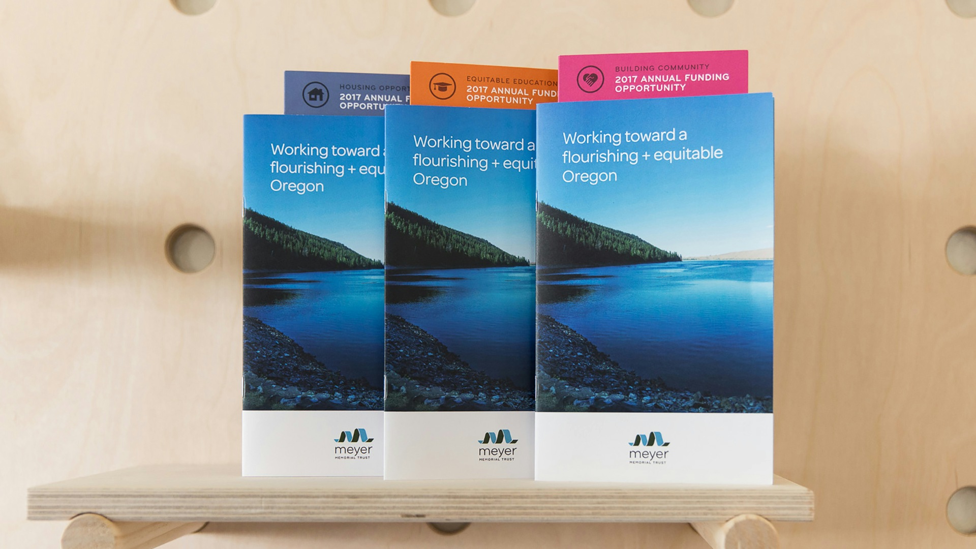
One of Meyer’s first events after they launched their new brand was a series of meetings for the nonprofit community all around the state. We developed materials for them, including a brochure with details for each of their portfolio areas. There was no more important goal than to help the community understand how to access resources and partner, so we created clear, direct, bold materials to help Meyer usher in this new era.

Smith & Connors brought more to Meyer's branding and website redesign than creativity, expertise and professionalism. Working with them has been a true partnership. We hired them at the tail end of an organization-wide redesign, a moment filled with both uncertainty and promise. They got us from the start. The logo they designed isn't just a pretty image and the website they created isn't just an elegant portal: both embody who Meyer is and the equity we are striving for.

Project Scope
- Brand Guidelines
- Brand Strategy & Messaging
- Core Messaging
- Logo Design
- Naming
- Positioning
- Print & Collateral Design
- Signage & Environmental Design
- Visual Identity Systems
- Voice & Tone Guidelines
- Change Management
- Interviews
- Staff Engagement
- Surveys
- Workshops & Focus Groups
- Audience & Channel Analysis
- Campaigns
- Communications Strategy
- Copywriting & Content
- Email Newsletters
- Marketing Assets
- Photography Direction
- Presentations & Pitch Decks
- Social Media
- Content Development
- Content Strategy
- Digital Tune-Ups
- Documentation
- SEO Strategy & Optimization
- Web Design & Development