

Sector
Services
Hearken is a social impact consultancy that uses democratic practices to help people engage more fully in systems.
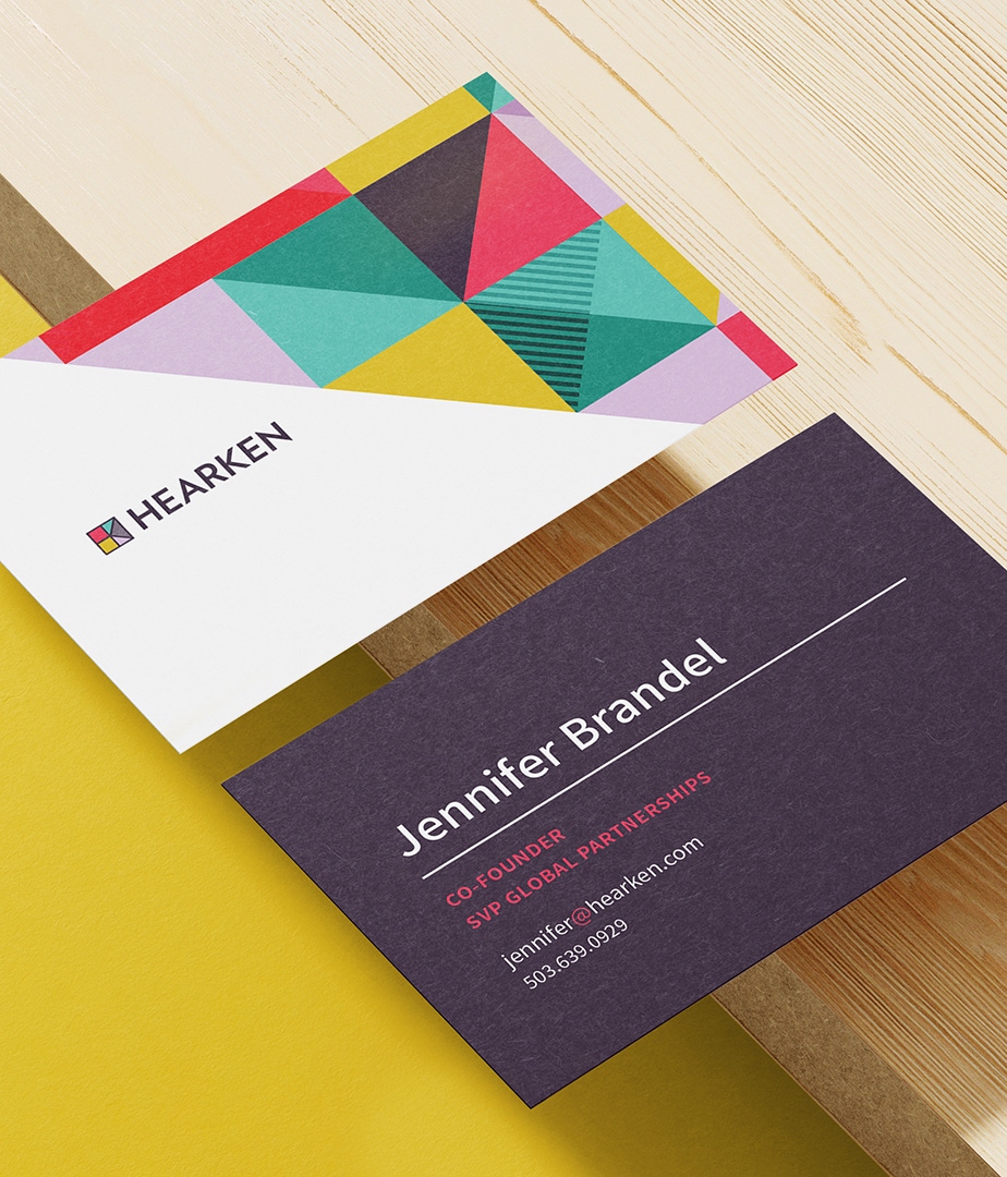
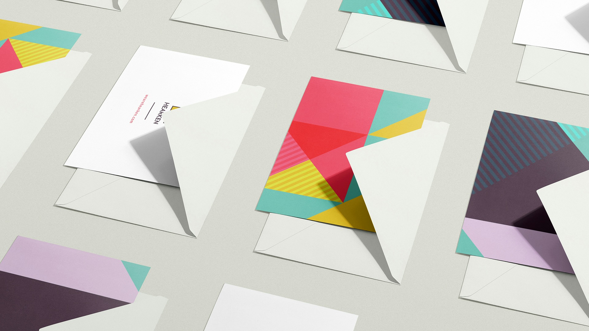
The company helps institutions and whole sectors drive positive social change (the founders are also the founders of Zebras Unite). They brought us on to develop a more expansive expression for their visual identity, delivered across media and templates that were easily usable by their team. They already had a lovely and meaningful logo that hinted at their core purpose. But their materials had become a collection of styles and expressions that often veered far from the core brand. We began our work by articulating their brand strategy and position, and then brought their identity alive in new ways, releasing it from its grid and expanding it into new dimensions.
Defining and refining
Brand Strategy
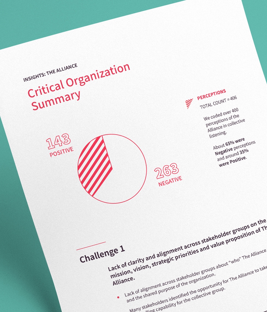
We analyzed the organization's target audiences and personas, researched competitor positioning, and evaluated the brand's mission, values, personality and archetypes. By assessing these foundational brand elements, we were able to develop an insightful new platform that provides deeper meaning and differentiation behind their work (and their logo).
Brand Drivers
Expert listener
Hearken attentively engages stakeholders through deep listening.
Insightful partner
Hearken collaborates with their clients to go further into their goals and help them solve problems.
Dynamic influencer
Hearken drives action by constantly reacting and responding to ever-changing situations.


Flexibility within guidelines
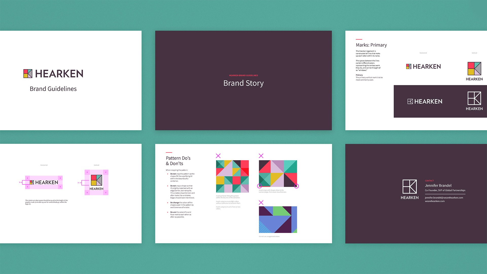
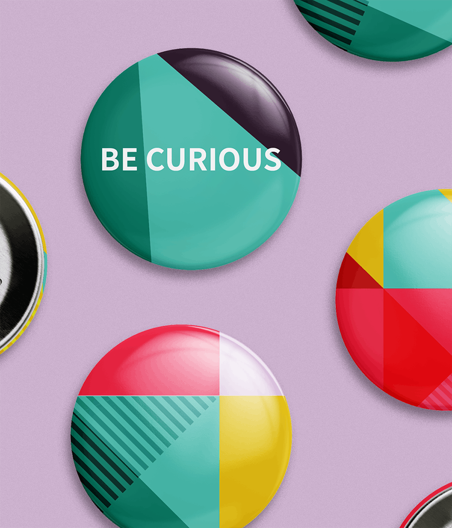
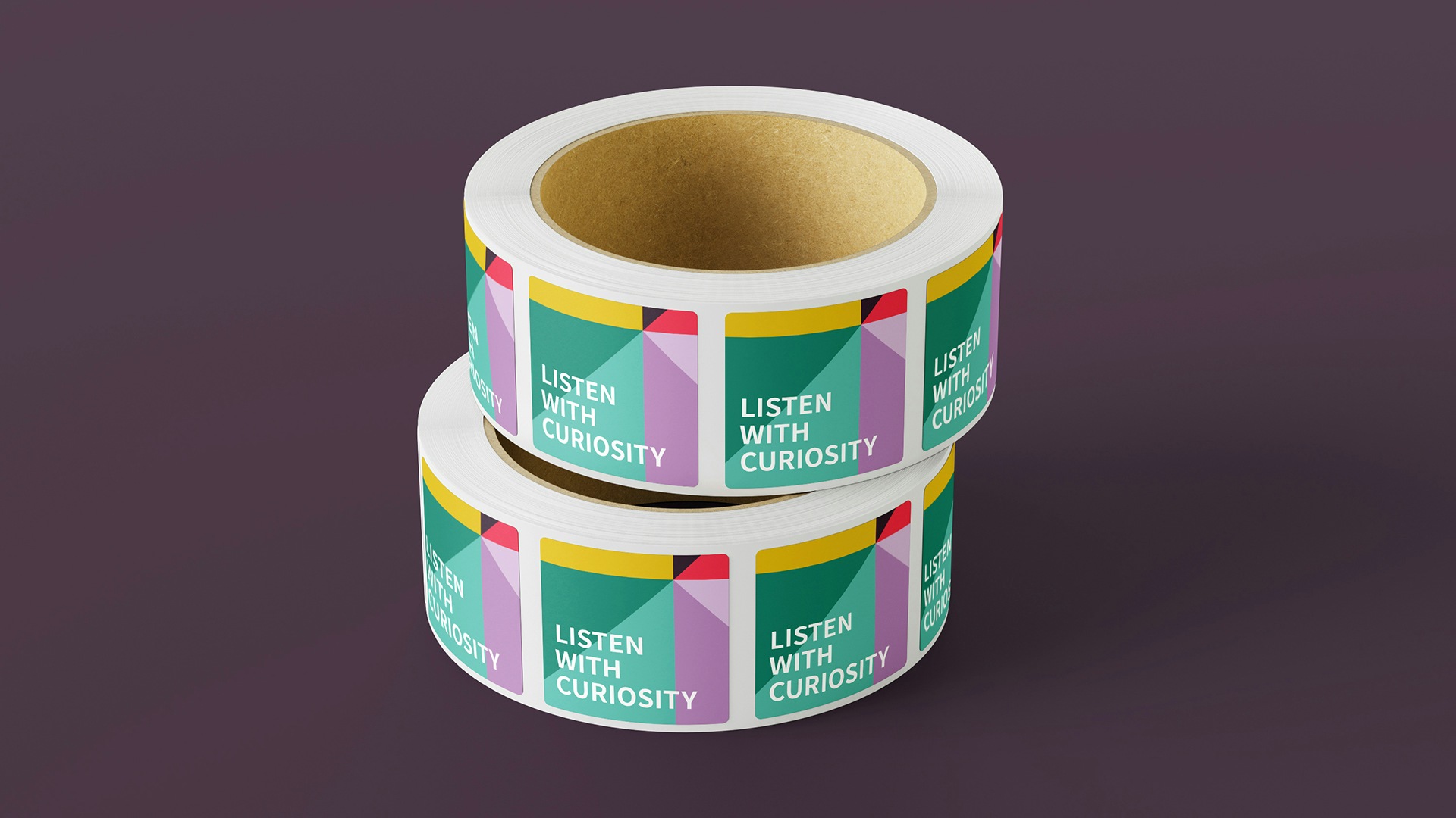
We developed a set of robust brand guidelines, then trained their team to use it, providing Hearken with a variety of ways they could expand their identity into the world. We created specific, but not restrictive, guidelines for the new brand pattern to equip their team with a toolkit to keep things fresh.

Nothing about this firm is transactional — they are relationship experts and exceptional communicators. From project management to strategy and visual design to technology — they took the raw concepts and ideas we had and worked collaboratively to find the true heart of who we are and why we exist. They then transformed the concepts into a variety of assets and tools with such polish and clarity.

Project Scope
- Brand Guidelines
- Brand Strategy & Messaging
- Positioning
- Print & Collateral Design
- Visual Identity Systems
- Marketing Assets
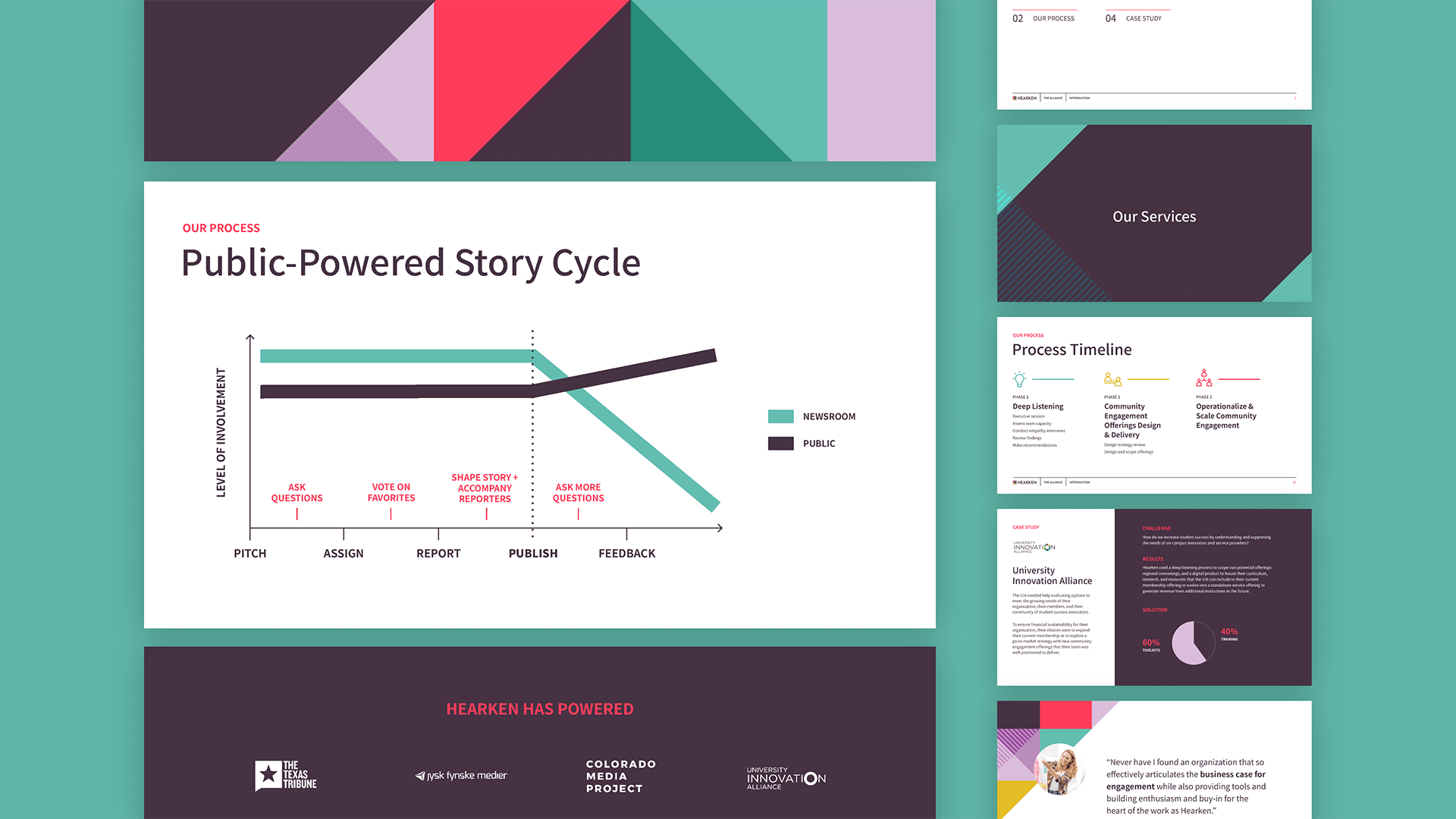
- Presentations & Pitch Decks

