Sector
Link
Boston University’s Center for Psychiatric Rehabilitation (CPR) needed a new website to serve their complex audiences and spread the word.
Psychiatric rehabilitation is an area of research that promotes recovery and improved quality of life for people with mental health conditions. CPR provides training, research resources, and clinical help. We worked with staff and leadership to delve deep into CPR’s multi-faceted services and diverse audiences to develop a new way to provide easier pathways to their services and research. They do so much. The challenge was: how to make one website serve everyone’s needs?
a new strategy
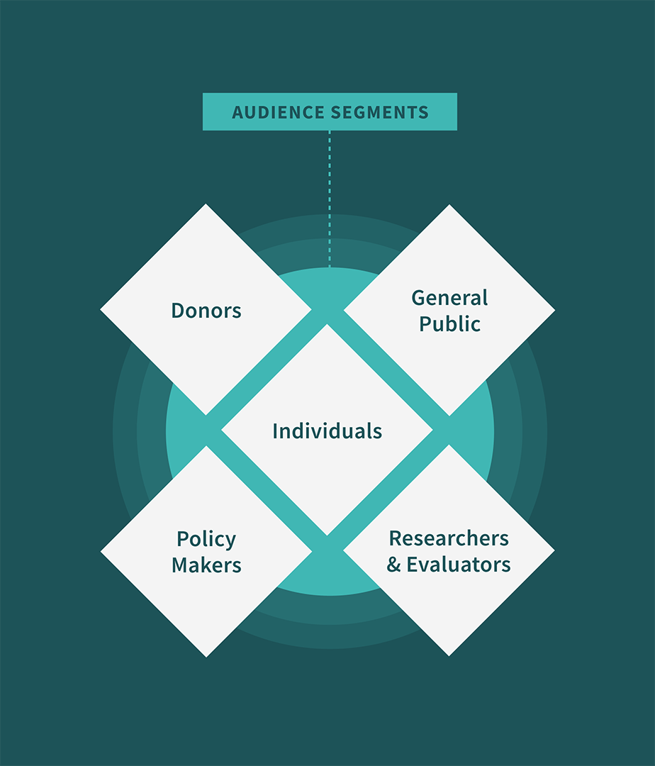
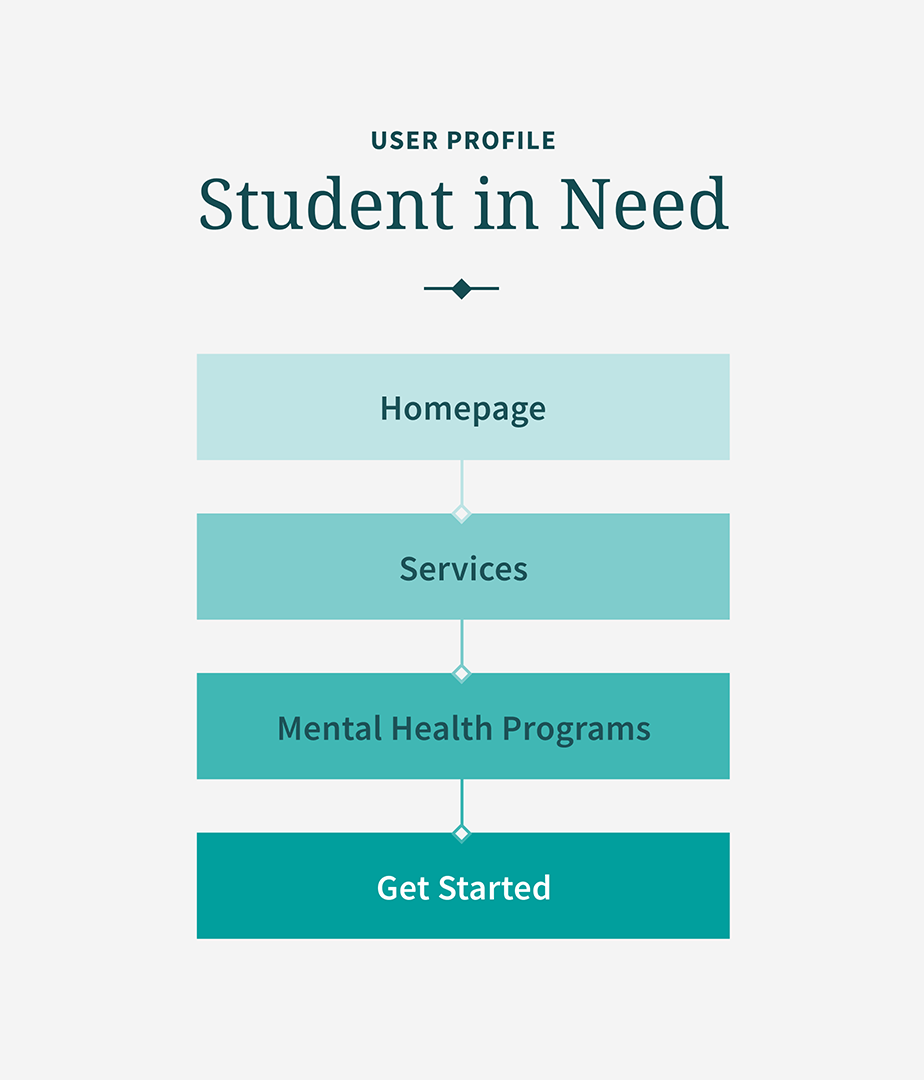
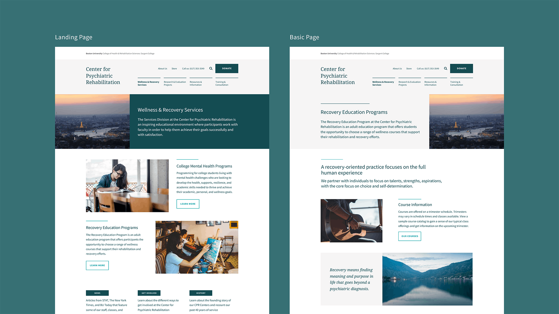
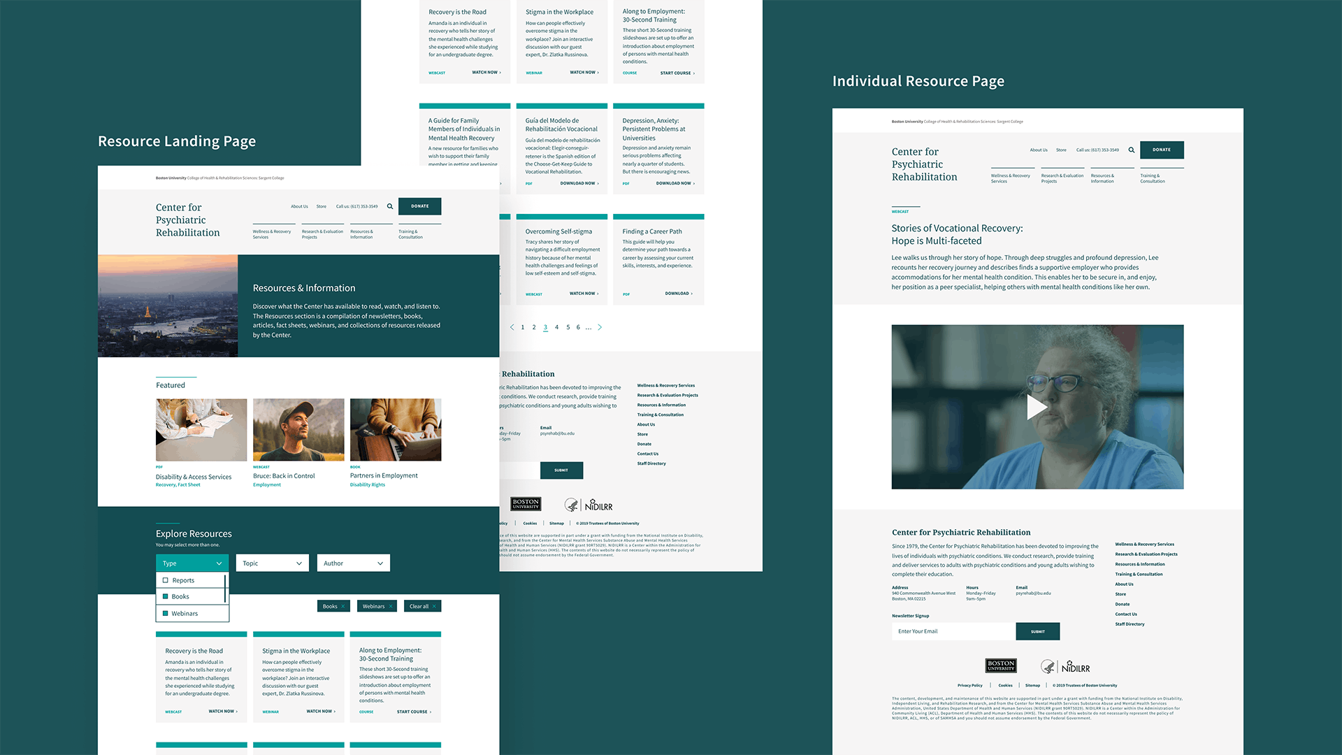
A site for all audiences
Some people landing at CPR are in distress, and some are coming to learn and work. We developed a vision of a site that was portal-like — visitors get high-level context about the Center and simple pathways to their goals, and the content throughout the site moves from high level to more granular as they go deeper.
Defining goals
Communicate values
Emphasize self-determination, hope for recovery, person-centeredness, respect for each person’s recovery journey.
Make it easy
We will provide content consistent with how our audiences think, not how we think.
Engage all audiences
Attend to the needs of all of those who use and contribute to CPR and its work.
Show thought leadership
Convey that we have a special niche in the field. We are leaders with a point of view.
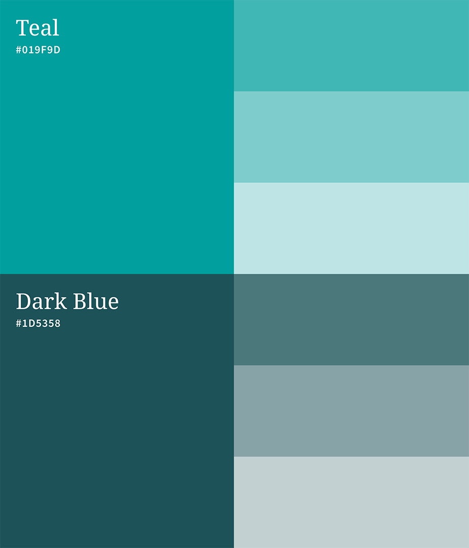


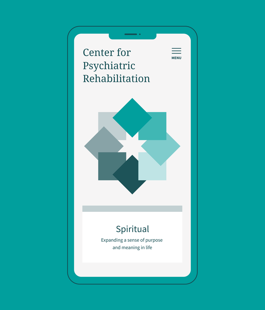
A cohesive, clear design
We designed the CPR site for maximum clarity. With so many audiences and so many possible pathways, we developed text hierarchies that telegraphed immediately where visitors should look to find the information and services they needed. All of the elements on the site mesh perfectly to create a unified look and feel with enough variety to create energy.

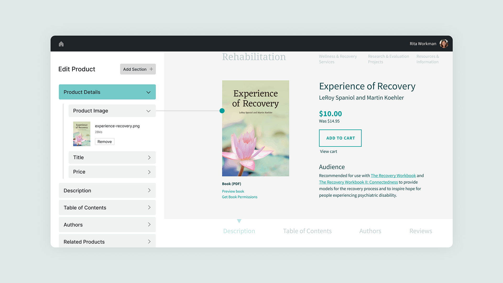
Simple experience, sophisticated tech
Under the hood, CPR’s site is a WordPress installation with a custom theme using Advanced Custom Fields to create an easy administration experience. The staff at CPR, for so long burdened with difficulty managing their resources, are now able to be nimble and keep their information up to date for all of their audiences.
Smith & Connors expertly and empathetically managed a very complex process for our website redesign and helped us create clarity in the work. Their follow-through, communication of values, and adhering to the plan that we laid out—all of that together has made this a great endeavor.

Project Scope
- Change Management
- Interviews
- Staff Engagement
- Surveys
- Workshops & Focus Groups
- Content Development
- Content Strategy
- Documentation
- SEO Strategy & Optimization
- Web Design & Development