Sector
Link
The Arizona Community Foundation is one of the largest community foundations in the United States and has a complex story and a broad variety of audiences.
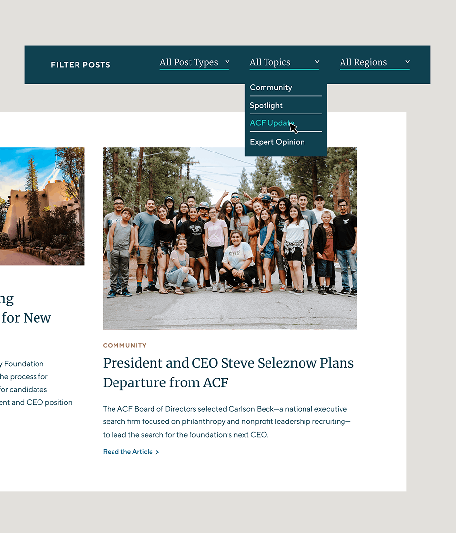
ACF’s website had built up organically over time, without a strategic lens. The content management system was too limiting and hard to use. It was time to rethink the site and build an audience-focused experience that also worked well for their internal teams. We rebuilt their site from the ground up with a simpler brand story and curated experiences for a myriad of audience types and donors.

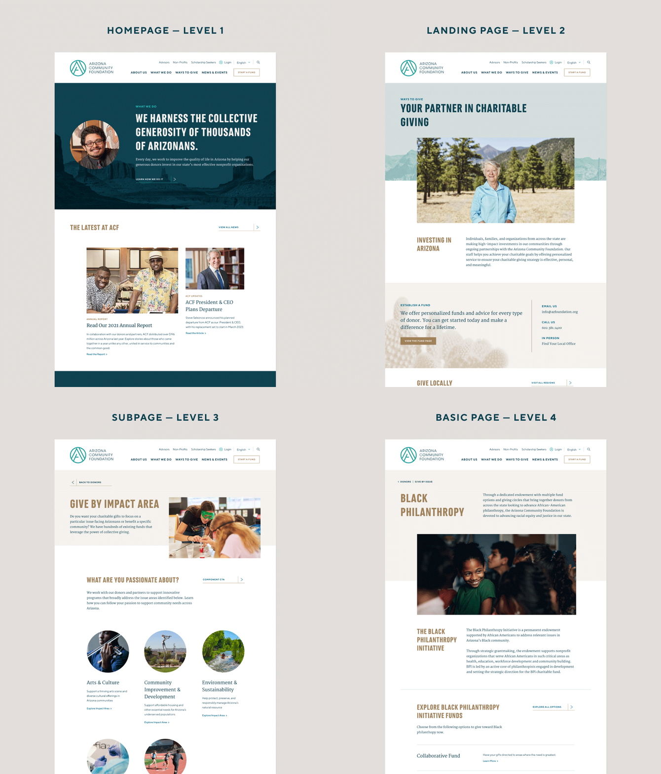
Focusing on the audience
Clear, simple pathways and a revamped visual hierarchy
Community foundations are complex because they have to be experts on the community, philanthropy, customer service, and much more. With this much complexity, communications can easily get caught in siloes. Our strategy hinged on the fact that the website is only one part of a holistic brand journey. The experience needs to tell a broad, clear story about the organization while also serving up simple pathways for each audience to easily find specific content.
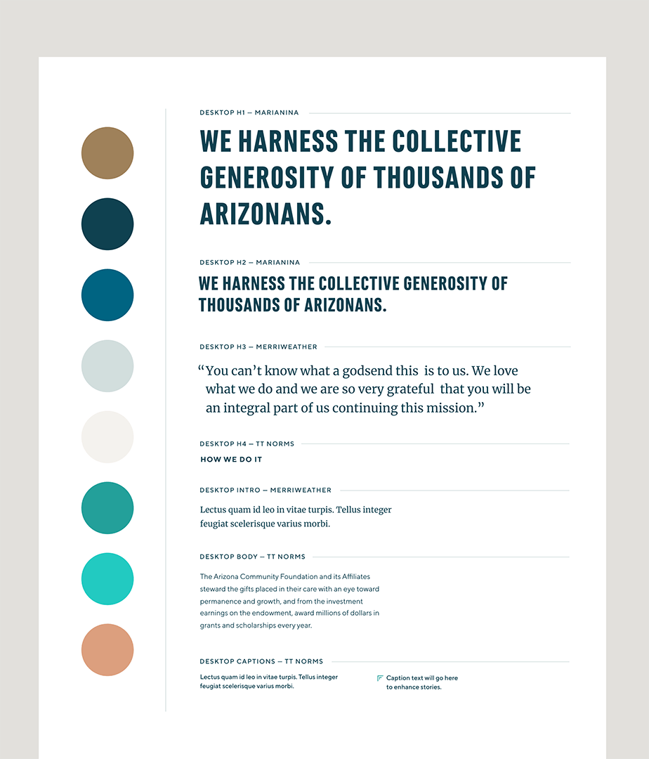
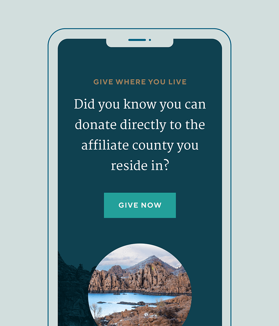
Defining the experience goals
Delightfully responsive
Interactions, designs, exhibit delightful moments of responsiveness, speaking to ACF’s laser focus on being adaptive to the needs of Arizonans.
Reflective
The site design and user experience reflect back to visitors the beautiful diversity and differences that make Arizona a great place to live. The visual design of the site is clean, beautiful, and puts the focus squarely on the content.
Warm
The designs should give a distinct feeling of warmth and care.
Non-corporate
Even though ACF is a $1.5B organization, they are different from other donor-advised fund administrators like Schwab and Fidelity. ACF should feel a lot more accessible.

Creating a modular, flexible storytelling system
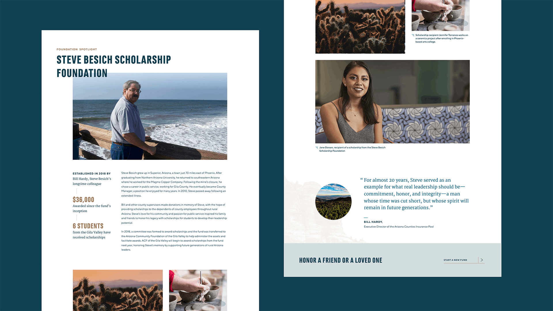
ACF’s website is built on a system of custom modular components that can be used to construct unique pages. We built a variety of themes for certain components using background colors and imagery to create a diverse visual experience across the website. We designed and built this intricate system to be a flexible tool for the communications team while ensuring that components work together visually.
Storytelling is a key tenet of the website. We designed flexible Story Block modules that can be added to a page. These special modules allow the ACF team to share small story quotes or longer multimedia-rich stories from their community about the impact of their work. And with the theming engine we built, they can bring in even more visual variety that reflects the landscape, flora, and fauna of the state.

Guidelines for maintenance and smart growth
For this site, we built a custom WordPress implementation that uses Custom Post Types to make it easy to maintain news, events, publications, grants & scholarship, and staff & board pages. We worked with a variety of third-party integrations so that ACF could keep using their current technology.
We also delivered a full set of documentation, including a user guide and a library of custom screencasts to document the strategic reasoning behind the site and to ensure that future members of the team have access to the knowledge base.


Designing and launching our new website was the capstone of a major, two-year technology overhaul. Our website had to project clearly and powerfully what we had become, and where we were going. Smith & Connors captured exactly what we hoped. Team players from the start, they excelled at listening and learning, ultimately translating everything they absorbed into our new site. They got us, we got them, and then they executed flawlessly. We could not be more pleased with the final product and the collaboration that led us here.

Project Scope
- Change Management
- Interviews
- Staff Engagement
- Surveys
- Workshops & Focus Groups
- Content Development
- Content Strategy
- Documentation
- SEO Strategy & Optimization
- Web Design & Development


