Sector
Links
Berkeley Lab is one of the foremost scientific institutions in the world. Since 1931 it has had an unparalleled record of breakthroughs that have changed the world for the better.
The Lab’s website hadn’t been updated since 2006 and didn’t allow the their communicators to properly tell a cohesive story of excellence. Due to decentralized management of the Lab’s various web presences, the previous site was fragmented along organizational lines and did not tell a coherent Lab story or offer the most critical web visitors a cohesive experience.
They selected Smith & Connors to help them design and build a best-in-class digital design system and set of flexible, modular websites to express their brand story accurately and inspirationally, and to serve the Lab’s mission and myriad audiences.
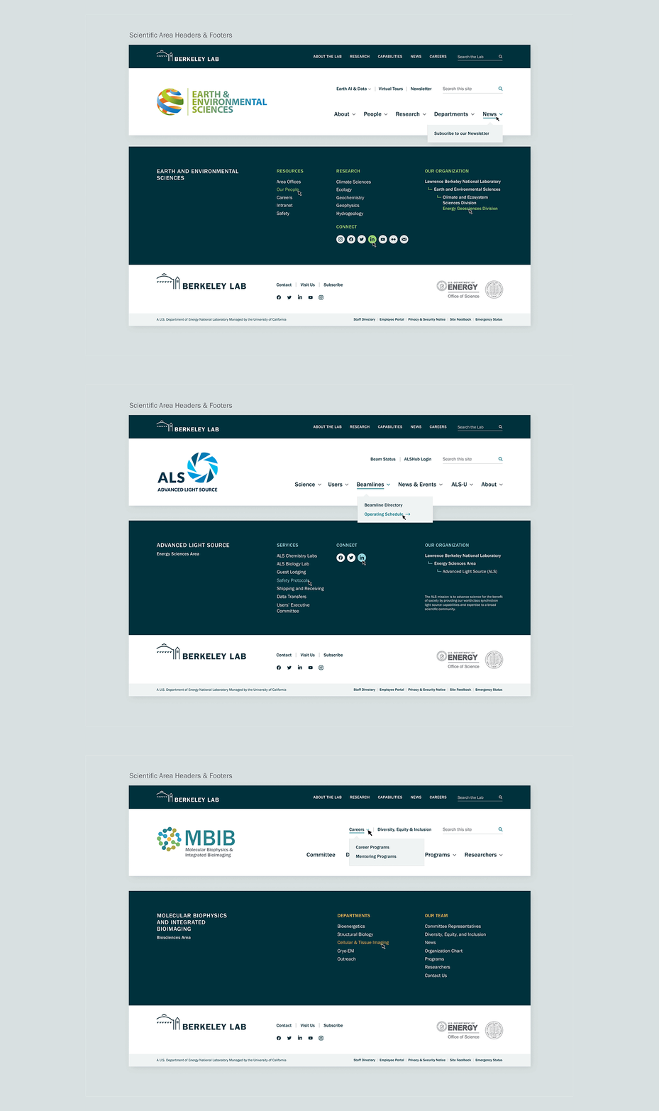
A major challenge of the project was to build a new system that embodied the vision of the Lab as a whole while meeting the requirements of the Lab’s office of strategic communications as well as 6 scientific areas, and their divisions and user facilities.
The Berkeley Lab Design System is leveraged by its divisions and user facilities to create websites that bring cohesion and modern accessibility across the Lab.
Awards & Recognition


Discovery at a Glance
Building the foundations
An audience-focused content strategy
After an extensive discovery phase, we organized our insights into a cohesive content strategy laser-focused on helping audiences find what they need and, at the same time, inspire them to explore, to go further and discover what they didn’t know was there. We wanted to satisfy audiences while also making them say, “Wow, I didn’t know they did that at Berkeley Lab!”
Defining the experience goals
Openness
Express a sense of welcoming and approachability throughout the experience.
Grandness of Mission & Scope
Celebrate Berkeley Lab’s excellence and portray it as part of a continuum in an ongoing history of one of the best labs in the world.
Expansiveness
Convey a sense of possibility.
Exact
Ground the experience in rigorous, evident structures.
Building a fully modular system
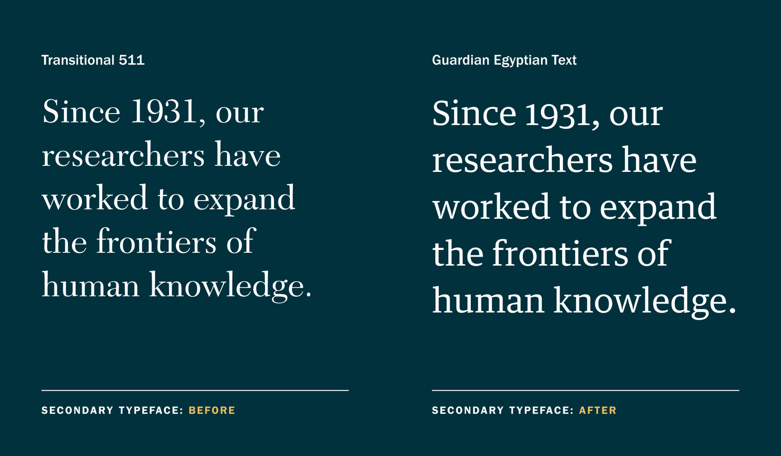
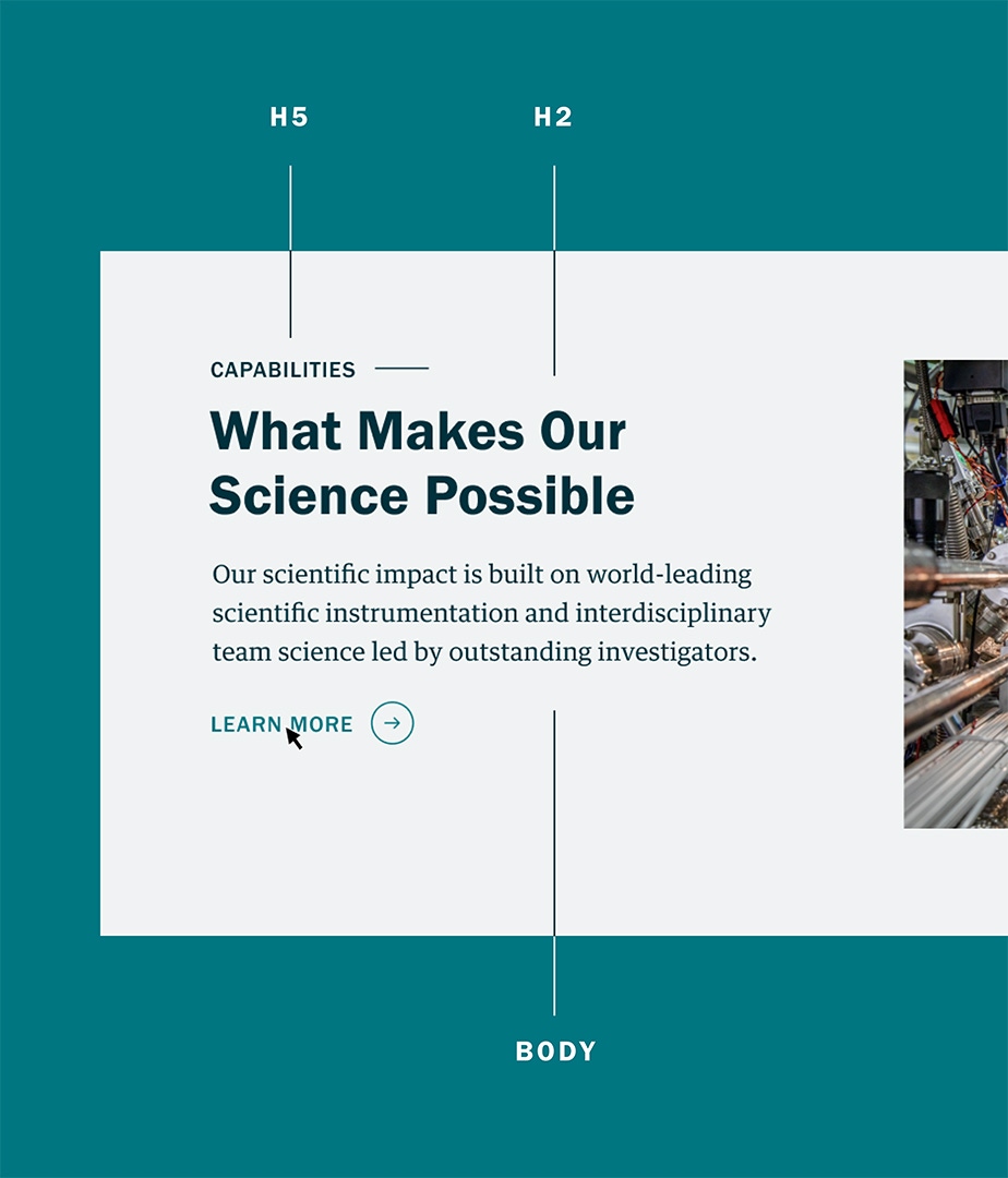
This was more than a website redesign. We built a modular system made of intricate parts that can grow with the Lab. The new Berkeley Lab Design System is built with Native Web Components and other cutting-edge technologies for extraordinary flexibility and best practices in SEO, accessibility, UX, and responsiveness built in.


The technology under the hood
We built a custom WordPress theme and plugin with highly complex settings and an intuitive CMS admin experience. Because the system will be accessed by hundreds of communicators and contractors, we built a library for documentation, user guides, and screencasts to guide website admins now and into the future.
Live user testing
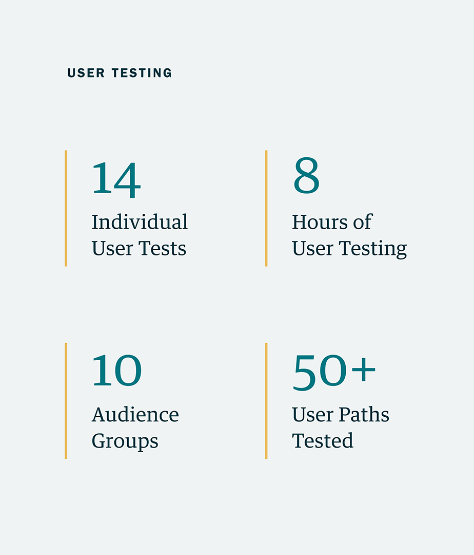
We developed test prototypes to validate our assumptions with users from different audience groups. We helped develop content and stitched together specific pathways through an interactive experience mimicking the real site. We then conducted 14 live test sessions with people from the Lab’s various audiences to see how they navigated the content and spot areas for improvements.

A news site to match
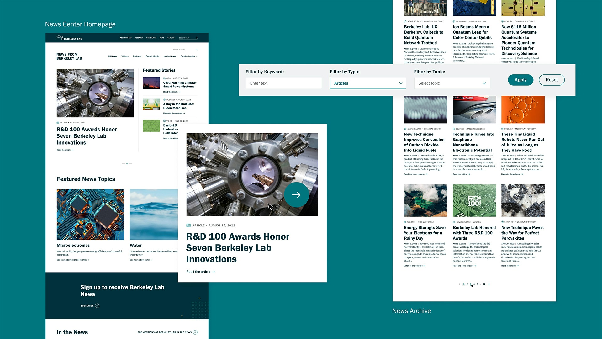
One of the key functions of the strategic communications team at Berkeley Lab is to get the word out to the public about their groundbreaking science. As a federal institution, they are responsible to us, the taxpayers. The new News Center site lets the science shine with beautiful imagery, featured links to publications and researcher profiles, and much more.

Our challenge from the beginning was to drive adoption by a dozen groups across the Lab that were unaccustomed to any central coordination. Smith & Connors helped us deliver a content and design strategy that offered a cohesive lab experience while offering the flexibility sought by our internal partners — while addressing everyone's need to adopt modern standards for user experience, accessibility, responsiveness, and SEO.

Project Scope
- Change Management
- Interviews
- Staff Engagement
- Surveys
- Workshops & Focus Groups
- Content Development
- Content Strategy
- Documentation
- SEO Strategy & Optimization
- User Testing
- Web Design & Development
